Relive fond memories of your favorite classic arcade or electronic handheld games with Ollie’s Arcade – a fun collection of retro-styled mini games that are challenging and simple to play.
All of us here at the Iconfactory love the classic video games we played in our youth. Many hours were spent in front of titles like Asteroids, Moon Patrol, and Battlezone, as well as cherished handheld electronic games like Mattel Football, Simon, and Merlin. Ollie’s Arcade recaptures a little bit of this magic and gives players a chance to turn their iPhone or iPad into a retro gaming experience.
Two of the games in Ollie’s Arcade – Ollie Soars and Tranquility Touchdown – were inspired by simple Easter eggs in Twitterrific, our beloved Twitter app. We polished Tranquility Touchdown, completely revamped Ollie Soars, and added an all-new third game – our own take on the classic Snake. All of Ollie’s mini-games are easy to learn and designed to be accessible for everyone. You can even play with your favorite game controller or via wireless keyboard.
The Games
Here are the three retro mini games:
Ollie Soars – The sky’s the limit as you fly around the world with Ollie. Find all the gems you can while soaring past obstacles. Take time to enjoy the scenery but watch where you’re going!
Snake – A hungry snake is its own worst enemy. Gobble up as many apples as possible while you avoid running into your snake’s own twists and turns. Watch out for apple cores!
Tranquility Touchdown – Head for the stars in a game of exploration and skill as you pilot your lander to the surface of six different planets. Keep an eye on your fuel – what goes up, must come down!
Do I need quarters?
No, you won’t need a pocketful of coins to play! And better yet, there are no annoyances while playing: all the mini games are ad-free with no subscriptions.
Ollie’s Arcade is a free download that includes Ollie Soars. The other two mini-games, Snake and Tranquillity Touchdown, are unlocked via a one-time purchase of just $1.99 USD each.
We have lots of ideas for future additions, and your purchase will help us bring them to life. So grab Ollie’s Arcade on the App Store today, press PLAY and have some fun!
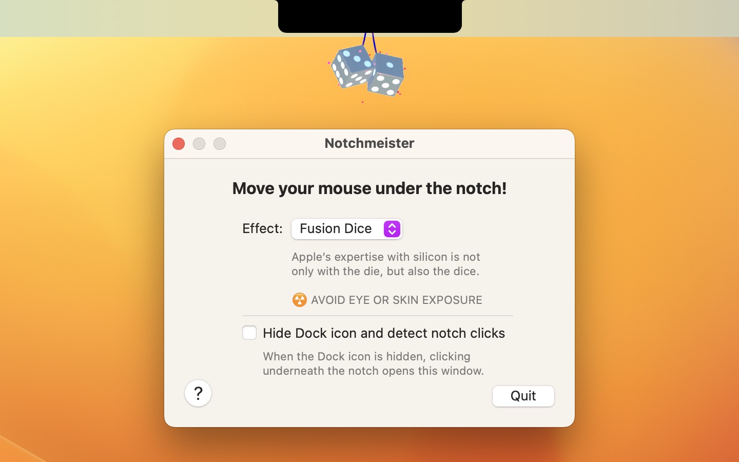
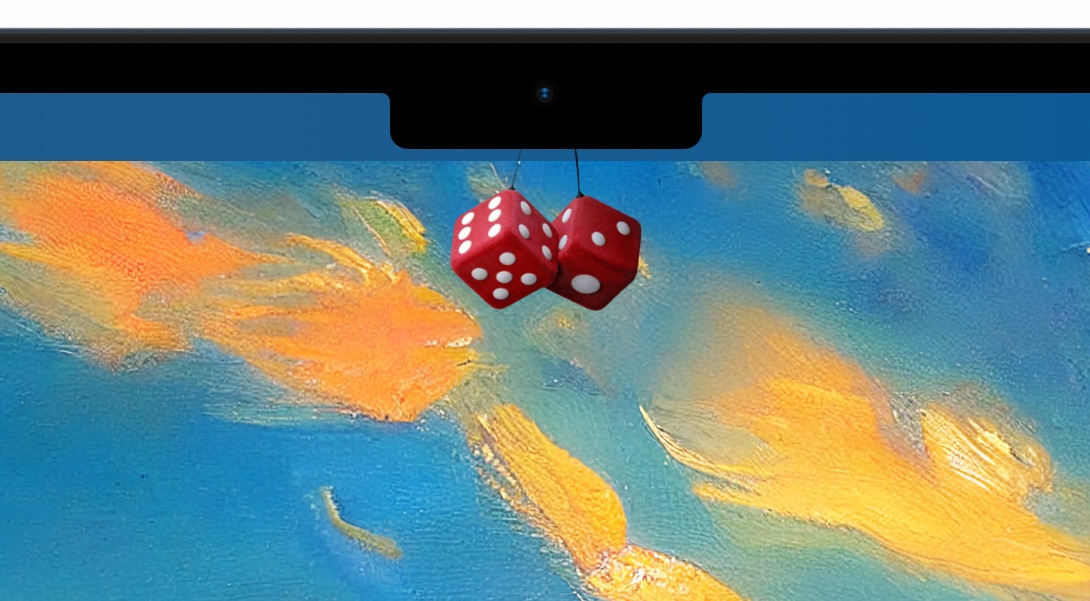
We’re proud to announce that version 1.0.4 of Notchmeister is now available to download. And with it comes a revolutionary new feature called Fusion Dice.
They spin.
You can click on them, too.
Fusion Dice are the perfect accompaniment to a never-ending video conference—you’re looking right into the camera while clicking the time away! And even if you’re lucky enough to not be in one of those meetings, they’re still a great fidget toy.
This all began with a toot from BasicAppleGuy. As soon as I saw this image, I knew it had to happen:
There was a snag: the window where the dice were being displayed blocked interactions. A large area surrounding your menu bar that prevents mouse clicks has just a few usability issues, so I asked people who are smarter than me for help. Luckily Guy English, Steve Troughton-Smith, and Justin Miller came up with some pointers that led me to a solution. It may not look like it, but there are five windows on screen, working in concert, just so you can fiddle around with your notch. As it should be.
Meanwhile, Louie Mantia was off making a font for die-hard fans of typography and Star Wars. And creating the assets needed to play Corellian Spike.
All good collaborations come to an end, even if one of the team members comes up with an idea that makes you think it will never be done.
(Unfortunately, this work has also inspired another request, but please don’t ask us for Truck Nutz. The first problem would be the unpleasant experience of finding a 3D model; the final problem would be App Review.)
This effort has been a labor of love, but if you’d like to show your appreciation, we have plenty of other apps you can buy. You can also be like BasicAppleGuy and become a Patreon supporter. We treat our patrons right, but not always this extensively 😉
The bottom line is that the more you support us, the more we can do the things that bring a little weird joy to your life. Once you’ve done your part, hold down the Option key while clicking on the Help icon, then live long and prosper.
WorldWideWeb, our simple web server for iOS and macOS, has been a hit with developers. It’s another case of us scratching our own itch and finding out there are lots of folks who need to do the same thing!
Of course, people who rely on an app also start asking for features. One feature that has gotten a lot of attention is auto refresh. It’s a huge time saver to edit your HTML, CSS, and JavaScript in your favorite editor, then see all the changes in your browser as soon as you save with ⌘S. It also makes testing in multiple browsers a snap because all of them update simultaneously.
The auto refresh we included in version 1.0 was very basic. We spent quite a bit of time with improvements and making the feature as bullet-proof as possible. The whole user experience is better.
And now our simple little product is a little less simple and needs more customer support. To deal with these new costs, we’re going to be charging for the features that only web professionals will need. The basic features will remain free and the PRO upgrade is a one-time purchase of $10 per-platform. You can also try out PRO with a free trial.
This new revenue source will also help keep the app FREE for the folks who need it the most. It makes us incredibly happy when people use the app to learn how the web works without first jumping over the hurdle of setting up a server with the command line.
We’ve also launched a new website that includes a quick demo of the new features. If you work on the web, you owe it to yourself to check out the new WorldWideWeb!
Our fast-paced puzzler, Frenzic: Overtime, is back with a brand new chapter to test your reaction and flex your gray matter. Enjoy new challenges as you battle your way through 30 exciting levels, complete new mini-goals, and solve unique puzzles that earn Game Center achievements.
Join in the fun to defeat the menacing Overbot once and for all in Frenzic: Overtime‘s third chapter: Unplugged!
Head on over to Apple Arcade to get the latest levels and start playing Frenzic: Overtime today.
We took some time to chat with the nice folks over at HostingAdvice about all things Iconfactory: from our history, to our current projects, to what the future might hold. HostingAdvice serves up a daily helping of technology news, product reviews, and profiles the movers & shakers of our industry.
Many of our long-time fans and customers know the Iconfactory from our top-tier apps, but it doesn’t hurt to toot our own horn about other projects every once in a while! The interview focuses on our design services, which include app icons, user interface design, promotional materials, Emoji design, illustration, and so much more.
If your project needs assistance, check out our design and development services at design.iconfactory.com. We can help you launch, improve, or grow a digital product, just like we do with our own. Get in contact with us today!
We’ve teamed up once again with our friends over at Cotton Bureau to bring you some cool new merchandise. In addition to our Iconfactory logo t-shirts and limited edition enamel pins, you can now be the proud owner of a snazzy Iconfactory baseball cap. These low-profile, dad style caps are 100% cotton and embroidered on-demand.
We’re also offering our Superhero Patreon supporters a special $4 discount when they order through Cotton Bureau. We’re always looking for new ways to show our gratitude to our Patreon supporters so if you’re subscribed be sure to head on over and grab your promo code prior to ordering.
If you are looking to level up your headwear game and add some flair to your dome, then don’t wait – head (see what we did there?) over to Cotton Bureau and order yours today!
Another day, another set of revelations. We’ve almost reached our destination, so let’s get going!
Tooling Problems
SwiftUI and the cross-platform frameworks you will be using are either:
A new thing with bugs and rough edges — and quickly evolving.
An old thing with decades of legacy — and unlikely to change.
You will have to deal with both.
Previews, Oh Dear!
You won’t realize how much you depend on SwiftUI previews until you start working on macOS.
Sometimes they kinda work, but more often than not you’ll get an endless spinner. When they do work, they’re not interactive (you have to use the selectable mode with the arrow icon). There’s also a weird app that you can open outside of Xcode to preview, but it’s unreliable and weird.
And when you do finally coax the previewer to work in Xcode, it never shows the button with a tint. That’s because whatever is showing that preview isn’t the key window, and windows that aren’t key don’t get tinted.
As a result, you’re going to run the app to see layout changes. Then you go back to Xcode to check the iOS layout and restart the previewer. Then after a few seconds you realize that’s not going to work because the target is still on the Mac. So you switch the target to iOS and check things out after restarting the previewer (again). Then the Mac code gets edited and you run to check the changes: and quickly realize that the iOS Simulator is kicking off because the target is set wrong. Lather, rinse, and repeat.
I’m not exaggerating, when I say THIS HAPPENS HUNDREDS OF TIMES EVERY DAY.
To adding insult to injury: if you’re using .navigationBarTitleDisplayMode() in your PreviewProvider, you’ll have to add #if os(iOS) because that API doesn’t exist on the Mac.
And you can bet your ass I’ve filed feedback about all of this. You will, too. (FB12071275)
Feeling Entitled?
Pay attention here: I’m about to save you a bunch of time. Many apps use entitlements for App Groups and Push Notifications and have key/value pairs in the project’s .entitlements file.
The keys for these things are different on macOS.
When you created the Push Notification capability for your iOS app, you added an “aps-environment” key with a “production” value. When you added the Mac as a Destination for your SwiftUI target, your entitlements were not modified.
You will first wonder why the UNUserNotificationCenterDelegate methods are either generating an error or not being called at all. Then you will search for documentation and find that “com.apple.developer.aps-environment” is needed. You check the entitlements and see “aps-environment”. Looks good!
The similarity of the key names makes this a hard lesson to learn. I looked at “aps-environment” and “com.apple.developer.aps-environment” for hours before I realized they were different. After you add the one for macOS manually, everything is golden.
After that trauma, you’ll see that group containers aren’t working quite right. You’re now a seasoned veteran and quickly determine that’s because iOS and macOS have different configuration requirements (macOS needs a TeamIdentifierPrefix, other platforms do not).
That’s a trickier one to fix manually: a target can only have one app group in its entitlements. You have to split the target and do a bunch of configuration changes in Xcode. Never fun.
Since we primarily used the group container to transfer information from a NotificationServiceExtension and its containing app, we were able to get by without this capability on the Mac. It was easiest to add an #if os() check at the points where the group was being used. For example, using UserDefaults.standard instead of UserDefaults(suiteName:) in our Preferences class.
And More…
In the grand scheme of things, these are minor irritations. Worth mentioning, but not worth worrying about:
We weren’t able to get FileRepresentation working in a Transferable. Other applications can’t access a temporary file that’s created for the export. This feels like a sandbox problem that we couldn’t work around. I use a great app called Shareful that makes the share menu a lot more useful, but it needs access to the exported files.
Pushing a view onto a NavigationStack feels like it should be animated, but it’s not. You can get very close with either NavigationStack(path: $path.animation()) or withAnimation { path.append(item) }, but there’s no way to animate the back button in the toolbar. Feedback submitted (FB12071343).
You can’t put an EnvironmentObject on a Window. Our Scene body uses WindowGroup (iOS) and Window (macOS) and it feels like that would be a better place to put shared StateObjects instead of the views embedded in each window.
When your SwiftUI macOS app goes into the background, Instruments will show a mysterious spike in CPU usage with NSPersistentUIFileManager(Snapshot)writeWindowSnapshot. This snapshot is used when macOS reboots and shows the window contents while re-establishing the desktop state.
TestFlight
Beggars can’t be choosers. I’m old enough to remember a time when there was no TestFlight on the Mac: all the way back in 2021.
Testing an app that exists on both iOS and macOS can, and will, confuse your testers. It will also confuse you because it behaves differently than what you’re used to on iOS.
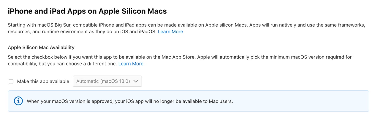
The first thing you want to do is turn off the ability to run your iOS app on Apple Silicon. As you can see above, it won’t matter for the App Store, but it will cause installation problems for your testers. That’s a good thing because it gives you a chance to remind folks that they need to install the macOS app.
More TestFlight fun that awaits:
Beta reviews take much longer than they do on iOS (days versus hours). TestFlight on macOS also gets confused if you replace a build with a newer one (because it’s taking so long and you have new things you want people to test). Be patient. If you’re not, you’ll see a “This beta isn’t accepting any new testers right now” and will have to submit a new build to set things right.
TestFlight users can only be added after macOS build is approved. You can do it before that and you’ll end up with a bunch of folks who will try to install the iOS version on Apple Silicon even though it’s not available. Confusing, both for the tester and you.
TestFlight users will see both macOS and iOS versions even if they can’t install the iOS version. And the only way to pick the right one is with a low-contrast segmented control at the top of the window. The default setting is also iOS. Dumb.
TestFlight beta review for incremental builds on iOS is instantaneous these days. You can expect something slower on macOS: it’s not only the initial review that’s slow.
Still, this is better than testing with manual provisioning or Developer ID and Sparkle. Baby steps!
The good news is that after you’ve run the TestFlight gauntlet, there’s only one thing left to do: press that “Submit for Review” button. Congratulations! 🎉
Documentation
As I look back on the challenges during this project, the biggest source of friction was Apple’s SwiftUI documentation. While they have done a fantastic job at getting folks started, things start to fall apart when you’re in the thick of things.
To give you an idea of what I mean, we didn’t learn about fileExporter until late in the project. Part of the problem is the naming: I’m thinking “save a file with dialog/panel” and “save”, “dialog”, “panel” are not mentioned at all on the page. Technically, this is correct:
Presents a system interface for allowing the user to export an in-memory document to a file on disk.
But it’s far too abstract for someone who’s just trying to solve a problem. I can understand this approach with the wording: it needs to work in a variety of platform-specific scenarios. But it’s impossible to target with a query.
So a developer heads to their favorite search engine and enters “save dialog swiftui”. You get back a bunch of hits and they all talk about NSSavePanel.
The current Developer Documentation is teaching folks that it’s only useful when you need specific information about an API. And even then, when you search for “frame(” you get ten identical results all telling you that the API is deprecated. I’m pretty sure it’s not.
Clearly the current search approach isn’t working. So what does work?
(* If you’ve blogged about Swift or SwiftUI in the past you have my sincere thanks. The sites mentioned here just happened to show up first in my Safari history.)
SwiftUI has freed us from having to know implementation details: when I first used fileExporter, I note that it picked up my accent color automatically on both platforms. That’s great, and I don’t need to know any details.
But I do need to know that I need a sandbox entitlement on macOS. I want to know the configuration options available (only a default file name, bummer). How do I create the a FileDocument for the API? And for an iOS developer who’s never seen a FileWrapper, what the heck is that?
It seems that in a world of SwiftUI, Developer Documentation would work better if it focused on the recipes rather than how the ingredients are made. Feedback submitted (FB12071380).
Conclusion
There has been a lot to take in over the past three days. It’s taken me a week to produce and will take you longer to consume.
Getting your app from iOS to macOS is a task with many steps. Start the journey with the hard stuff that’s going to turn out to be easy, and then chip away at the easy stuff that’s harder than you expected. Come back to this guide as you work through it all.
You’ll get into the swing of things and before you know it, you’ll have a great app with surprisingly little effort. It’s easy to forget how much time you saved with all those hard things that just worked. Hopefully we helped you get through the easy things. 😀
It’s day two of our epic journey from iOS to macOS. Let’s get started with everyone’s favorite topic.
Ugly Code
In every app, there’s code you hate writing, but do it anyway. Shipping is better than perfection!
Here are our less-than-proud moments in Wallaroo for the Mac:
Handling URLs
SwiftUI’s default mechanism for handling URLs on macOS isn’t great. If you’ve used .onOpenURL on a View to handle external events, you’ll be disappointed to learn that a URL scheme on macOS opens a new window (Scene) before it hands the URL to the view modifier. And if you’re using a single Window instead of a WindowGroup, nothing happens at all.
This makes things like OAuth callbacks, deep navigation links, or a Shortcuts x-callback-url difficult. Wallaroo uses all of these techniques.
The workaround here is to create an AppDelegate and pass it to the NSApplicationDelegateAdaptor. In the delegate, you can grab the URLs before SwiftUI gets them and handle them as needed in other parts of your application. We passed the URL in a custom notification posted to the NotificationCenter. The views that need to handle it used .onReceive to get the information from the publisher. Very un-SwiftUI-ish, but it worked well.
Pop that NavigationStack
We want to make Wallaroo as keyboard friendly as possible (we’re still working on it, in fact).
One thing we wanted to do was use the Escape key to pop the NavigationStack. On the Mac, it’s a key that has always represented “go back” and many apps (like Photos) take advantage of that. Unfortunately, to accomplish that in Wallaroo, we had to use an invisibleToolbarItem with a .keyboardShortcut(.escape, modifiers: []).
It’s not possible to use a CommandMenu either: again, this key has a special history on the macOS responder chain.
And More…
Here are a bunch of other small things that no one should feel proud of:
We ended up not using a separate Settings window, but using NSApp.sendAction(Selector(("showSettingsWindow:")), to: nil, from: nil) to open it would have made my fingers hurt. It would also be an unpleasant surprise if someone decided to change the selector name back to "showPreferencesWindow:" 😳
Hiding “Show Tab Bar” isn’t a CommandGroupPlacement like you think it would be. Instead it’s NSWindow.allowsAutomaticWindowTabbing and is best done in the NSApplicationDelegate. Thankfully, this has been addressed when you use a single Window in the latest macOS beta, so you don’t need to go into AppKit power user territory.
ToolbarItem with a Menu that uses .menuIndicator(.hidden) and Label with .labelStyle(.iconOnly) does not center the image in the border and there’s no way to fix it. It eventually lays out correctly after pushing/popping the NavigationStack. Every one of our designers reminded me that this control wasn’t aligned correctly and we eventually moved it to a Category menu in the menu bar.
ProgressView in a toolbar is ginormous and needs .scaleEffect to halve its size.
TabView controls can’t be hidden and replaced with custom controls. The only choice is .automatic, so we hid the view under the top toolbar — thank goodness for blur that hides it. On iOS we use .page(indexDisplayMode: .never) to get rid of it completely. Feedback submitted (FB12071194).
While you’re struggling with window and sidebar size constraints, you end up with UserDefaults for frames that have “fun” keys like "NSWindow Frame SwiftUI.(unknown context at $1acd3d768).SceneBridgeReader, SwiftUI.ModifiedContent>, SwiftUI._PreferenceWritingModifierSwiftUI.PreferredColorSchemeKey>, SwiftUI._EnvironmentKeyWritingModifier>>>>-1-AppWindow-1". Frequent use of “defaults delete com.whatever.app” is needed (cherry picking the frame keys would be a challenge!)
Non-Obvious Things
Every project has surprises. These are them.
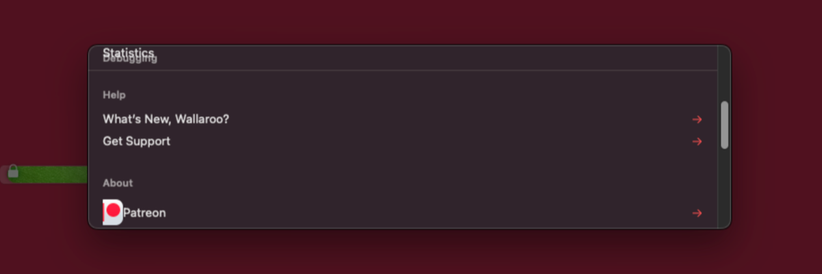
Help Needs Help
The default for the .helpCommandGroup uses Help Books — a technology that is only used by Apple. I’d be willing to bet that no iOS developer has even heard of it (much less had to implement). The documentation, which was last updated in 2013, just screams modern.
It’s also why you see “Help isn’t available for …” in so many Mac apps.
A more forward thinking approach would be to include a “support URL” key in an Info.plist that provides a link to a developer’s website. It could potentially be useful on iOS, as well. Everything about SwiftUI is forward thinking — a link seems like a much better default behavior. Feedback submitted (FB12071205).
In Wallaroo, we replaced the default implementation with a couple of Buttons that use openURL in their action. We’ve included it in the sample app.
SwiftUITestApp > Window > CommandGroup
And More…
These two bullet points will probably save you hours of wondering what the hell is going on:
On macOS, there is no support for @3x image assets. There are no @3x screens, so you must include at least a @2x version. For iOS developers who are using @3x and having them scale down at runtime, this is a head scratcher.
iOS uses a case-sensitive file system and macOS does not (by default). Image("Border") and Image("border") won’t necessarily produce the same result. This is not a fun discovery.
Mac-assness
Being Mac-assed is something to strive for: here are some things that will help you achieve the fit & finish that customers on macOS want.
Open and Save
You’ll want to familiarize yourself with opening and saving files on macOS.
Using Transferable to get information into the sharing APIs works fine, but it doesn’t have the breadth that you’re used to on iOS. For example, there is no “Save Image” or “Save to Files” action supplied by the system.
Mac customers are also going to look for File > Save or ⌘S before even thinking about a sharing icon.
When it comes to the implementation, you have a choice between SwiftUI’s fileExporter and fileImporter and AppKit’s NSSavePanel and NSOpenPanel. It’s a complex choice depending on the needs of your app, so take a look at the comments in the sample code to help you make a decision.
We went with AppKit, but I wish we could have gone with SwiftUI. Feedback submitted (FB12071234).
PanelView > useAppKit
Playing In a Sandbox
If you’re planning on saving files on macOS, remember that you need an App Sandbox entitlement. Take a trip over to your target’s Signing & Capabilities > App Sandbox > File Access > User Selected File and make sure it’s set to “Read/Write”. Your app will crash if you don’t.
While you’re there, take a look at the other things you might need. A common one is Outgoing Connections (Client). Without it, you’ll wonder why you can’t download any data from your server — and probably spend a fair amount of time thinking it has something to do with App Transport Security. Don’t be like me.
Additionally, some things, like the Camera, need a sandbox entitlement in addition to the usage description you’re familiar with on iOS.
The Mac has always had a keyboard and your customers on the platform know how to use it. Maybe even in ways you don’t know about. I’m an expert.
Keyboard shortcuts are easy to add: all you need is a .keyboardShortcut on a View. The harder part is to determine what keys to support. Some common ones are:
.return – This, combined with a .buttonStyle(.borderedProminent), will perform the default action in a view when the customer presses the Return or Enter keys (see below).
.pageUp & .pageDown – Used to page through a list of information.
.home & .end – Like the paging keys, but goes to the beginning or end of the list.
.upArrow, .downArrow, .leftArrow, .rightArrow – Used to navigate through a grid or for positioning elements.
KeyEquivalent shows all of the possibilities. Be aware that the default for modifiers on the keyboard shortcuts is .command: for the single keys listed above, you’ll want to pass an empty set.
PanelView > Button(“Open Me”)
Sometimes SwiftUI does this work for you. An example is a List with a .listStyle(.sidebar). When the sidebar has focus, you can use the arrow keys or type letters to change the selection.
Sidebar > SidebarView > List
Button Acclaim
After my previous treatise on the differences between buttons on iOS and macOS, you might think I have a grudge against the HIG. I don’t.
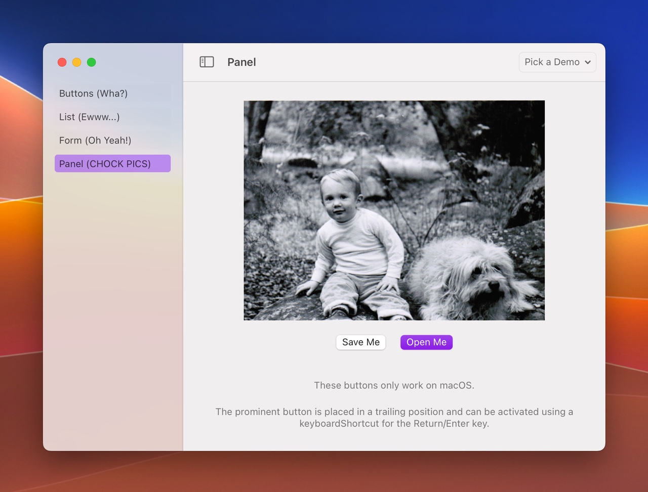
On the Mac, prominent buttons are used to highlight a primary action. If you’ve ever used the Return key to open the selected file in a dialog, you know how this works.
Don’t use prominent buttons because they look pretty or stand out. Use them as a cue and make sure they’re hooked up to the Return key so the action is easy to perform (see above).
And just as you only have one Return key on your keyboard, you should only have one prominent button in your View:
Bitmap Image What?
NSImage has over 30 years of legacy. UIImage does not.
You will learn this quickly the first time you try to save a JPEG and wonder what the heck an NSBitmapImageRep is all about. For those of us old enough to remember, NeXTSTEP images could be represented as snippets of Display PostScript (sort of like NSEPSImageRep) or as TIFF files with multiple subfiles (.tiffRepresentation). Hence .representations.
(For a good time, take a look at the documentation for NSPICTImageRep. I barely know what any of those words mean.)
You’ll find common ground in CGImage, which works perfectly across platforms and is supported by both NSImage and UIImage. And as you use these APIs, remember that you’re working with pixels instead of points.
PanelView > saveDocument
And More…
The sample project includes a bunch of these things:
NSSound.beep() is your friend. It’s a good way to let someone know that an action didn’t go as planned. The PanelView demo uses it when a file can’t be created.
Add an “App Category” (LSApplicationCategoryType) to your Info.plist — you don’t need it on iOS, but you can’t submit to the Mac App Store without it.
Add copyright information to your Info.plist. The key is “Copyright (human-readable)” (NSHumanReadableCopyright) and it’s used in the About box and Finder’s Get Info. This should be a part of the standard project template, especially since it’s something unfamiliar to iOS developers. Feedback submitted (FB12071253).
Mac apps have traditionally shown credits as a part of the standard About box. Add a Credits.rtf file to your app’s resources and you’re done.
Good news! The ITSAppUsesNonExemptEncryption you use in your iOS Info.plist also works on Mac builds to avoid the compliance step after you upload a build.
Make sure you turn on scroll bars while testing your layouts. Use System Settings > Appearance > Show scroll bars: Always. These scroll bars are much more prominent than on iOS and will affect view placement in many unexpected places. Don’t assume that everyone has a trackpad and uses one of the other scroll bar settings.
Turn on Accessibility Shortcuts and use them to test reduced transparency, increased contrast, inverted colors, etc. You can find them in System Settings > Control Center > Accessibility Shortcuts > Show in Menu Bar: On. (Not in Accessibility settings – surprise surprise!)
The macOS icon still needs individual sizes and should include transparency (unlike on iOS). It’s likely you’re relying on iOS to mask out the corners — you have to do it yourself on the Mac. Look at AppIcon in the sample project’s asset catalog to see what you need.
Keep It Up!
Another long trek today, so congratulations for making it to the end. We’ll wrap things up tomorrow in Part 3. See you then!
But this initial release was only available on iOS. From the get go, we had planned on making the product work on multiple platforms. So why no macOS version?
Put simply, we still had a lot to learn.
Introduction
In this blog series, we’ll again explore the challenges and solutions we encountered during our development, this time on the Mac.
A comment I made early on in our Slack channel got used repeatedly:
SwiftUI makes the hard stuff easy and the easy stuff hard.
We have a View in the app that uses SceneKit to display a 3D scene with a confetti flourish after a customer starts a subscription. I was expecting stuff like that to take a lot of effort to get working on the Mac. Instead, it ran 100% out of the box with no modifications at all.
And the stuff that I was expecting to be easy, like a settings view, buttons, and menu commands, turned out to be hard. To put that “hard” in context, it took me about a month to go from an app that we were proud of on iOS to one that we were equally proud of on macOS:
You’ll see a lot of problems with SwiftUI mentioned in these posts, but the overall experience was wonderful. This new way of building apps gets a wholehearted recommendation from our entire team: designers and developers alike.
We also found that many of the issues encountered on macOS were things we had done wrong on iOS. Porting the app to the Mac made both platforms better. We’re also rethinking our View architecture so things that are currently Mac-only can be used to improve the iPad experience.
I’d encourage you to look at Wallaroo on both iOS and macOS. It’s a FREE download and will give you context for some of the choices we talk about in the following sections.
You’ll also want to check Apple’s own sample code for creating a macOS app using an iOS app as a base. Unfortunately, I discovered this excellent tutorial towards the end of our project. I’m sure that we’re not the only developers who were oblivious to the needs of macOS while creating a codebase for iOS. Apple’s sample project can help if you’re just starting out on iOS with macOS as a future goal.
One final thing before I finish up this summary: everything that follows was originally recorded in Tot. The bullet points in some sections reflect that — it was easy to create a short snippet with the thought of “someone else will need this”.
The SwiftUI team at Apple has also shown a great willingness to receive feedback and I was happy to provide these bullet points of real world experience. In turn, a lot of what you will read below was shaped by their feedback.
(And if you haven’t discovered Tot as a way to keep track of what you’re doing, get with the program! It’s a FREE download and makes a great addition to your development toolkit.)
So let’s get started. Here are the things we’re going to cover in the coming days:
Expectations – Stuff that doesn’t work like you think it will.
Ugly Code – You hate writing it, but do it anyway.
Non-Obvious Things – Surprises along the way.
Mac-assness – Fit & finish for the desktop.
Tooling Problems – Tools and frameworks aren’t perfect, you know?
TestFlight – The last major hurdle.
Documentation – Knowing what you don’t know.
Expectations
We all have expectations on how things should work based on our experiences on iOS. A lot of those assumptions don’t hold true as soon as you start working on macOS.
As we work through these issues, I’ll be using a sample project called SwiftUITest — this blog post is a narrative, but you’ll want to see the details, too. Download the code, build for iOS and macOS, and when you see this breadcrumb trail:
You can open the SwiftUITestApp file, look for the ContentView in a Window, and check out the .onReceive view modifier. In some cases there is conditional compilation or a configuration variable that let you compare approaches: tweak to your heart’s content!
#if os()
You’re going to have platform-specific code. More than you realize: certainly more than I expected!
Sometimes this check is just to skip over an API that’s iOS-only. Sometimes it’s to fork huge swaths of code. These directives are unavoidable, but you should be careful about where you place them: they can make code hard to read and a future maintenance burden.
I ended up doing a lot of #if os() refactoring towards the end of the project. You’ll use them with abandon at first: it’s a good idea to rein them back in as you start to see patterns emerge.
Scene Out of Phase
One of the first things you’ll encounter is in your app’s Scene body. On iOS, many apps use the scenePhase environment variable as a way to know that a customer is about to see the app. ScenePhase.active is where things get refreshed and new state is established.
But on macOS, a Scene only becomes active when a window is created. Conceptually, this is a very different state than on iOS. It’s likely that you’re more interested in knowing that the application has become active.
We accomplished this by observing NSApplication‘s .didBecomeActiveNotification and using this as a point to refresh models. Another code path for iOS continued to do the same thing with Scene.active — which means we’re approaching that code smell of refreshing our model in two places. This is what I was talking about in the previous section: #if os() is your friend, but can also be your enemy.
One of the things in your iOS Scene is a WindowGroup. On macOS, as on iOS, this gives you multiple windows, each with their own ContentView.
But on macOS, you have a new option: Window. This creates a “single, unique window” — for many iOS apps this is a better choice. You’ll see a lot of recommendations on developer websites to replace CommandGroupPlacement.newItem with an empty implementation because early versions of SwiftUI didn’t have Window. If you need to get rid of the “New” menu item, the new single window instance is a better choice.
It was for us, and guess what? It’s an #if os() fork!
In our experience, the App body is a good place to have platform-specific customizations. Not only will you be having a different container for your ContentView, but you’ll also need separate delegate adaptors, a place to handle menu bar commands, a mechanism for URL processing, and many other tasks.
We’re using a TabView as a way to switch between Content and couldn’t find an easy way to swipe. We also found the paging dots that we had implemented at the bottom of our custom View were too small as a click target, so we added big arrows to move between images.
A nice little addition we made here is a keyboard shortcut on the arrow Button:
.keyboardShortcut(.leftArrow, modifiers: [])
It’s one line of code and it acknowledges that every customer who will use this app can interact using a keyboard.
Swiping would obviously be nicer for devices that have a trackpad capability. Ideally there would be a way to detect this via the environment and adapt the View layout accordingly. We have submitted feedback for this: you should, too. (FB12071140)
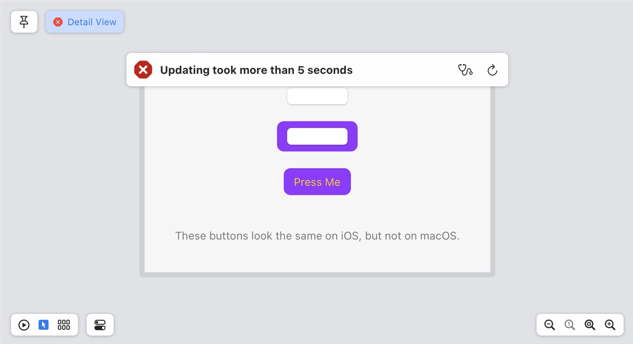
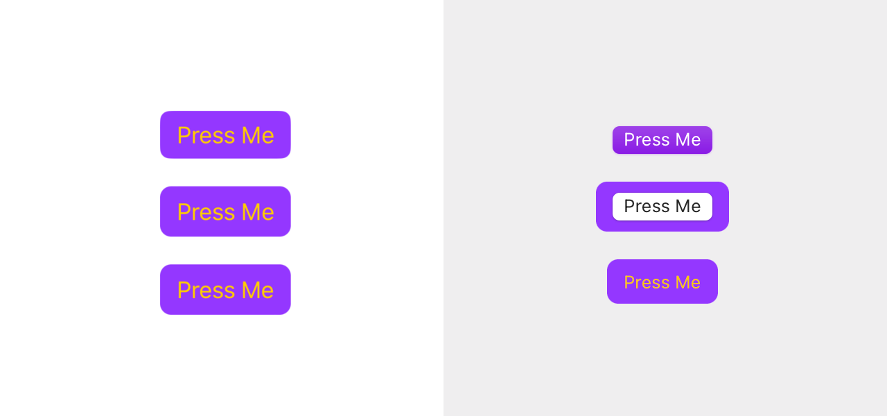
Buttons! Is This a Prank?
The first time I ran Wallaroo on macOS, I saw this:
I had no idea what was going on here, and thought we had a lot of work cut out for us. We thought SwiftUI was going to make things easier! This was depressing and I lashed out in frustration. (I regret that tweet and the length of this treatise may be related.)
Then I added one line of code that fixed everything!
.buttonStyle(.plain)
If you look closely at the screenshot above, you’ll see that macOS is drawing a bordered button with a fixed height by default. It’s doing the right thing, but it’s also the unexpected thing.
Buttons can be too platform specific when a developer is bringing an existing app to macOS. This is compounded by our assumptions about how buttons are rendered and ends up causing major layout issues.
We’ve been reading the Human Interface Guidelines for years and know that buttons on macOS should have borders. But those baked-in borders cause issues when you have an app designed around buttons without borders. To wit:
The buttons on the left use common iOS techniques like prominent borders and backgrounds with RoundedRectangle.
And like all of you, we’ve copied “solutions” from Stack Overflow that are just plain wrong. You may be looking at that middle button on the right and saying “hahaha SwiftUI is so dumb!”. Instead, it’s me who’s dumb.
Additionally, these buttons appear as a part of an integrated whole: the top-right example on macOS looks correct in many places, but if you have a finely tuned iOS user interface, chances are good that it will stick out like a sore thumb.
The solution in these cases is to use a custom button style. With the right configuration, you can get something that makes sense on both platforms. The lower-right macOS button is an example.
ButtonView > CustomButtonStyle
One thing we found with our custom button styles is that the 12 point corner radii that we were happy with on iOS looked too chunky on macOS. Buttons on the Mac have an 8 point radius, so we split the difference and went with a 10 point radius on both platforms.
As soon as you start making buttons that look like they do on iOS, you want them to work the same, too. If you expand a button .frame on macOS it expands the container, but it does not expand the clickable area. The solution is to change the label frame width instead.
If that “wider button” uses a clear background, the clickable area doesn’t change. You have to use .contentShape(Rectangle()) to have a click register.
Buttons in a .groupedForm are rendered as bordered buttons without any extra style. A lot of the other elements in that Form conform to an iOS appearance (such as Toggle changing from a checkbox to a switch). It feels like form rows with Button content should get a tint and extend the width of row (and highlight it when clicked). This is where we discovered the “wider button” issues mentioned above. (Feedback submitted: FB12071157)
FormView > FormButtonStyle
A related “button” issue is with Link in a Form. Its .tint can’t be adjusted, so you try to use .foregroundColor and find that you lose the highlight while the mouse is down. Links that don’t highlight are bad, and so is blue text that appears in the middle of a well crafted UI. Luckily you can use a Button, buttonStyle, and openURL to solve the problem.
FormView > Form > Section > Link
One final Button difference on macOS – they don’t change size because there is no accessibility setting to set Dynamic Type. This does not excuse you from testing for accessibility: more on that later.
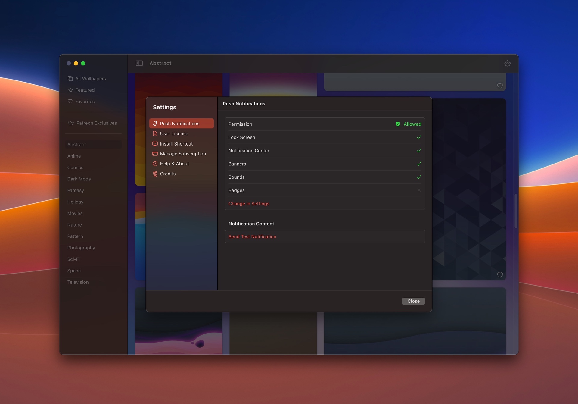
Settings Ouch
After the shock of seeing buttons subsided, we opened our Settings view. It’s a View that’s presented as a sheet on top of the main ContentView. Things were not looking up:
The first problem here was relatively easy to fix. That wonky layout was caused by using the wrong container. All our settings views were Section in a List on a NavigationStack. Something like what you see in the ListView of the sample code.
ListView > List
The easy fix here was to change the List to a Form and add the .formStyle(.grouped) modifier. This immediately gets you a look that matches what you see in Ventura’s System Settings.
FormView > Form
Then we had a new problem: it wasn’t possible to push a view onto the NavigationStack while it was presented in a sheet. (This has since been fixed and is in the latest macOS beta release.)
We started looking at alternatives and explored a Settings window style recommended by the HIG. It was quickly apparent that this wasn’t going to be a good solution for our preferences — and it would be difficult to implement.
Why?
A View on iOS is designed to fit in a ScrollView which can vary widely depending on the size of the device and text display settings. These views tend to be vertically oriented with multiple levels of hierarchy.
On the other hand, traditional macOS setting panes are laid out horizontally, with a fixed size, no scrolling, and only a single level of hierarchy. We also found that naming the panes was problematic: the names we used were long because they could take up an entire Form row on iOS. But there is little space below the icons in a traditional window toolbar.
As a result, this was another area where we did a big #if os() fork. Luckily, the only thing that needed to change was the top-level View presented as a .sheet. We used a NavigationSplitView for the setting items in the left sidebar and the views we had created for iOS in the detail view (sized approximately as they would be on the iPad).
Not being able to push content on the detail view turned out to be a blessing in disguise. We found that a flatter navigation hierarchy (like with a traditional settings window) worked better for finding what you need. One of our complaints with the Mac’s new System Settings is that it’s easy to get lost: flat navigation prevents that.
The result is reminiscent of the System Settings in Ventura with a .cancellationActionToolbarItem to make it feel at home in a Mac app. It doesn’t follow the HIG and we don’t think anyone will care:
This new settings layout, with a NavigationSplitView, also feels like something that we’ll want to adopt on iOS, especially for the iPad. A case of a SwiftUI change to accommodate macOS that benefits all platforms. And we get to remove an #if os() check during the refactor.
Commandeering the Menu Bar
Now that we’ve covered two of the hardest things in making a Mac app, buttons and settings, let’s look at a harder one: the menu bar. One of the easiest things in AppKit is complex in SwiftUI. Making a menu bar item do something is painful.
(See what I mean about that easy/hard comment popping up a lot?)
Your Window or WindowGroup view will have a .commands modifier where you supply CommandMenu implementations. That’s straightforward and easy to implement.
But you eventually have to make that menu do something. It took me three days to hook up a Save menu item and have it work reliably.
Mapping CommandMenu to view state is confusing. To me, it feels like the binding relationship is backwards: views should have a way to establish a relationship with the menu bar commands. Instead FocusedBindings and FocusedValue establish a relationship from the menu to the view.
When I first started looking at FocusedBindings it looked like they would cause a lot of changes in model objects to make them Observable (they didn’t adopt this protocol because the information is static). I also found FocusedValue to be incredibly fragile on views that aren’t controls and have Content whose state changes asynchronously. FocusedValue on an Image is fine. FocusedValue on a cached AsyncImage is not.
Focus elements also behave differently based upon the user’s setting in System Settings > Keyboard > Keyboard navigation. If you’re using the Tab key to move between the controls, the view you worked hard to make .focusable is not.
To make matters worse, iOS developers have never even seen this navigation method: it’s only supported on macOS, tvOS, and watchOS. There’s a huge learning curve for something that honestly doesn’t work very well.
At the end of my three days of frustration, I put some state in an EnvironmentObject and exposed that to the CommandMenu. When the state was right, the menu item was enabled and a notification was posted when the item was selected. That notification was received by the View and the file was saved. Not proud of this code, but it felt good to be done battling the focus system.
I love the way .keyboardShortcut can be attached to any View: I’d love to see something similar for menu commands. Feedback submitted (FB12071179).
Whew!
We’re at a good place to stop for a rest. We covered a lot of the difficult stuff today, so good work making it here! More tomorrow in Part 2…
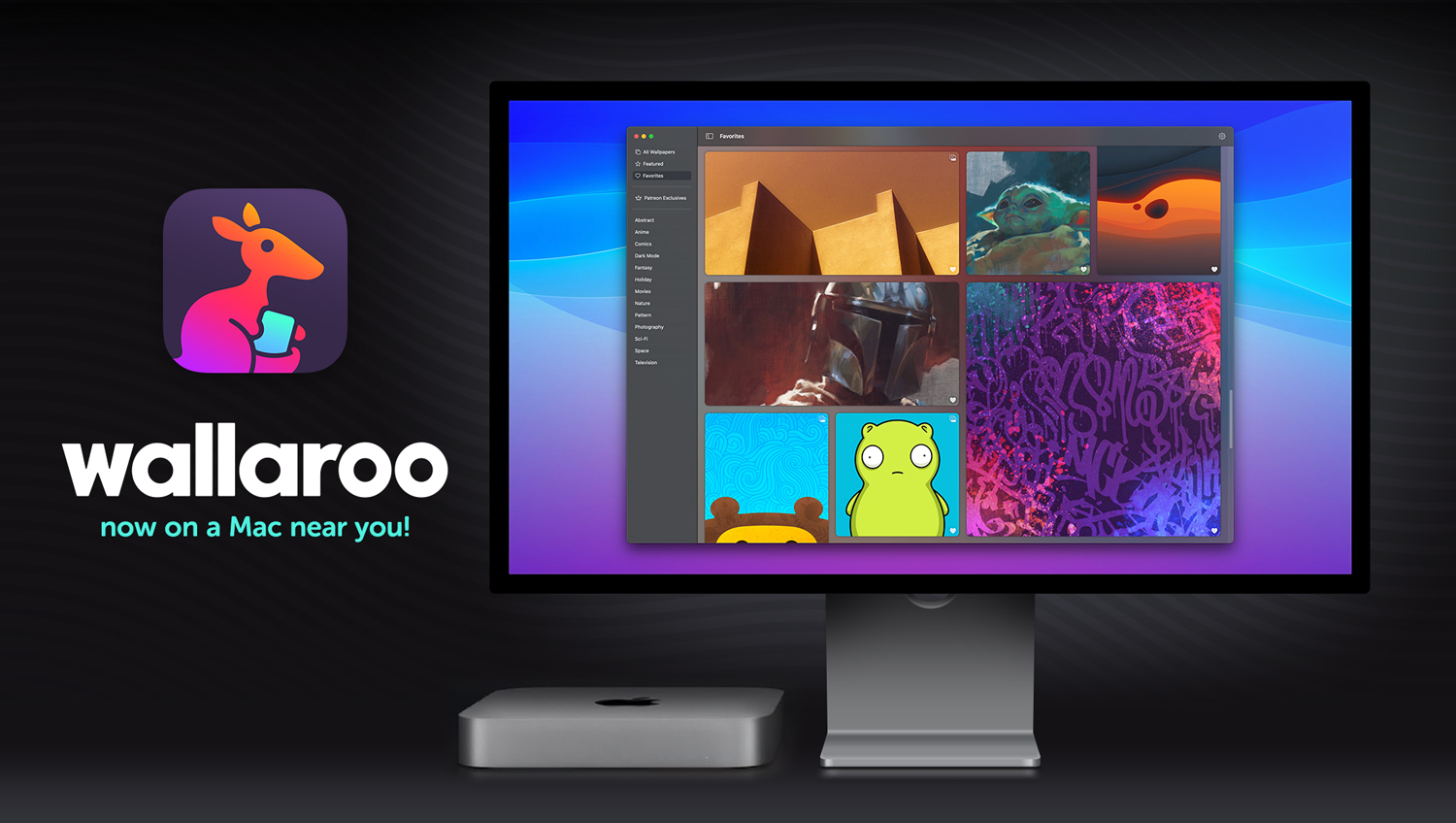
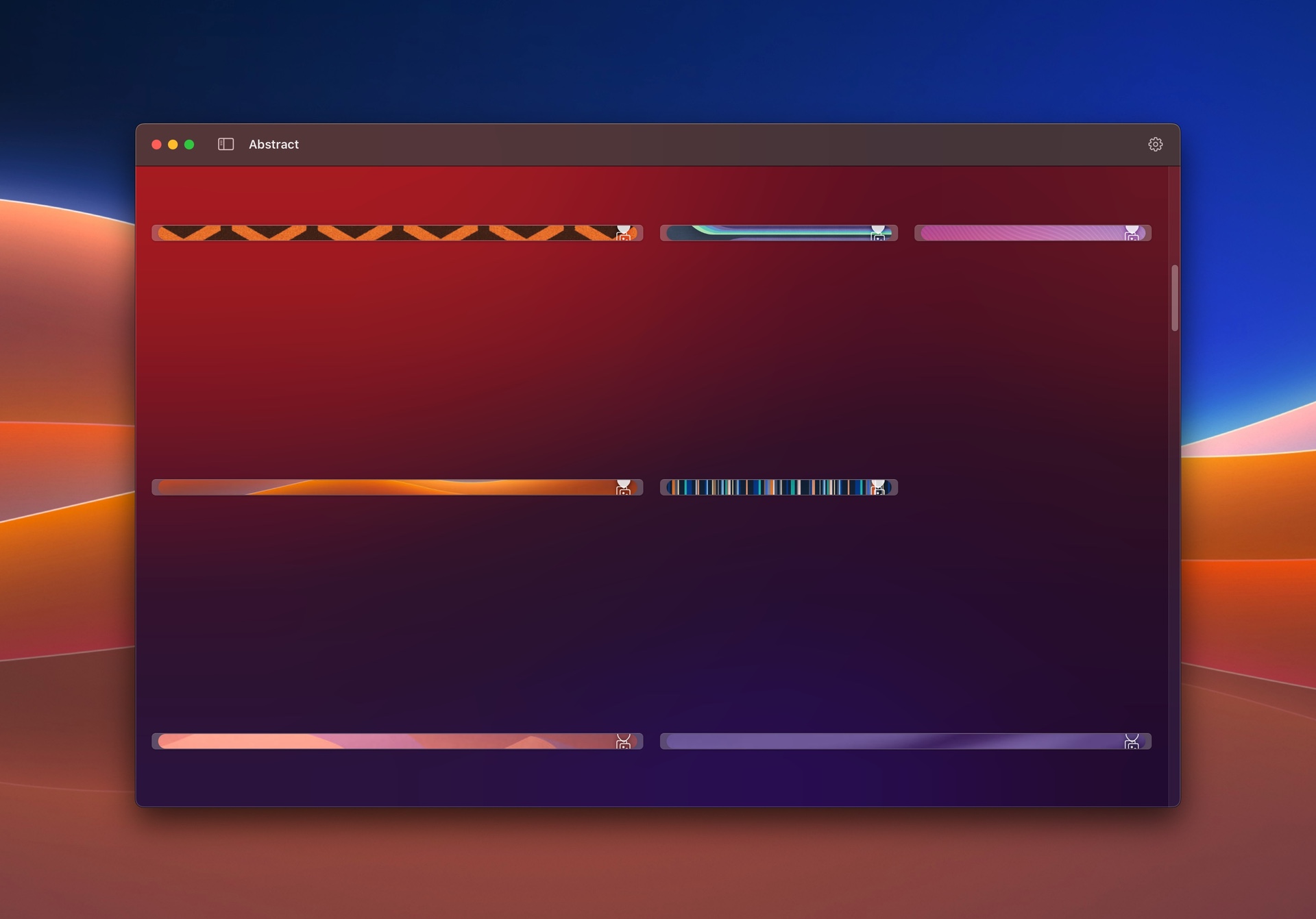
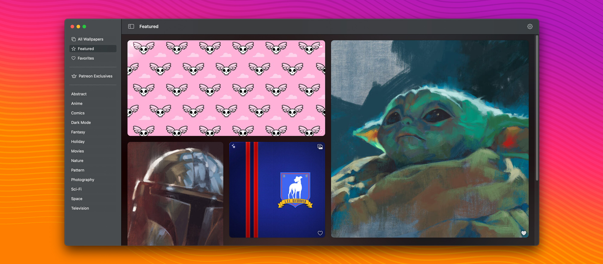
Ever since we launched Wallaroo for iOS back in September of 2022, people have been rediscovering the joy of custom wallpapers. Wallaroo makes it easy to explore, discover, and set the hundreds of wallpapers our artists have created over the past few years, with new creations added each week. Now Wallaroo brings everything you love about custom wallpapers to the Mac desktop.
Quick and Easy
Wallaroo for macOS is a light, native app written in SwiftUI that makes browsing our huge archive fun and easy. To make it easy to find what you’re looking for, wallpapers are broken down into categories like Abstract, Comics, Holiday, Sci-Fi, Television, and more.
A new category in the 1.3 release is “Featured”. Here you’ll find wallpapers that have recently been updated or are culturally relevant (football is life!)
You can also browse by artist or keyword: perfect for finding a match for dark mode or that extra-cute anime character. And when there’s a wallpaper you love, it’s easy to make it a favorite for future reference.
Shortcuts Are Us
As on iOS, Wallaroo’s superpower comes courtesy of Apple’s Shortcuts. A series of simple actions takes the pain out of setting your desktop wallpaper in just a few clicks. Pick a wallpaper in the app, click a button, and you’re set!
And fans of multiple spaces and Mission Control can use Wallaroo to put different wallpapers on your various screens: never lose your way no matter what you’re working on!
One More Thing
Perhaps the best part of today’s launch is that if you are already subscribed to Wallaroo via the App Store or via our Patreon, Wallaroo for macOS will automatically sync your subscription via iCloud and everything will “just work”.
Patreon subscribers get access to exclusive wallpapers not found in the App Store, plus additional wallpaper releases each month, early access to select releases, the ability to beta test new features, and more. If you just can’t get enough of Wallaroo, consider subscribing via Patreon.
Wallaroo doesn’t collect your information, serve you ads, or push sketchy schemes. We want to keep bringing you an ad-free experience and keep the wallpaper assembly line running smoothly.
Give Wallaroo a Go!
Wallaroo is available today as a FREE download on the Mac and iOS App Stores. Be sure to visit the official product website and follow us on Mastodon for more information or to answer your questions. If you love customizing your screens, hop on over, and give Wallaroo a go!