The Breakroom

Wallaroo and SwiftUI (3 of 5)

September 21, 2022

By Sean Heber

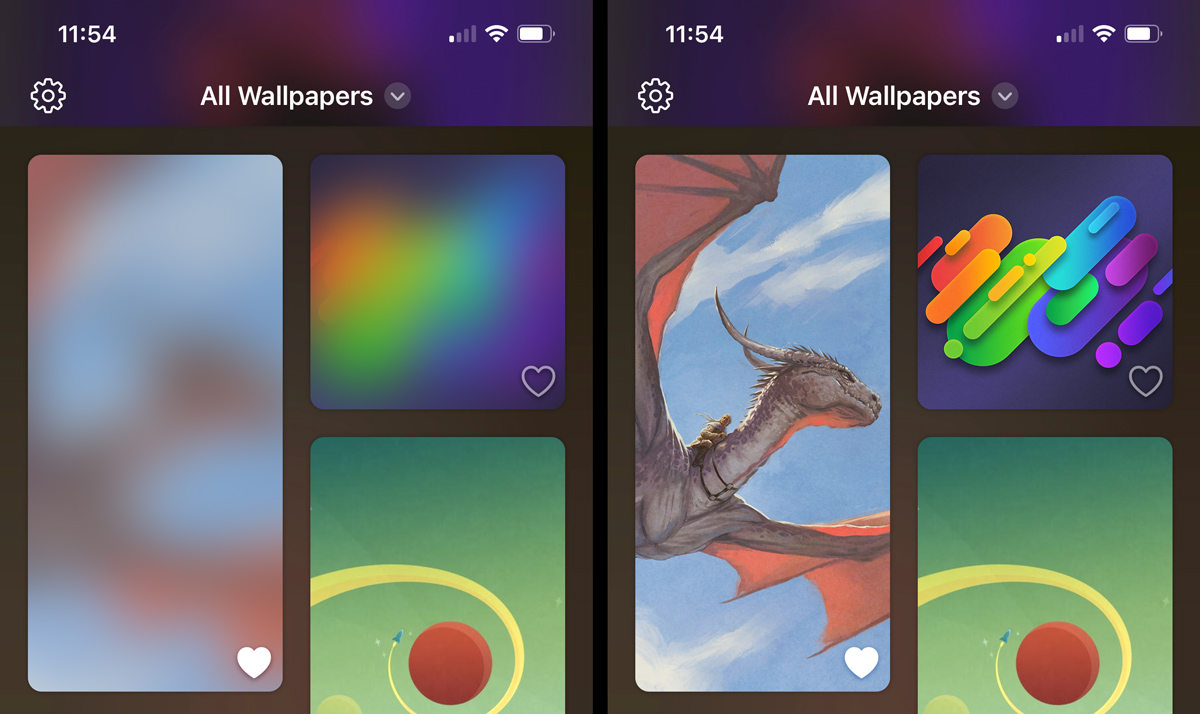
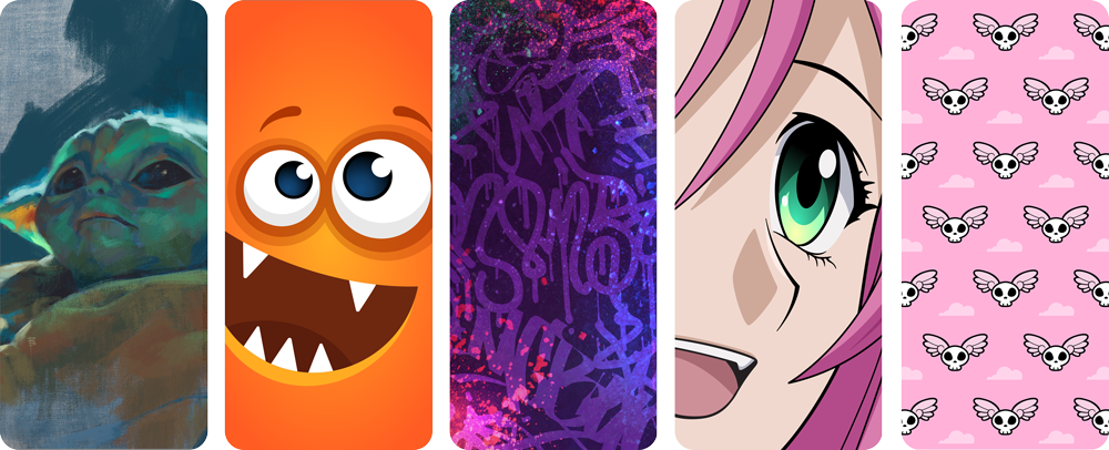
Now that Wallaroo had a unique and good-looking main gallery view along with nice parallax and blurs and everything, my focus shifted to optimizing scrolling performance.

The parallax and lazy custom layout seemed to perform just fine, but rendering the glyphs/buttons on each tile view as well as the actual wallpaper image seemed to be slowing things down a lot.

When I commented each of these bits of code out in turn, scrolling would become silky smooth, but enabling just the glyph/button overlays or just the wallpaper images would result in unacceptable stuttering on my 2016 iPad Pro. Hmm!

Slow and steady might work for races against rabbits, but it’s a drag during user interactions.

Eagle-eyed readers might have noticed earlier that I said I was using AsyncImage “at the time.” Eventually I replaced it with a custom implementation on my quest to achieve smoother scrolling and then extended it a bit more to solve another problem we ran into.

It seemed (at least on the earlier iOS 16 betas), that AsyncImage did not prepare the image for display before rendering it. That meant that when two or three images all loaded during the same view update cycle it would cause animation hitches.

I solved this in my custom view by using a .task modifier so I could async load the image data myself, then convert it to a UIImage, and then call the async version of UIImage.byPreparingForDisplay all before finally assigning the SwiftUI Image instance that would ultimately be displayed to a state variable.

Around this time Craig also realized that as I worked throughout the day my computer was hitting the image server a whole lot and this probably was not going to scale very well once it went live in the App Store.

To address this, I adjusted the URLRequest for the images to always return from the URL cache directly when possible, but ultimately we fixed our server to set the correct HTTP caching headers so the URL loading system stopped rechecking for freshness all the time and trusted that the cached data was good.

If Craig hadn’t been watching our server logs at the time, I’m betting we’d have totally missed this and then had to deal with a flood of server traffic on launch day!

(Aside: It may sound like we arrived at all of this in a matter or hours, but of course we didn’t. I spent a ridiculous amount of time off and on over weeks trying various caching schemes for my custom AsyncImage that prepared the image in different ways, kept the prepared image around keyed by URL, used NSCache or a simple Dictionary, used a Swift actor, etc. Happily I was able to get rid of all of that complication once the required pieces finally fell into place. This sort of thing happens a lot and I often spend a bunch of time on things that turn out to be dead ends. I tend not to stop the moment I get something working, but instead keep thinking about it for a while trying to simplify or get rid of as much code as I can. Sometimes the results are good as in this case, but other times it can go badly where stuff becomes much too specific to a single situation and ends up causing problems for myself later. Such is the nature of evolution, I guess?)

Another of the limitations of AsyncImage that I was able to work around in our custom implementation is that AsyncImage only delivers the final Image after the load finishes and not the original data.

We wanted to be able to access the raw downloaded data of the big images as seen in the full wallpaper detail view so we’d have it when saving or setting the wallpaper. I built a way into my custom image view to get the downloaded image’s raw Data as well as the prepared Image to avoid needing to re-encode the image or download it again separately. There are other ways to solve this problem (I tried a few), but it seemed the most straightforward to do it this way since it ensured the image data was only ever downloaded once.

After getting the thumbnails to load without a hitch, I moved on to the troublesome issue with the glyphs.

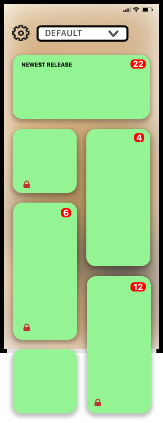
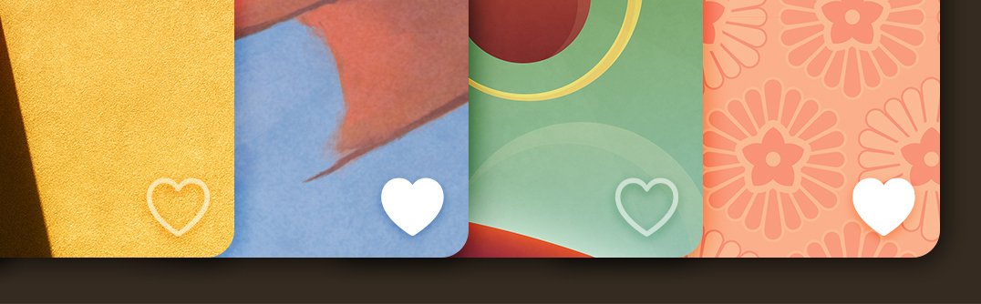
There are at most three symbols on each wallpaper gallery tile: The favorite heart, the multi-variant indicator, and the lock (which only shows up on some of them when unsubscribed). When these overlays were enabled, it caused a ridiculous amount of stuttering.

I had a suspicion as to the root cause: Gedeon had wanted the glyphs to be rendered with a custom shadow using a blend mode that didn’t interfere with the semi-transparent favorite heart but also worked against a wide range of wallpapers. This effect was first implemented early in the prototyping stage and hadn’t been revisited.

Wallaroo’s drop shadows use a custom setup so they look good in all states (semi transparent and fully opaque) and against a wide array of backgrounds.

Sure enough when I disabled these effects the scrolling was perfectly smooth. I tried a whole bunch of things to get this to perform better until finally stumbling on the fact that I was using a .mask modifier on the glyph views in order to get the appearance we wanted. When I came up with a much smarter way to make the effect work without masking, the performance skyrocketed. I guess the lesson here is: Don’t use view masking if you can help it!

This highlights one of the weakness of SwiftUI. It is very hard to debug this sort of thing or to get a sense of where time is being spent by the engine because so much of it is inaccessible and outside of our control. Hopefully these things can be improved somehow in the future. For all I know, maybe there are already ways to use instruments to diagnose problems like this – although personally I find a lot of the instruments to be inscrutable and it ends up taking me just as long to trace through a problem with them as it does to hunt around with educated trial and error. But maybe that’s just me.

With most of the issues surrounding the main gallery view taken care of, it was time to finally move on to the much more straightforward wallpaper detail view! How hard can it be?

Wallaroo and SwiftUI (2 of 5)

September 20, 2022

By Sean Heber

At the end of the previous post of this series, Gedeon had just suggested that we add a parallax effect while scrolling through Wallaroo‘s gallery view.

There’s nothing inherently complicated about parallax – it’s just moving a background layer at a different rate from the foreground. The real question was how the heck I was going to do add it without ruining the simplicity of the code I had built so far.

After I stopped despairing, I realized I already had the information I needed to do this: I knew where the frame of the overall visible view was on screen, and I knew the frame of the child tile view. That’s all it takes to come up with some kind of an offset for a layer. The problem was, that information wasn’t really where I wanted it to be – namely somewhere inside of the ReleaseTileView.

I started by trying to compute an offset in the main content view and passing it into the ReleaseTileView, but that didn’t feel like a very “SwiftUI” way to do it (although it worked and was relatively straightforward). Instead, I spent some time trying to research how problems like this are meant to be solved in a way that doesn’t fight (or at least publicly embarrass) the framework.

Some of the scenarios I thought about where things like: What if I wanted to have this parallax effect in some small cutout deep inside of the tile view and not on the whole background? How would the information get all the way there? Would it be passed from view to view in their initializers? What if Gedeon suddenly decided that only some of the views should do the parallax effect while others should not? What if that condition was something specific to an individual release? Etc. While some of these weren’t likely scenarios, I wanted to make sure I did it “right” at least insomuch as I could determine what that meant.

The parallax effect adds subtle depth to the UI. Watch Kirby’s clouds change as he scrolls by!

What I ended up going with was pretty simple: I decided that knowing where the containing gallery’s frame was would likely make sense as an environment value, and so I added the visibleGalleryFrame that was computed in the code snippet in part 1 as an environment value for all of the child tile views to use. To get the parallax to work, the tile views measure the frame of whatever area they want to apply the parallax effect to and compare it with the environment’s gallery frame and offset things accordingly.

While I’m sure there are many good ways to do it, it seemed to me that this approach is in line with how SwiftUI wants us to think which is to consider which pieces of information are part of something like the “world” that a view lives within vs. the information a view is meant to be displaying.

Of course, even this is still a bit fuzzy. I think it could be argued, for example, that putting the wallpaper object itself in the environment rather than passing it to the initializer for each child view could also make sense! I’m not sure where to draw the line with this sort of thinking, to be honest. There’s really nothing stopping almost every value normally passed as a parameter from being passed in the environment instead, but there’s something about that which feels like it’s terribly wrong – I just can’t articulate exactly what the rules should be.

It feels like the only thing preventing people from using the environment more often (and perhaps “incorrectly”) is the fact that defining a new environment value involves a bunch of boilerplate in an EnvironmentValues extension! It doesn’t seem ideal to only depend on that friction to guide behavior, though, especially since I’d love to see some kind of new Swift syntax or feature that could eventually make the boilerplate go away!

While the sweet parallax effect was a nice touch, there was still an annoying flaw with the gallery view that jumped out every time we scrolled it: The thumbnails sometimes took awhile to arrive over the network leaving an empty hole while loading.

From my time playing around with Mastodon, I remembered that they had a solution to this which displayed a blurred image while the full thumbnails loaded. I didn’t know how that worked, so I dug into their code a bit to find out how they did it. I discovered that some very smart people came up with a way to encode a blur into a relatively small string using math I do not even remotely understand myself.

Blur hashes create a “soft loading” effect as thumbnails scroll into view.

I shoehorned the open source BlurHash code into a SwiftUI view that could take a hash string and a size and generate an Image from it. Once that was working, Craig modified our backend to compute real hashes for all of the thumbnails and images and included them with the catalog of JSON data that the app downloads when fetching new content. The whole process was surprisingly straightforward and, in our opinions anyway, is much nicer than having a static bundled placeholder image!

Adding all of these bells and whistles makes the app look pretty, but does it perform well? Wait until part 3 to find out – or just download the app and check it out yourself!

Wallaroo and SwiftUI (1 of 5)

September 19, 2022

By Sean Heber

The Iconfactory has been releasing beautiful wallpapers on Patreon for years. Our latest app, Wallaroo, was built to make the process of browsing and using these hundreds of wallpapers more fun and convenient for everyone.

Wallaroo is the first app we’ve built entirely with SwiftUI, so in this series of more technical posts, I want to talk about some specific issues we ran into along with how we solved them. In a separate post, Craig discusses development of the whole app so if you prefer to get a bird’s eye view of Wallaroo’s creation, be sure to check his article out.

Over two months of development, all of us at the factory worked on the app in our own ways. Craig and I did the programming while the designers remastered a ton of their artwork, mocked up UIs, made marketing materials, filled out spreadsheets with metadata, and did all of the other little things that needed doing that us programmers like to pretend don’t exist.

Craig built the entire server backend (where the metadata and images live) as well as Wallaroo’s settings and StoreKit 2 purchasing flow while I worked exclusively on the primary functionality of the frontend. (Now that I write it out I suddenly feel like a total slacker…)

One thing that worried me about adopting SwiftUI was that the demos from WWDC and elsewhere always seemed so superficial. While they usually have pretty animations and relatively few lines of code, most of the apps felt like nothing more than a thin wrapper around a list view. As someone who has done battle with UIKit for over a decade, I know how often a seemingly simple thing can turn out to be ridiculously complicated in practice. Given this, I really had no sense for how SwiftUI might fare when faced with real-world complications.

Since Wallaroo wasn’t designed to be a particularly complex app, it seemed like the perfect time to find out by taking the SwiftUI plunge.

Early Wallaroo gallery concept by Talos Tsui.

The mockup that Talos did of what would become the main Wallaroo gallery view had each wallpaper release being presented in one of four different-sized randomly selected tiles. From what little I knew of SwiftUI, I suspected this was going to be tricky because the framework didn’t (and still doesn’t) have even a simple flow layout, let alone something complicated like a flowing irregular grid! Luckily WWDC22 had just announced the new Layout protocol for SwiftUI, so I hoped I’d be able to use it to make this work. Nothing else about the UI mockups seemed especially unusual or beyond SwiftUI demos I had seen before, but the layout we wanted was something new. So I started there.

Considering that the only SwiftUI work I had done prior to building Wallaroo were some simple toy views over a weekend, it felt a bit like jumping into the deep end to immediately start work on a custom layout – but it turned out to not be too bad! The first decision I made was to avoid trying to implement a “perfect” layout and just get it working for the cases we needed. This meant mostly ignoring infinite and zero size proposals and disregarding the preferences of the children. (I’m sure all the kids out there can relate.)

One of the more interesting things about the grid is how we wanted to randomize the shapes of each child view to keep the gallery fresh and visually call attention (by way of size) to different wallpapers over time as the list of releases changed. I didn’t want to have to somehow assign a “shape” to each child view from outside of the layout, so I tried to find a way to get this logic inside of it so it could be automatic.

What I came up with was to seed a random number generator with the number of subviews that the layout received. This ensured that the layout would be consistent as long as the wallpaper list didn’t change – which is what we wanted. I then used that random number generator to shuffle a bag of shapes (large, vertical, horizontal, and small) and pulled the next one whenever processing the next subview. If the pulled shape would fit in the remaining horizontal space, I used it. If it didn’t fit, I’d discard it and try again. When the bag was empty, I’d fill it back up with a couple of sets of shapes, shuffle it, and keep going. I think it worked remarkably well! (Incidentally I used a similar technique to randomize Frenzic: Overtime’s daily challenges by seeding the random number generator with Game Center’s current leaderboard date.)

We were a few days into this, and I was feeling pretty good about it when the first real-world complication reared its ugly head: Custom SwiftUI layouts aren’t lazy!

The Captain Pike Appreciation App. Anson Mount knows how to hit it.

This became distressingly apparent when I replaced the one bundled test image I was using for each of my tiles (a wonderful portrait that Dave did of Captain Pike from Star Trek: Strange New Worlds) with URLs for images on our server.

Suddenly whenever the app launched or the gallery came back into view, all 15 or so test images would start downloading immediately even if they were well off the screen – which obviously wasn’t going to scale. This happened because AsyncImage (which I was using at the time) starts loading when the view pops into existence in the view hierarchy and not when the view actually becomes “visible” on screen. Doh.

What I needed to solve this was some way to discern if the view was actually on screen or not and then emit the appropriate view. Since I had already put the GalleryView inside of a ScrollView in order to scroll, it turned out to be easy to capture a rectangle that could be used to indicate the “on screen” frame by simply putting the ScrollView itself inside of a GeometryReader.

The next step was to figure out where on screen the child views were actually being placed. This was easily accomplished by putting each of the children of the layout inside their own GeometryReader, too.

So now I had two rectangles in global coordinates – one for the container frame, and one for the frame of the child view. After that it was just a matter of checking if those rectangles intersected or not and either emit or not emit the tile view. SwiftUI’s ViewBuilder has no problem with this – it worked great. Now all of the child views would only exist when actually on the screen and cease to exist when they left it. This allowed for images to be lazy loaded as you scrolled without any child views needing to worry about the details.

I think laziness for custom layouts ought to be built into SwiftUI, but at least my code for adding it turned out to be relatively simple in our case:

GeometryReader { galleryGeometry in
    ScrollView {
        let visibleGalleryFrame = visibleFrame(for: galleryGeometry)
        GalleryLayout(columns: visibleColumns(for: galleryGeometry.size), padding: 20) {
            ForEach(releases) { release in
                GeometryReader { cellGeometry in
                    if visibleGalleryFrame.intersects(visibleFrame(for: cellGeometry)) {
                        ReleaseTileView(release: release)
                    }
                }
            }
        }
    }
}

(Note: The visibleFrame(for:) function just expands the safe area the geometry proxy includes so that the returned CGRect is the actually visible space and not just the safe area space.)

By this point things were looking and working pretty well for an early prototype – the primary stuff we were worried about being able to build in SwiftUI seemed to be solved! I was about to move on to other parts of the app when Gedeon said, “Hey, can we add some parallax when scrolling?”

Actual photo of Sean’s reaction when Gedeon suggested adding parallax.

What’s New? Wallaroo!

September 12, 2022

By Webmaster

Introducing Wallaroo – the quickest and easiest way to browse and set wallpapers on your iOS devices. The Iconfactory has been crafting custom wallpapers for the Mac and iOS community for over 25 years, and now we’ve packaged them up in a fun, handy app that’s available today on the iOS App Store.

Wallaroo comes with dozens of FREE wallpapers with hundreds more available after you subscribe. New wallpapers are released each week so there’s always something to fit your mood or current style.

It’s also fun to say!

Quick and Easy

Wallaroo’s superpower comes to you thanks to Apple’s Shortcuts. A series of simple actions takes the drudgery out of getting something onto your Lock or Home Screen. Pick a wallpaper in the app, tap a button, and you’re set!

Our wallpapers are organized into collections like Abstract, Comics, Dark Mode, and more. Every wallpaper release also has tags that let you explore and find related content. And when you find a wallpaper you love, it’s easy to make it a favorite for future reference.

Latest and Greatest

For the past three years, our Patreon supporters have enjoyed regular, weekly wallpaper updates so there’s always something new on the horizon. Wallaroo continues this tradition with new and exclusive content each and every week, so the next great wallpaper is never more than just a few days away.

Set It With Style

We’ve always been inspired by popular culture for as long as we can remember. Wallpapers that pay homage to movies, anime, television, or the latest technology are just some of the fun topics to explore in Wallaroo’s galleries. We also love beautiful, abstract, and elegant wallpapers so naturally Wallaroo has plenty of those to offer as well.

Many releases also come with additional colors and layouts for that added touch of customization you’ve come to expect from the Iconfactory. There’s something for everyone in Wallaroo.

No Ads, Only Wallpapers

We’ve thrived over the years by treating our customers with respect. Wallaroo doesn’t collect your information, serve you ads, or push sketchy schemes. We just want to keep bringing you great content and get paid for our efforts. It’s as simple as that.

Give Wallaroo a Go!

Wallaroo is available today as a FREE download on the iOS App Store. Be sure to visit the official product website and follow us on Twitter for more information in the days and weeks ahead. If you love customizing your screens, hop on over and give Wallaroo a go!

Tot & xScope Back to School Sale

August 17, 2022

By Webmaster

Now through August 31st, we’re offering a 30% discount on two of our most popular productivity tools – Tot for note takers and xScope for designers and developers.

Saving a bit of cash is always welcome, even if you’re not a student, so be sure to head to the App Store to pick up Tot Pocket at a reduced price or use the promo code BACKTOSCHOOL when you purchase xScope from our website. Don’t wait, this sale will be over before you know it!

Gaming the System

August 1, 2022

By Webmaster

Those industrious bots are back with an update to our fast-paced puzzler, Frenzic: Overtime. Whizbot’s Test Lab Daily Challenge has received an upgrade to include all new exciting bonuses and strategies as you compete to be the top bot world wide. The Test Lab now also makes it easier to see the players immediately above and below your current rank on the leaderboard, and the bonus meter is personalized by displaying your player avatar from Game Center.

Finally, for those who want to kick back and build power cores at a bit more of a leisurely pace, Frenzic now offers the ability to toggle between Quick Pace and Casual Pace via Settings. Casual Pace means slower chip and shift timers as well as a less aggressive Cipher on Hacker Levels. Just don’t tell BossBot!

Head on over to Apple Arcade and enjoy the latest update to Frenzic: Overtime today!

Tot 1.4 – Making People Happy

June 28, 2022

By Webmaster

Tot, our tiny text companion, makes a lot of folks happy. But with any product, there are always requests for new features. In version 1.4, we’re happy to announce that we tackled our top two requests!

Smart Bullets

A lot of folks, including your humble developers, use Tot for lists. It’s a quick, easy, and unstructured way to keep track of things that need attention. So it makes sense to have a way to check things off in those lists, right?

Prior to today’s release, that wasn’t easy.

And all the solutions we looked at weren’t easy either. Adding in-line checkmarks like Notes was a move away from Tot’s superpower: handling plain text. The size of tap areas on iOS was also an issue: text tends to be a lot smaller than your finger (one of the reasons folks want a magnifier when selecting text).

But after several tries, we finally found a way to do it, and we’re calling the result “Smart Bullets”. These bullets are plain text, but the thing that makes them smart is that you can click or tap to change their state. And when you add a new bullet, it always starts unchecked and stays that way until you change it.

On macOS, you can add a smart bullet using the ✻ button at the bottom of the window. On iOS, you can setup the bullets using Quick Keys in Settings.

Based on our own use over the past month, this is one of those “how did I ever live without this?” features.

iOS Widgets

Dots on your Home Screen? Finally.

The widgets come in two flavors:

  • The Multi-dot layout shows a short summary for each dot.
  • The Single dot layout shows a single dot that you can configure by tapping and holding, then selecting Edit Widget.

Both layouts come in a variety of sizes to match your needs. The heading for the widget comes from your first line of text. The body comes from any subsequent lines.

With the release of support of Shortcuts in the last Tot release, you now have a place on your Home Screen that can be automated with text! One of our beta testers is using the Tot widget for a quote of the day, but you could use it to display system status, the number of days until Christmas, or whatever you can dream up!

(If you want to play around with the Quote of the Day shortcut, you can download it from iCloud. Be aware that it replaces the contents of one of your dots, so proceed with caution!)

And More…

There are bunch of other minor improvements like opening links directly in the app on iOS, improved pointer interactions on iPadOS, and a new Paste and Match Style on macOS. See the product website for a full list of changes.

If you’re new to Tot, you can check out the product website or download a FREE copy today for your Mac. A paid version is also available on iOS.

WorldWideWeb Wows

June 24, 2022

By Craig Hockenberry

WorldWideWeb, our FREE app for running a simple web server has struck a chord with developers and other folks who work with HTML, CSS, and JavaScript. Even the discerning individuals at Hacker News had nice things to say about it!

Today we’re happy to announce an update for both macOS and iOS.

The main improvement in version 1.0.1 is “auto refresh”. As you edit the text files in your Website Folder, the app watches for changes. When an update is detected, a web socket is used to send a notification to the browser that causes a refresh.

A small bit of JavaScript is injected into every HTML page to make this happen, and the feature can be disabled if that causes a problem.

It feels like freedom to work on a site in a text editor and see the browser update as soon as you press ⌘S. Flipping back and forth to refresh is a thing of the past!

The new version also supports drag & drop to get a site going. You can drag a folder onto the Dock icon or Website Folder section of the window.

For other changes, check out What’s New on the App Stores. Your FREE download for macOS and iOS await!

WorldWideWeb, Part II

June 2, 2022

By Craig Hockenberry

The Mac and Web have a long history together. From the very beginning, Mac OS X included the ability to run an Apache web server by clicking a Start button:

A screenshot of Sharing preferences in Mac OS X 10.0
Sharing preferences in Mac OS X 10.0. Courtesy 512pixels.net

About a decade ago, things started to change. Since then it’s gotten harder and harder to start a simple web server for testing HTML, CSS, and JavaScript. I eventually found a way to do it using AppleScript, but as Apple continues to remove open source components from its standard macOS distribution, this workaround isn’t likely to last.

So I decided to write my own web server app. After a bit of research, I landed on the Swifter project for handling the socket connections and file transfers. While not as capable as a production quality server like Vapor, it was perfect for the simple and lightweight solution I had in mind.

The focus for this new app was to not be a production web server. These features are great for development and not something you’d want on a real server:

  • No caching — Every request gets a new response, no cache busters needed
  • Easy to configure — Pick a folder and go, recent folders let you switch sites instantly
  • Directory listings — A handy list of files whenever you hit a URL that doesn’t exist
  • Bonjour support — Automatic DNS for easy access using devices on your local network
  • REST friendly — Set default responses as JSON or XML for easy mocking of APIs
  • No dependencies — Completely standalone, no need for other tools like Python or Ruby
  • Simplified logging — Track requests & responses in Terminal with an easy-to-read format
  • Built-in security — Runs completely in a sandbox, no access to data unless you allow it
  • Powerful and lightweight — A small memory footprint with minimal CPU overhead
  • No rocket science — Perfect for people who are less technically inclined

Once I had all this running on macOS, I stumbled upon something unexpected. All of the Swift code I had written for macOS worked perfectly on iOS. With multi-tasking and a great text editor, iPadOS was suddenly a viable environment for standalone web development.

Bonjour is the glue that ties it all together. It’s effortless to start a server on your Mac and view your content on an iPhone or iPad. Or vice versa. It’s been the perfect tool for managing the video help library content in Linea Sketch: it lets Ged and me work together without a complex setup and ensures that things look great on all screens.

We only had one thing left to do: come up with a good name. During that search, we came across the first name. The thing that made the original WorldWideWeb so great was its ability to combine editing and serving of content into a single app. Our new WorldWideWeb continues that tradition: allowing a single device, like your iPad, to perform both tasks.

Actually, that’s a lie. We had two things left to do: the app also needed a kick-ass icon. It seemed fitting to reach back to the time of Aqua for this one: who better to do that than Dave Brasgalla?

The good news is that both apps are FREE on macOS, iPadOS, and iOS. It felt right to give something back to the web community that has give us so much over the years, so download the apps today and enjoy making great content no matter where you are!

Corey B. Marion 1967 ~ 2022

May 31, 2022

By Webmaster

Last week we paused to remember the life, art and legacy of Corey Marion, our beloved friend and Iconfactory founder who passed away on Sunday, May 22nd. Corey was a kind, talented and amazing person who touched the lives of all who knew him by his digital creations and generous deeds.

We love you now and forever, Corey. 🖖