At the end of the previous post of this series, Gedeon had just suggested that we add a parallax effect while scrolling through Wallaroo‘s gallery view.
There’s nothing inherently complicated about parallax – it’s just moving a background layer at a different rate from the foreground. The real question was how the heck I was going to do add it without ruining the simplicity of the code I had built so far.
After I stopped despairing, I realized I already had the information I needed to do this: I knew where the frame of the overall visible view was on screen, and I knew the frame of the child tile view. That’s all it takes to come up with some kind of an offset for a layer. The problem was, that information wasn’t really where I wanted it to be – namely somewhere inside of the ReleaseTileView.
I started by trying to compute an offset in the main content view and passing it into the ReleaseTileView, but that didn’t feel like a very “SwiftUI” way to do it (although it worked and was relatively straightforward). Instead, I spent some time trying to research how problems like this are meant to be solved in a way that doesn’t fight (or at least publicly embarrass) the framework.
Some of the scenarios I thought about where things like: What if I wanted to have this parallax effect in some small cutout deep inside of the tile view and not on the whole background? How would the information get all the way there? Would it be passed from view to view in their initializers? What if Gedeon suddenly decided that only some of the views should do the parallax effect while others should not? What if that condition was something specific to an individual release? Etc. While some of these weren’t likely scenarios, I wanted to make sure I did it “right” at least insomuch as I could determine what that meant.
What I ended up going with was pretty simple: I decided that knowing where the containing gallery’s frame was would likely make sense as an environment value, and so I added the visibleGalleryFrame that was computed in the code snippet in part 1 as an environment value for all of the child tile views to use. To get the parallax to work, the tile views measure the frame of whatever area they want to apply the parallax effect to and compare it with the environment’s gallery frame and offset things accordingly.
While I’m sure there are many good ways to do it, it seemed to me that this approach is in line with how SwiftUI wants us to think which is to consider which pieces of information are part of something like the “world” that a view lives within vs. the information a view is meant to be displaying.
Of course, even this is still a bit fuzzy. I think it could be argued, for example, that putting the wallpaper object itself in the environment rather than passing it to the initializer for each child view could also make sense! I’m not sure where to draw the line with this sort of thinking, to be honest. There’s really nothing stopping almost every value normally passed as a parameter from being passed in the environment instead, but there’s something about that which feels like it’s terribly wrong – I just can’t articulate exactly what the rules should be.
It feels like the only thing preventing people from using the environment more often (and perhaps “incorrectly”) is the fact that defining a new environment value involves a bunch of boilerplate in an EnvironmentValues extension! It doesn’t seem ideal to only depend on that friction to guide behavior, though, especially since I’d love to see some kind of new Swift syntax or feature that could eventually make the boilerplate go away!
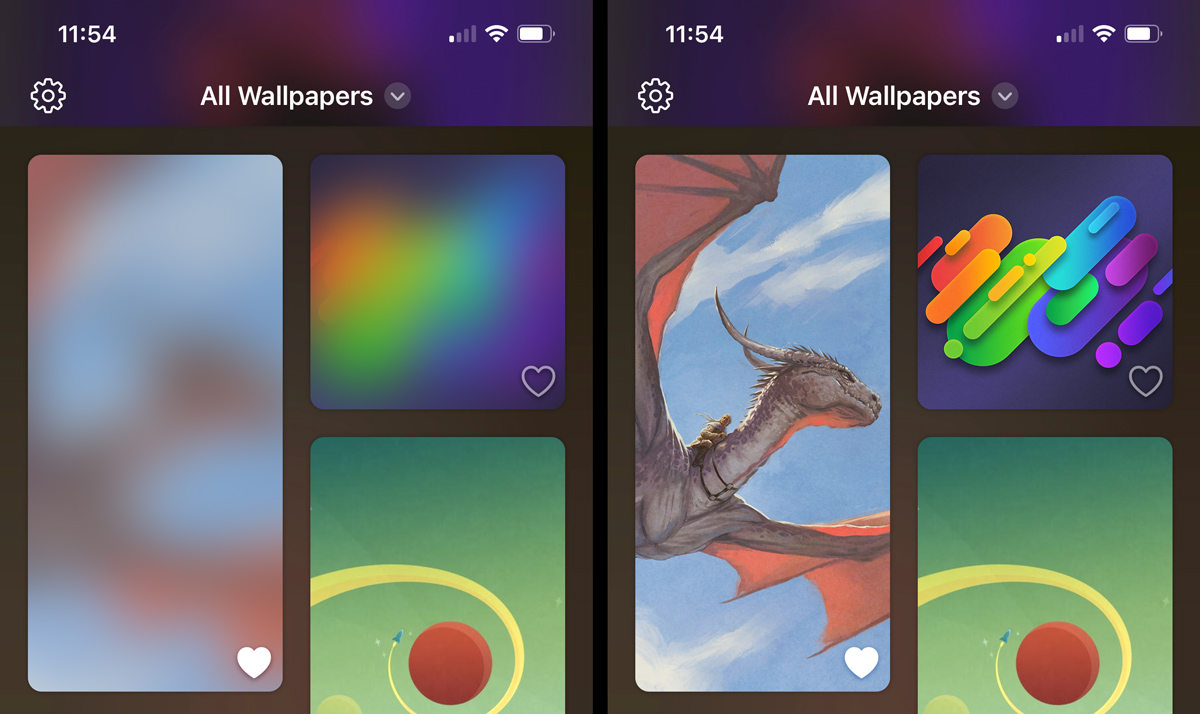
While the sweet parallax effect was a nice touch, there was still an annoying flaw with the gallery view that jumped out every time we scrolled it: The thumbnails sometimes took awhile to arrive over the network leaving an empty hole while loading.
From my time playing around with Mastodon, I remembered that they had a solution to this which displayed a blurred image while the full thumbnails loaded. I didn’t know how that worked, so I dug into their code a bit to find out how they did it. I discovered that some very smart people came up with a way to encode a blur into a relatively small string using math I do not even remotely understand myself.

I shoehorned the open source BlurHash code into a SwiftUI view that could take a hash string and a size and generate an Image from it. Once that was working, Craig modified our backend to compute real hashes for all of the thumbnails and images and included them with the catalog of JSON data that the app downloads when fetching new content. The whole process was surprisingly straightforward and, in our opinions anyway, is much nicer than having a static bundled placeholder image!
Adding all of these bells and whistles makes the app look pretty, but does it perform well? Wait until part 3 to find out – or just download the app and check it out yourself!