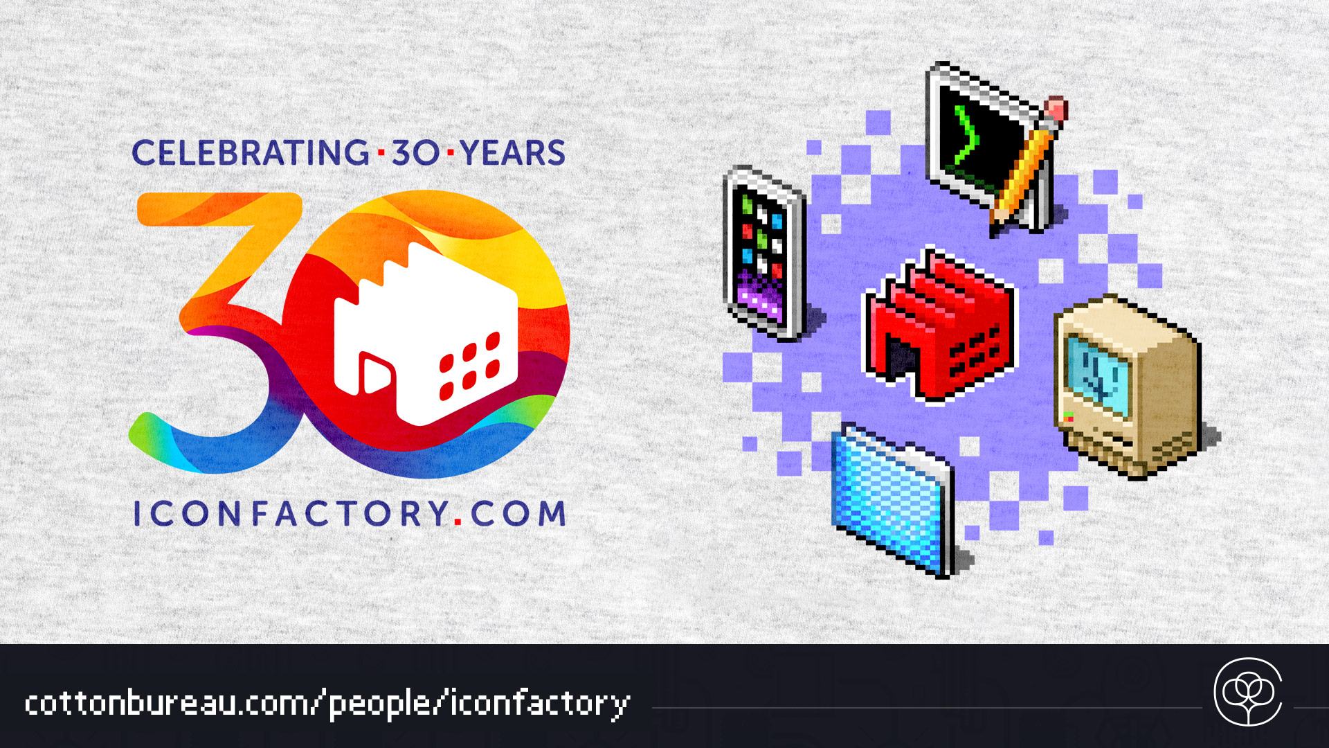
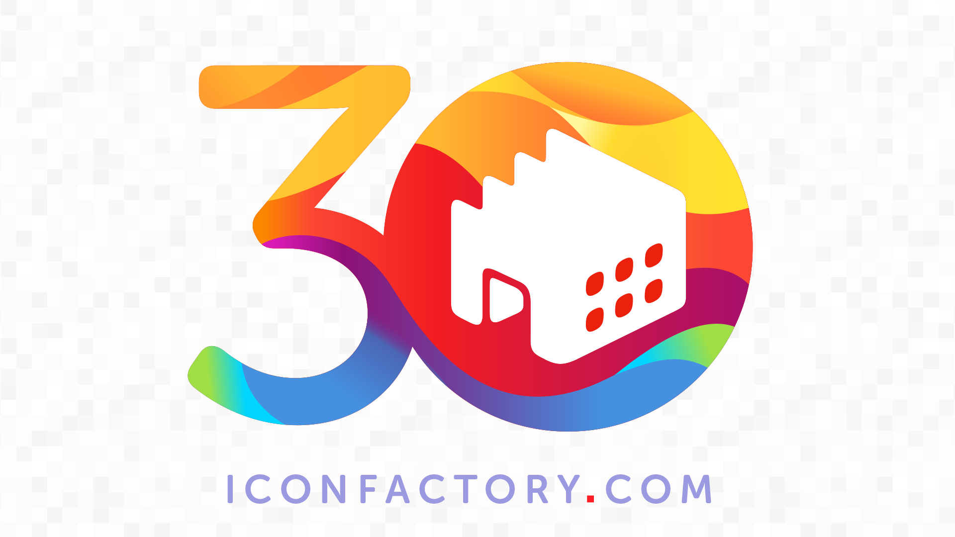
This month marks the Iconfactory’s 30th year pushing pixels and to celebrate we’ve partnered up with our friends at Cotton Bureau to offer a special t-shirt for the occasion. This high-quality, on-demand shirt sports the 30th anniversary logo on the front breast and a large, retro pixel-clicked design on the back.
Thirty years ago this month, three friends working at a small multimedia company in Greensboro, NC, decided to post a few fun sets of Mac desktop icons on an AOL webpage. Little did we know what we were getting ourselves into back then, but here we are, incredibly, thirty years later.
So this month, we hope you’ll join us and celebrate this major, minor milestone by kicking off a sale of some of our most popular apps. The offer is good from now until July 4th for new or previous subscribers only. Click the following redemption links to take advantage of the savings:
Tapestry – Create your own personal, chronological timeline of blogs, podcasts, social media and much more. Easily create filters to see only what you want and customize the look of your feeds. – Tap here to redeemjust $2.99 for 3 months. This is roughly 50% off the normal price of a 3-month run.
Linea Sketch – Draw, take notes and sketch on the iPad with ease. Linea lets you stay focused on your creations, not the tools and is a perfect digital sketchpad for novices and professionals alike. – Tap here to redeem $2.99 for 3 months. Roughly 50% off the normal 3-month subscription price.
Triode – Listen to your favorite internet radio stations no matter where you go, in your pocket, on your Mac or in your car via CarPlay. Beautifully designed and seamlessly syncs your music via iCloud. – Tap here to redeem $2.99 for a 6-month run, roughly 50% off the normal price.
We have some other fun things in the works that we’ll be posting about in the days ahead too, but we don’t want to spoil the surprises, so stay tuned.
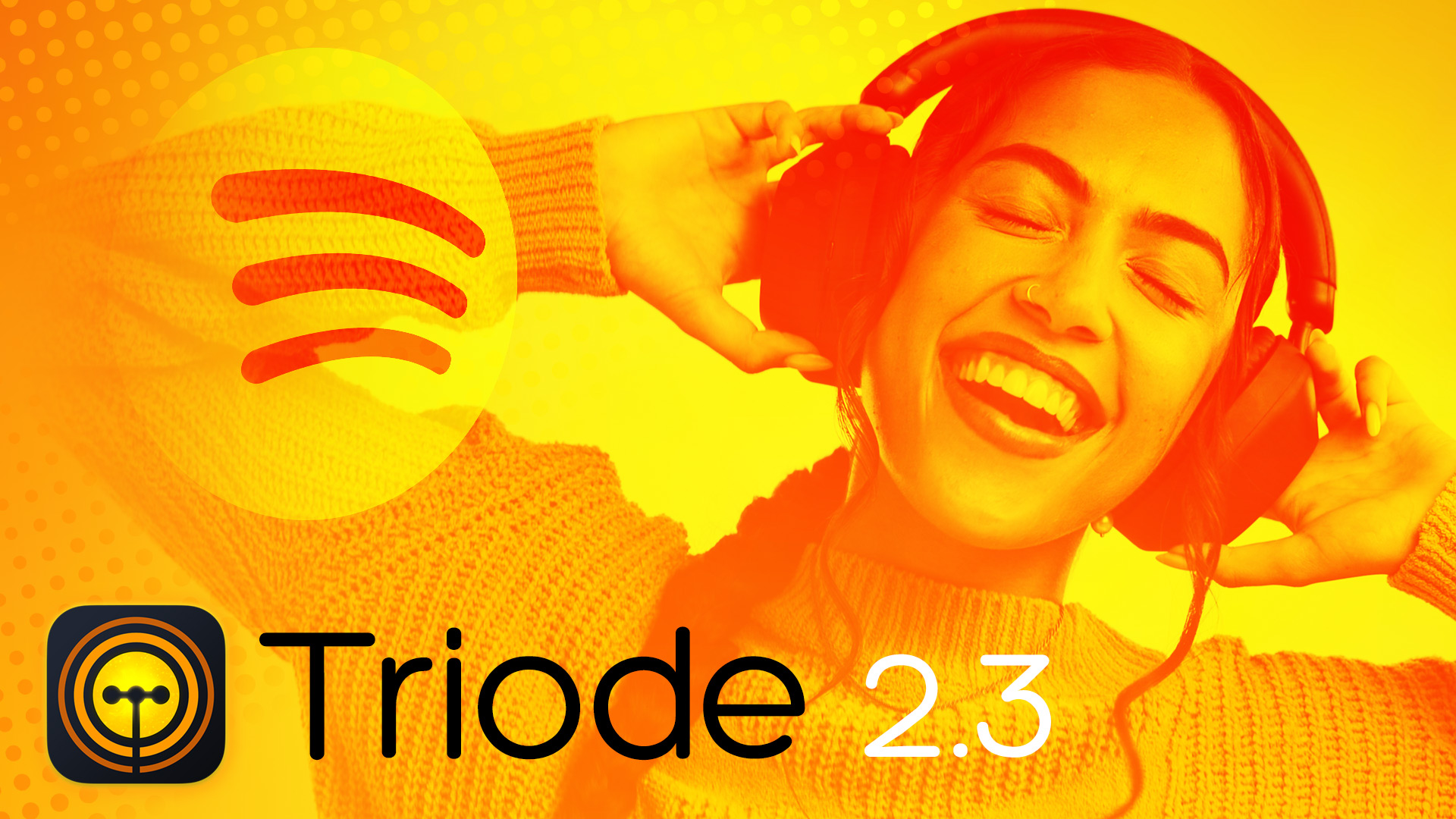
We’re proud to announce a new release of Triode. Version 2.3 of our Internet radio app gains a couple of new features along with a bunch of bug fixes and improvements.
For customers who use the Spotify app, there’s now a new button in the track history details that lets you search for the song and artist. The results are shown in the Spotify app where you can learn more about the track, play the song again, or add it to a playlist. On iOS, the track history is available from the music note button; on macOS it’s in the Station > Show Track History menubar item (or with Cmd-T).
We’ve also updated code on our server to update the stations database more frequently. The app will automatically update the search database each week, or you can use Refresh iCloud Data in Settings to update manually.
Other minor improvements include a way to remove favorites while in the organizer and a smoother artwork animation in the macOS app. For a full list of changes, check out the version history.
To learn more about Triode, check out the product page. Free downloads are available for iOS, macOS, and tvOS. An inexpensive subscription gets you additional features across all platforms.
Today’s update to our venerable digital sketchbook for iPad, brings a mix of precision tools, interface refinements, and under-the-hood improvements designed to make drawing more fun and fluid than ever.
A Fresh Look for iOS 26
Linea’s interface has been updated to feel right at home on iOS 26 and Liquid Glass. Today’s update emphasizes your canvas while keeping tools just as accessible and intuitive as ever.
Redesigned transformation handles make it more obvious how to scale, rotate, and adjust your selections, reducing friction when refining your work.
Skewing: A New Dimension of Control
ZipShapes also get a meaningful upgrade making it easier and faster to draw geometric shapes. You can now create left, right, and equilateral triangles with ease. In addition, ZipSquare corner radius controls offer more flexibility and precision.
Tapping and dragging the center side handles of a shape lets you skew horizontally or vertically—either freely or in precise 15º increments with snapping enabled.
You can also skew ZipShapes, lassoed selections, and even annotations to create new text effects. All subtle but powerful additions that open up new creative possibilities.
But There’s More
Drawing in Linea with the Apple Pencil is better than ever thanks to a new hover preview showing the brush size of the selected drawing tool.
Canvas management is also smarter, with Set as Canvas Defaults now preserving size and orientation. It also presents a new clearer confirmation when the preference is updated, as well as a new option in Settings to review or reset your default canvas setup at anytime.
Linea Sketch 4.4 also fixes a bevy of bugs and crashes so be sure to update your copy. Finally, there’s also an update to Linea Link for macOS, the app that let’s you move your iPad sketches into your favorite desktop image editor quickly and easily.
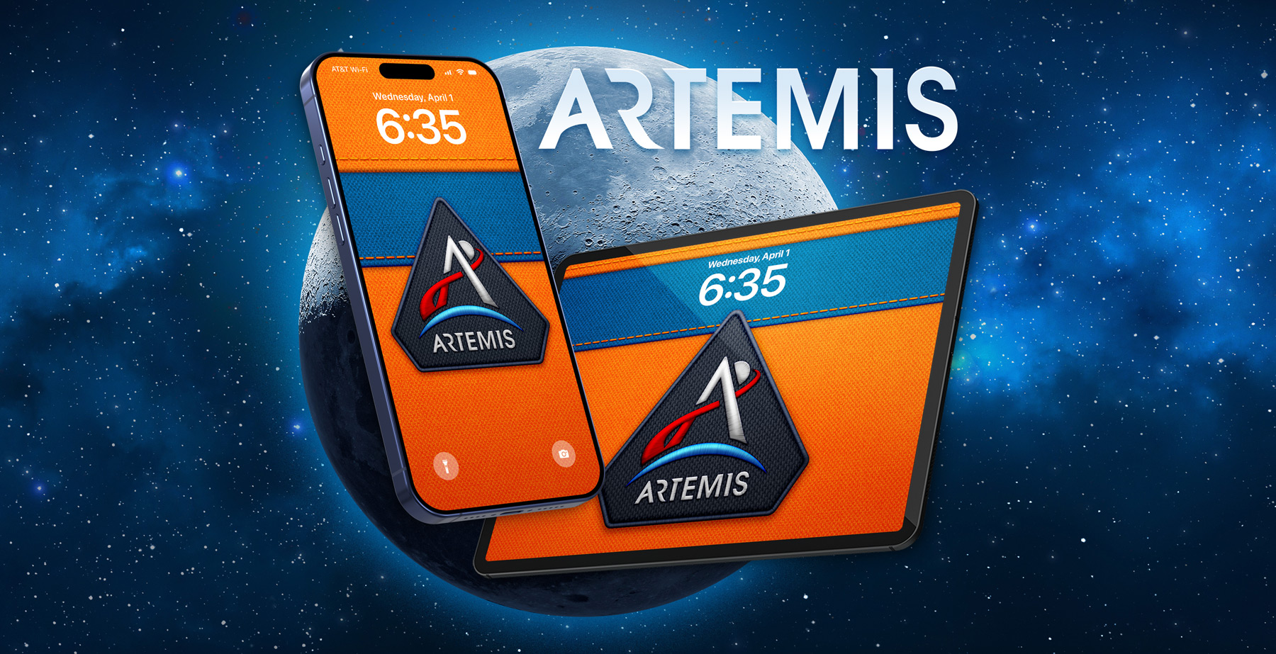
Today we watch as the astronauts aboard the Artemis II mission fly further from Earth than any human beings have before. As we write this they are approaching their historic fly-by with our celestial neighbor, the moon.
Last week we were inspired by the NASA journey and released a fun, free wallpaper that Artemis and space fans are sure to love. You can find the Artemis wallpapers in Wallaroo, our handy iOS wallpaper app in the App Store or download them completely free for iPhone, iPad and macOS on our Patreon. Have fun, everyone!
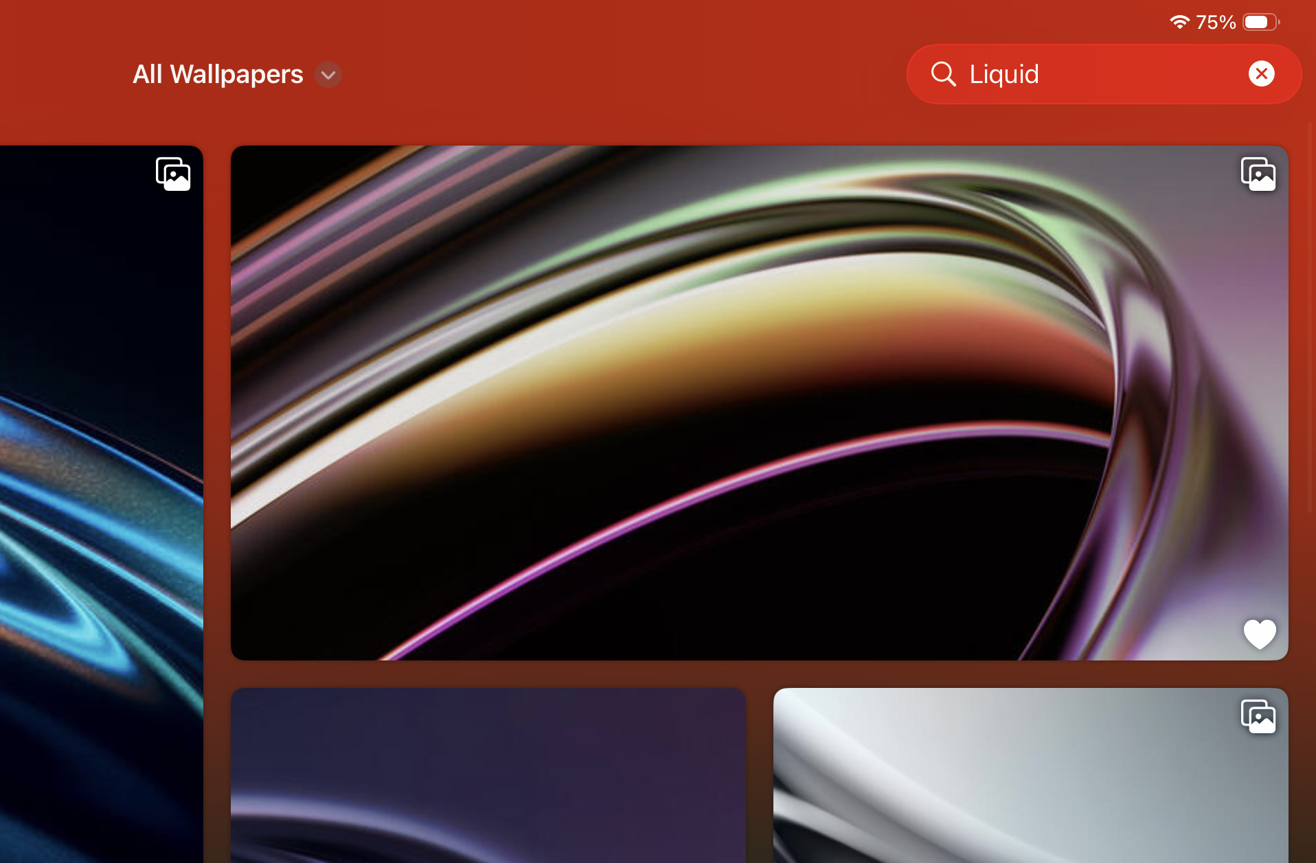
There’s an important update to our handy wallpaper app, Wallaroo that brings one of the most requested features: searching. It’s now possible to search for words, tags, artists and more to quickly find your favorite wallpapers. Results are returned in the currently selected tab as you type and we encourage you to give it a try, it’s a great way to explore all the fun content the app has to offer on both iOS and macOS.
The 1.5.3 release also updates the Patreon API. This means our patrons who subscribe to the Superhero or Legends tiers and enjoy bonus wallpapers each month, will need to re-link their account in Wallaroo. Subscribing on Patreon is a great way to show your support for real human artists, keep The Iconfactory up and running, and also get easy access to the entire gallery of wallpapers, including exclusives not available via the App Store.
Re-enter your Patreon account information in Settings > Manage Subscription > Login with Patreon and grant Wallaroo permission to access your pledge status. Once you do, all of the bonus wallpapers will be unlocked and free to use.
The Wallaroo 1.5.3 update is available today. Download Wallaroo for iOS and macOS for free and have fun customizing your lock and home screens with hundreds of fun, amazing walls with new ones added each week.
The latest version of our personal timeline app, Iconfactory Tapestry, includes a bevy of improvements users are sure to love. The media viewer has been overhauled to make gestures more friendly and improve video handling. New preferences to exclude YouTube shorts and live streams in feeds, the ability to turn off the timeline item counter plus lots more.
Enhanced Media Viewer
Swiping to dismiss photos / videos in the media viewer is now smooth and effortless! You can also pinch-zoom (or double tap) videos to get a better look and we’ve added a new video playback speed control (1x 1.5x 2x) for when your time is short.
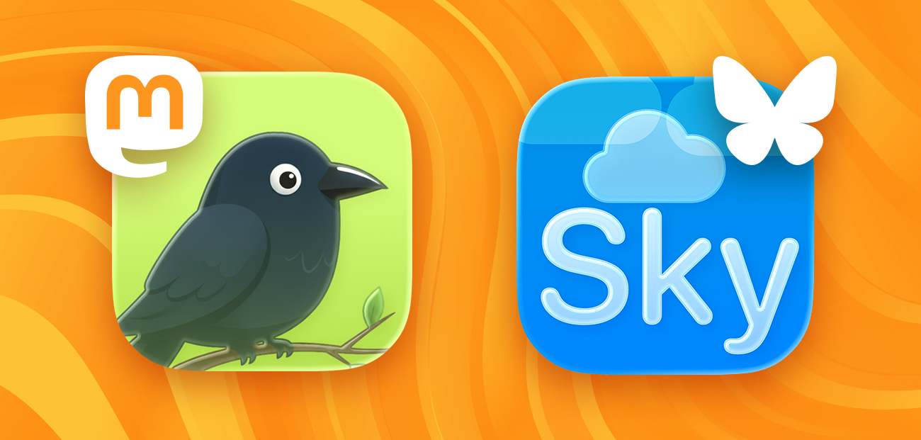
Open In: Crowfi & Skyscraper
We’ve added Open In support for two new nice third-party apps: Crowfi for Mastodon and Skyscraper for Bluesky. Find a Mastodon or Bluesky item in your timeline and tap … on the item > Customize Feed > Open In scroll down and select the third party app of your choice to change the way it’s opened from the timeline.
Connector Improvements
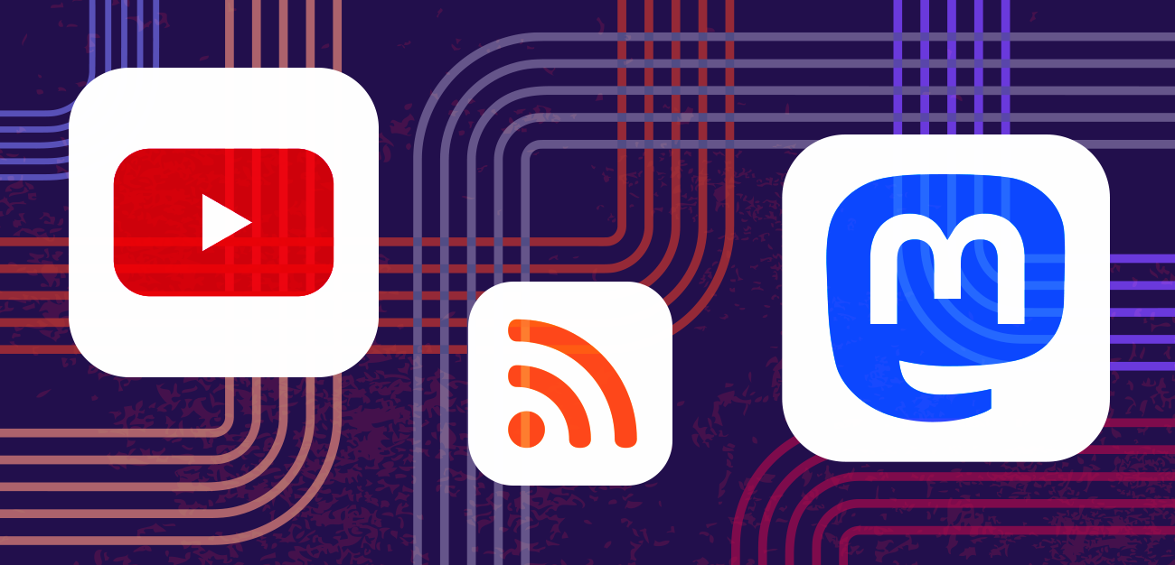
Bluesky and Mastodon connectors now have options for “Include Reposts” and “Include Quotes” respectively. YouTube feeds now have the option to exclude shorts or live feeds letting you see only the kinds of content you want. There’s also a new option for RSS/JSON feeds to disable titles that duplicate the body text in the title.
Customize the settings of individual feeds by tapping the … on the item in the timeline > Customize Feed.
More to Explore
Is your timeline count stressing you out? Tapestry 1.7 adds a general behavior preference to turn off the item counter. Head to Settings > Behavior and take some of the reading pressure off.
A new search field in Settings > Feeds lets you quickly find the feed you need, even disabled feeds, and act on it. The Feed Finder is smarter and faster when inputting all kinds of YouTube URLS, /r/subreddits and @usernames. Lastly there’s a new, easy way to quickly add third party connectors to Tapestry – Connector Finder. Simply head to Settings > Connectors and paste a URL to an online website or repository to a connector and Tapestry will magically prepare it to be installed. No more fiddling with .tapestry files, it’s just that easy.
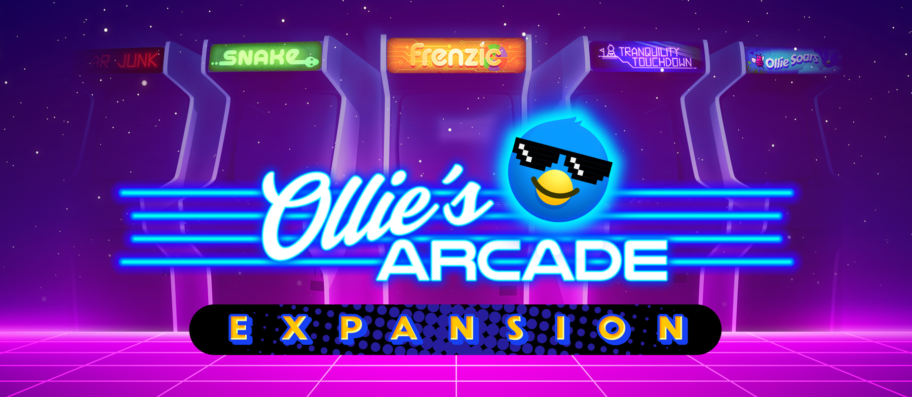
This week we announced a new Kickstarter that’s aimed at expanding the game offerings of Ollie’s Arcade, the fun, ad-free retro gaming app we introduced back in 2023. Ollie’s Arcade has always been a great way to escape doomscrolling, even if just for a little while, and now we have an opportunity to bring these retro games to even more people on iOS.
The Kickstarter aims to raise enough money to make all of the in-app purchase games in the app completely free for everyone to enjoy. We also want to bring our beloved puzzle game, Frenzic, to life once again. Frenzic was one of the very first games available on iOS back in 2008, then was reborn as Frenzic: Overtime on Apple Arcade. Since it left, people have been asking us for a new version that they can just pick up and play. We couldn’t agree more!
If you enjoy small, casual games that help kill some time while you wait in line or you just want to relive some of the heady days of electronic hand-held games from the 70’s and 80’s, we think Ollie’s Arcade just may be your jam.
From a bigger perspective the Kickstarter is yet another way we’re trying to sustain ourselves and keep the Iconfactory up and running. We all know times are tough, especially for small, non-investor driven businesses like ours. We’ve struggled to pay our salaries, keep up with the rising cost of health care and to compete against the onslaught of AI driven design solutions. The new KS won’t be enough to solve all our revenue problems, but it will help give us runway to keep the lights on while we find new ways to stick around and serve you. The more we raise now, the longer and safer that runway gets.
We hope you’ll consider backing the project, help us spread the word far and wide and support us once again as you’ve done so many times in the past. We love what we do and we want to be able to keep on doing it for years to come. We hope you’ll help us reach our goal and more.
Head over to the project page on Kickstarter to learn more about all the fun stuff we have in store and pledge your support. Thanks from all of us here at the Iconfactory!
We’re pleased to announce the arrival of Iconfactory Tapestry on iOS 26 with stunning support for Liquid Glass, visual improvements up and down the timeline, and a new native app for macOS.
Tapestry looks great in Liquid Glass
Tapestry’s user interface has been completely overhauled for iOS 26 and Liquid Glass and the results are pretty amazing. Controls and Quicklinks now float over the timeline, primary navigation and search UI have been refined, and more.
Your timeline is looking even better
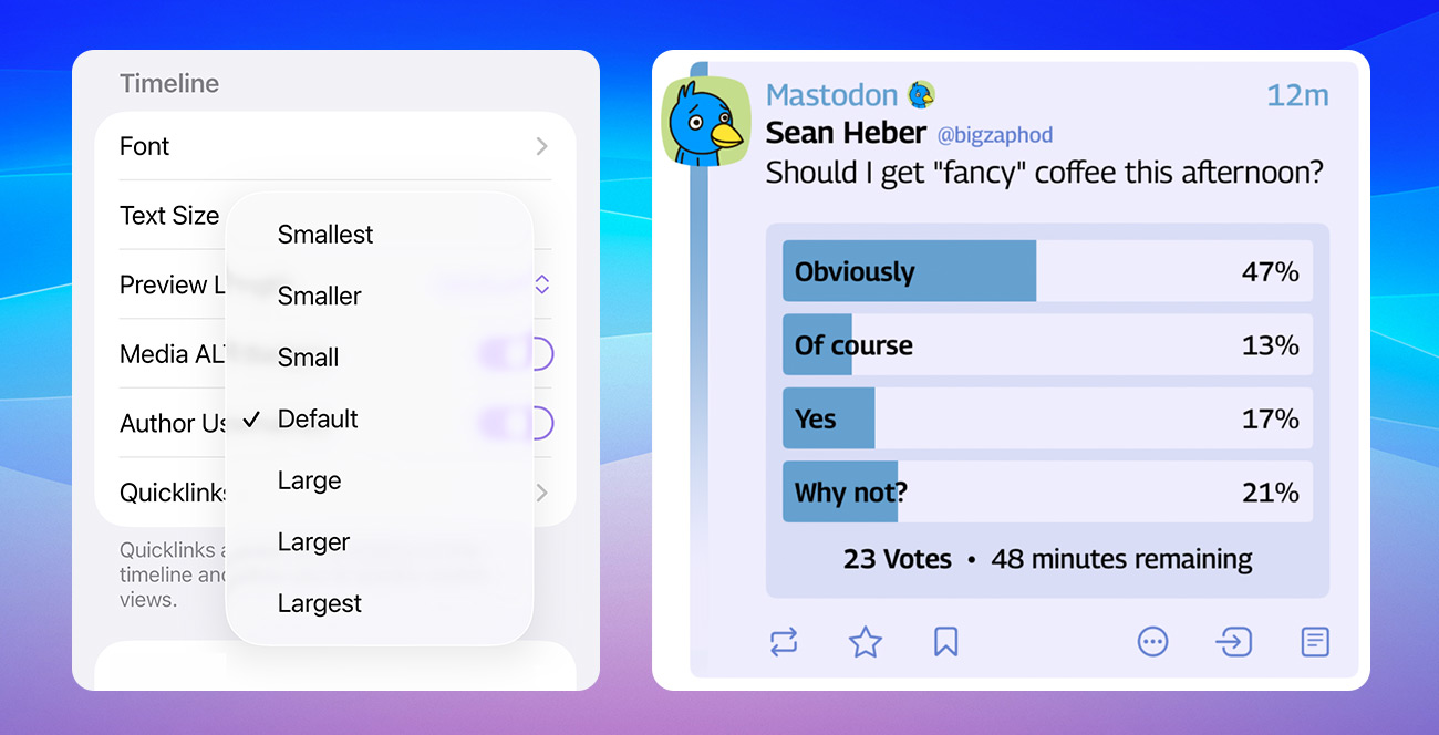
Tapestry 1.3 also sports a host of timeline improvements, including the ability to adjust font sizes within the app. Use Settings > Appearance > Text Size inside of Tapestry instead of the system settings.
There’s also initial support for Mastodon quoted posts, an improved design for Mastodon polls, and the Bluesky List connector now lets you exclude reposts and replies.
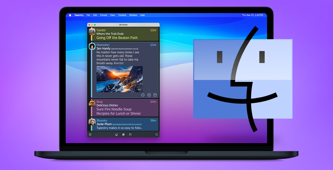
Native Tapestry for macOS
Tapestry on the Mac no longer emulates an iPad and is now a full-fledged native app. While still a work-in-progress, Tapestry is much improved, including initial keyboard support, font size control, and more.
Tools, too!
We’ve also improved the tools used to build Tapestry’s connectors. Check out the updated API documentation or download a new version of the Tapestry Loom development tool.
Not all app updates are created equal. Some are big, flashy affairs that bring new features and complete visual overhauls. Then there are the cryptic “Bug fixes and improvements” that make us cringe. Today’s Linea release falls somewhere in-between.
Linea Sketch 4.3.6 won’t fundamentally change the way you work, but it will let you do that work better, faster and more securely. If you’re looking for Liquid Glass, we’re still trying to figure out how Apple’s new UI framework fits into the app – we certainly don’t want it on the canvas while you’re drawing.
We’ve spent months overhauling Linea’s iCloud framework to bring it up to date with changes Apple has made over the years and to handle large libraries much more efficiently. Linea launches more quickly to get you up and running as fast as possible, whether you have a dozen sketches or hundreds. You’ll get feedback when sketches are syncing, and the app won’t freeze when handling large numbers of sketches and projects.
Despite these improvements, we would be remiss if we didn’t remind you to regularly back up your work. Even with safeguards in place, iCloud has been known to misbehave, which can lead to disaster. If you’ve never manually backed up your Linea Sketch library, now’s a great time to do it. Backing up via the Mac is a snap but it can also be done via the Files App. Be sure to follow our step-by-step guide to keeping your creative work safe and sound.
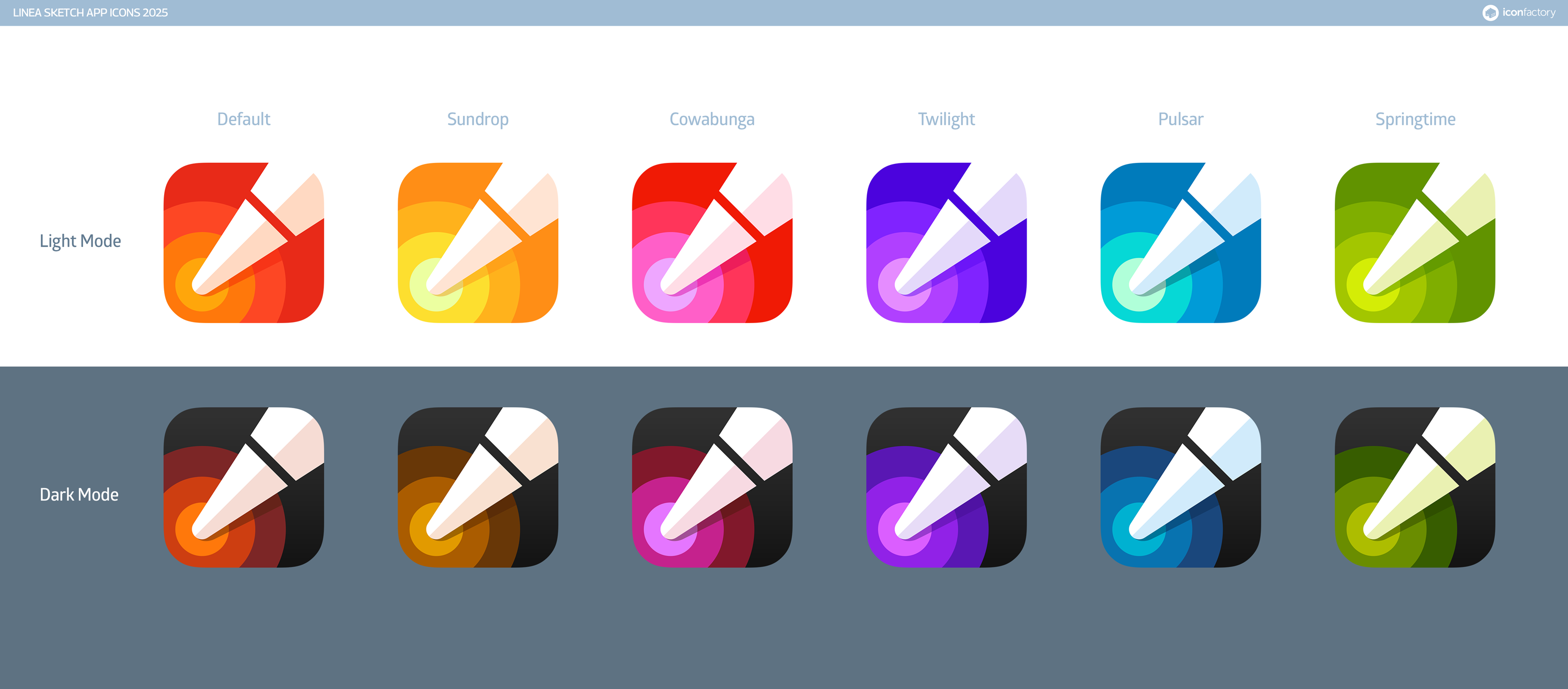
In addition to iCloud improvements, Linea now also sports a new app icon that adapts for light, dark, and tinted mode across all its color themes. Check out the complete version history for more info on the 4.3.6 update.
And if you’re new to Linea Sketch, get started today with a FREE download.


