The Iconfactory has been releasing beautiful wallpapers on Patreon for years. Our latest app, Wallaroo, was built to make the process of browsing and using these hundreds of wallpapers more fun and convenient for everyone.
Wallaroo is the first app we’ve built entirely with SwiftUI, so in this series of more technical posts, I want to talk about some specific issues we ran into along with how we solved them. In a separate post, Craig discusses development of the whole app so if you prefer to get a bird’s eye view of Wallaroo’s creation, be sure to check his article out.
Over two months of development, all of us at the factory worked on the app in our own ways. Craig and I did the programming while the designers remastered a ton of their artwork, mocked up UIs, made marketing materials, filled out spreadsheets with metadata, and did all of the other little things that needed doing that us programmers like to pretend don’t exist.
Craig built the entire server backend (where the metadata and images live) as well as Wallaroo’s settings and StoreKit 2 purchasing flow while I worked exclusively on the primary functionality of the frontend. (Now that I write it out I suddenly feel like a total slacker…)
One thing that worried me about adopting SwiftUI was that the demos from WWDC and elsewhere always seemed so superficial. While they usually have pretty animations and relatively few lines of code, most of the apps felt like nothing more than a thin wrapper around a list view. As someone who has done battle with UIKit for over a decade, I know how often a seemingly simple thing can turn out to be ridiculously complicated in practice. Given this, I really had no sense for how SwiftUI might fare when faced with real-world complications.
Since Wallaroo wasn’t designed to be a particularly complex app, it seemed like the perfect time to find out by taking the SwiftUI plunge.

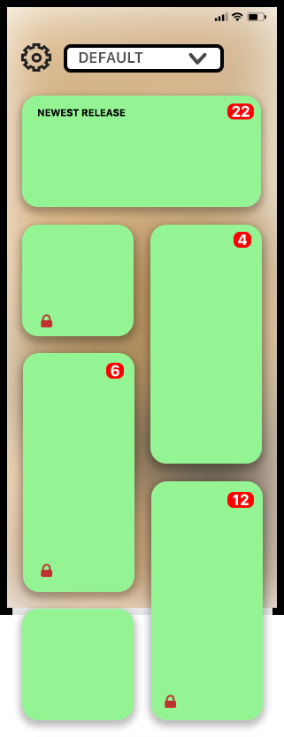
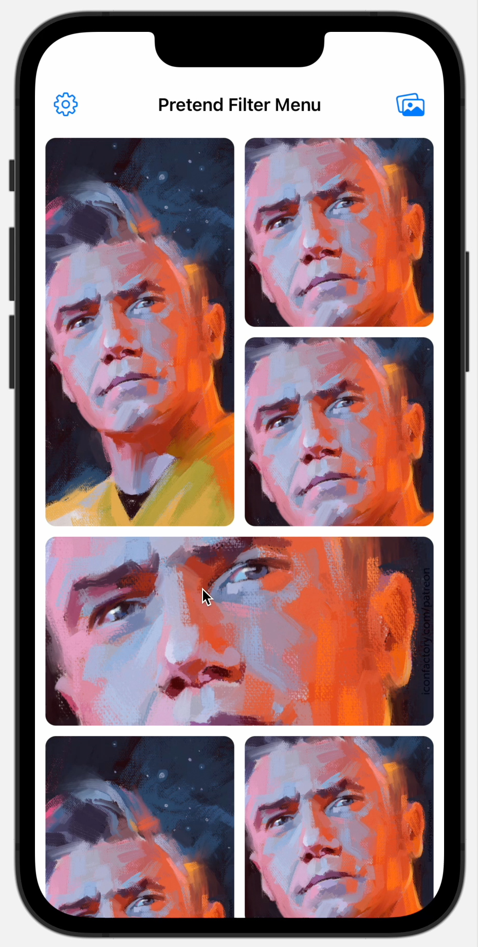
The mockup that Talos did of what would become the main Wallaroo gallery view had each wallpaper release being presented in one of four different-sized randomly selected tiles. From what little I knew of SwiftUI, I suspected this was going to be tricky because the framework didn’t (and still doesn’t) have even a simple flow layout, let alone something complicated like a flowing irregular grid! Luckily WWDC22 had just announced the new Layout protocol for SwiftUI, so I hoped I’d be able to use it to make this work. Nothing else about the UI mockups seemed especially unusual or beyond SwiftUI demos I had seen before, but the layout we wanted was something new. So I started there.
Considering that the only SwiftUI work I had done prior to building Wallaroo were some simple toy views over a weekend, it felt a bit like jumping into the deep end to immediately start work on a custom layout – but it turned out to not be too bad! The first decision I made was to avoid trying to implement a “perfect” layout and just get it working for the cases we needed. This meant mostly ignoring infinite and zero size proposals and disregarding the preferences of the children. (I’m sure all the kids out there can relate.)
One of the more interesting things about the grid is how we wanted to randomize the shapes of each child view to keep the gallery fresh and visually call attention (by way of size) to different wallpapers over time as the list of releases changed. I didn’t want to have to somehow assign a “shape” to each child view from outside of the layout, so I tried to find a way to get this logic inside of it so it could be automatic.
What I came up with was to seed a random number generator with the number of subviews that the layout received. This ensured that the layout would be consistent as long as the wallpaper list didn’t change – which is what we wanted. I then used that random number generator to shuffle a bag of shapes (large, vertical, horizontal, and small) and pulled the next one whenever processing the next subview. If the pulled shape would fit in the remaining horizontal space, I used it. If it didn’t fit, I’d discard it and try again. When the bag was empty, I’d fill it back up with a couple of sets of shapes, shuffle it, and keep going. I think it worked remarkably well! (Incidentally I used a similar technique to randomize Frenzic: Overtime’s daily challenges by seeding the random number generator with Game Center’s current leaderboard date.)
We were a few days into this, and I was feeling pretty good about it when the first real-world complication reared its ugly head: Custom SwiftUI layouts aren’t lazy!

This became distressingly apparent when I replaced the one bundled test image I was using for each of my tiles (a wonderful portrait that Dave did of Captain Pike from Star Trek: Strange New Worlds) with URLs for images on our server.
Suddenly whenever the app launched or the gallery came back into view, all 15 or so test images would start downloading immediately even if they were well off the screen – which obviously wasn’t going to scale. This happened because AsyncImage (which I was using at the time) starts loading when the view pops into existence in the view hierarchy and not when the view actually becomes “visible” on screen. Doh.
What I needed to solve this was some way to discern if the view was actually on screen or not and then emit the appropriate view. Since I had already put the GalleryView inside of a ScrollView in order to scroll, it turned out to be easy to capture a rectangle that could be used to indicate the “on screen” frame by simply putting the ScrollView itself inside of a GeometryReader.
The next step was to figure out where on screen the child views were actually being placed. This was easily accomplished by putting each of the children of the layout inside their own GeometryReader, too.
So now I had two rectangles in global coordinates – one for the container frame, and one for the frame of the child view. After that it was just a matter of checking if those rectangles intersected or not and either emit or not emit the tile view. SwiftUI’s ViewBuilder has no problem with this – it worked great. Now all of the child views would only exist when actually on the screen and cease to exist when they left it. This allowed for images to be lazy loaded as you scrolled without any child views needing to worry about the details.
I think laziness for custom layouts ought to be built into SwiftUI, but at least my code for adding it turned out to be relatively simple in our case:
GeometryReader { galleryGeometry in
    ScrollView {
        let visibleGalleryFrame = visibleFrame(for: galleryGeometry)
        GalleryLayout(columns: visibleColumns(for: galleryGeometry.size), padding: 20) {
            ForEach(releases) { release in
                GeometryReader { cellGeometry in
                    if visibleGalleryFrame.intersects(visibleFrame(for: cellGeometry)) {
                        ReleaseTileView(release: release)
                    }
                }
            }
        }
    }
}
(Note: The visibleFrame(for:) function just expands the safe area the geometry proxy includes so that the returned CGRect is the actually visible space and not just the safe area space.)
By this point things were looking and working pretty well for an early prototype – the primary stuff we were worried about being able to build in SwiftUI seemed to be solved! I was about to move on to other parts of the app when Gedeon said, “Hey, can we add some parallax when scrolling?”
