We were getting near the end of Wallaroo development and the app was close to fully functional, but as mentioned at the tail of the previous post, there was still one more important thing that I had to figure out how to implement.
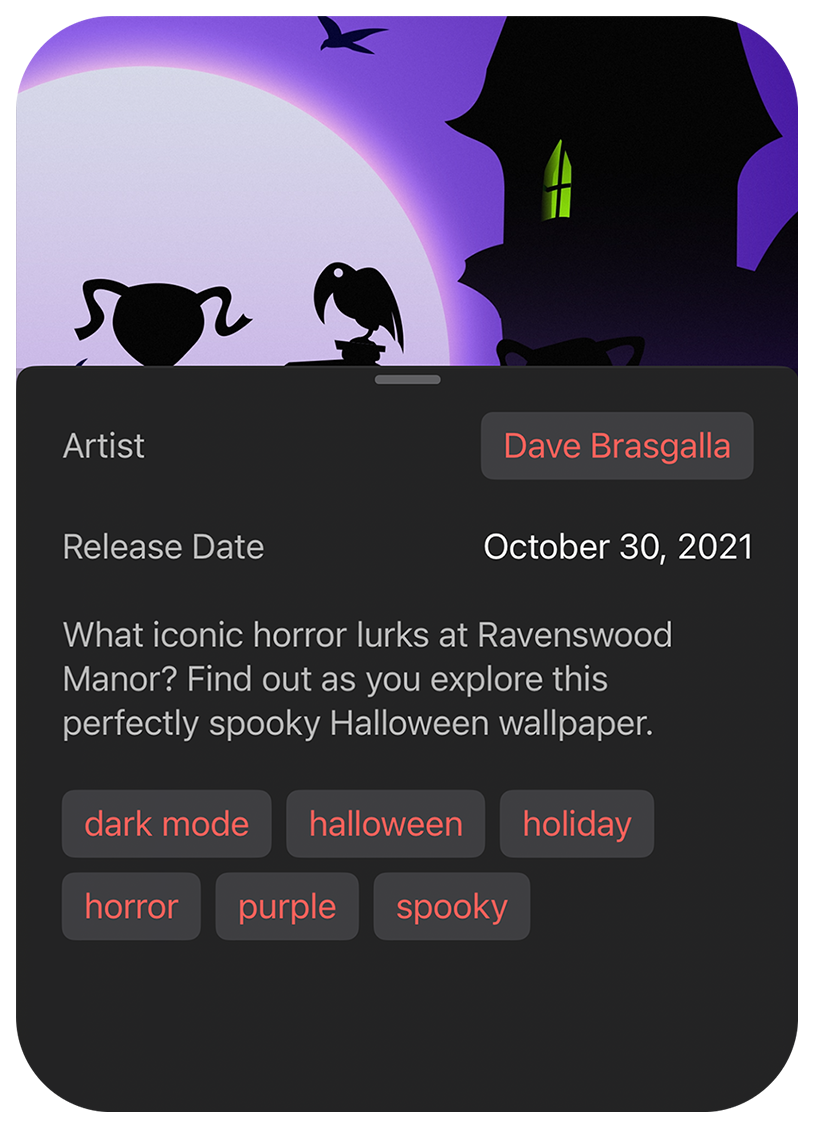
The wallpaper detail view has a popup with metadata about the wallpaper you are viewing. Some of that metadata takes the form of tags and tapping a tag needed to push a new page on the navigation stack.
Normally this would be relatively easily done with a NavigationLink but there was a wrinkle: The button that needed to have these links lived inside of a .popover which, when presented, is not part of the navigation stack! That resulted in the NavigationLink being disabled since from its point of view there was no navigation stack to push anything to.

Luckily Apple introduced NavigationPath this year and it seemed like it might be possible to use it to solve this problem.
Of course since NavigationPath was a brand new API, there wasn’t a lot of information out there about how to work with it. Many of the quick “tutorial” posts that showed up within hours of the WWDC announcement didn’t help, either. (Unfortunately most were nothing more than reprints of Apple’s simple demonstration code which was immensely unhelpful.)
Those that went farther did things like tuck the NavigationPath into an ObserverableObject which was then added to the environment or passed explicitly to subviews for them to manipulate. I’m certainly not a SwiftUI style expert, but that didn’t feel right to me.
Fueled by my prior research into finding the “right” way to pass what I needed around for the parallax effect, I opted to model a solution based on the way that dismiss and openURL are implemented in SwiftUI itself: As an environment action.
Instead of passing an object around that was nothing more than a thin wrapper of the navigation path, I created an action struct that implemented callAsFunction() just as Apple does with DismissAction, OpenURLAction, RefreshAction and others. The root view then added the action to the environment so all child views could use it.
With this approach, the NavigationPath is private to the root view which remains in control of adding things to the path. The root view also already implemented .navigationDestination for the views in the navigation stack, so it made sense to me that it should own how pages get pushed, too.
When the detail view needs to open a new gallery page, it uses my new OpenPageAction from the environment to request the new page much like this: openPage(.gallery(.tag("abstract"))).
We also sometimes needed to present other standard views that were overlays of the whole UI (like the purchase screen) and all I needed to do was add a case to the Page enum and a new line to the function that opens the pages. The same mechanism that pushes a new view on the navigation stack can also now open a new modal popup without the caller needing to know the difference.
(Note: When the first iOS 16.1 beta dropped, we suddenly had a navigation regression where sometimes empty views were pushed on the navigation stack. I spent an afternoon and isolated a simple reproducible example [filed: FB11518877]. We reached out to multiple Apple engineers that we had contact with and eventually learned this is a known regression which is expected to be fixed before 16.1 ships. I implemented a workaround in the meantime – but fingers crossed!)
The last bit of polish we wanted before shipping was to make the favorite button do something a bit more fun when you pressed it.
Gedeon hand drew a wonderful animation frame by frame as a reference and I set about trying to figure out how to make it work.
My first instinct was that this should exist as a custom view transition, but I spent a lot of time trying to figure out how to make that work and couldn’t get it right. I suspect I was missing something obvious, but I was running out of time and couldn’t spend any more time digging into it so I needed a different way.
I was also torn between deciding if I should find a way to translate all of the frames of Gedeon’s animation to code or just use the images he had already made and be done with it.
Given enough time I could have probably worked out a way to actually draw each of the shapes into an animated Canvas, but ultimately I gave up on that and built a flip book-style animation view powered by TimelineView to play a sequence of Image views.
I set up the flip book animation to play when it first appeared and then to update a binding when it was done which allowed me to overlay it on top of the normal heart button, play when it appeared, and then have it disappear when finished. I think it turned out pretty great!

Building Wallaroo in SwiftUI was quite an eye-opening experience for all of us. There were a lot of unexpected troubles along the way, but we worked through them and found solutions. There were certainly some problems that, in my opinion, would simply have never occurred had we built the app with UIKit – but that said, I’m not sure we would have completed the app in time for the launch of iOS 16 without SwiftUI.
While I ran into a lot difficulties that may or may not be bugs and spent a bunch of time trying to better understand the “right way” to do things for future reference, Craig was able to easily implement the entire set of settings screens, the purchasing flows, Patreon integration, and a bunch of other simple but important views without any significant problems – likely because they all better fit the types of things that SwiftUI was originally designed for in the first place.
In my opinion, a lot of the app’s ancillary views would have required far more code and time to build with UIKit and that’s an important point in favor of SwiftUI despite the occasional trouble in some corners.
I think it’s important to remember that our goal was to build an entire app which means dealing with a lot of the incidental stuff that SwiftUI makes trivial – like experimenting with different interactions, layouts, animations, and even whole view hierarchies. Making quick changes to those things in SwiftUI requires practically no code and absolutely no auto layout constraints, no management of delegates or controllers, and no subclassing all while adapting to different aspect ratios and accessibility settings with nearly no effort. (Plus you can see the changes as you type them if you have the previews set up!)
Clearly there are some blindspots in the framework that need to be addressed, but without trying to use it we could not have known where they were. Just because some parts of the app may have been less troublesome to implement had we used UIKit doesn’t mean SwiftUI itself is a failure or useless. Our new experience will hopefully allow us (and perhaps you) to better pick battles going forward. There’s no rule against using UIKit when necessary, after all – but ideally (in my opinion) we shouldn’t have to.
I hope you enjoyed this deep dive into the Wallaroo development process. For my part, I mostly liked working with SwiftUI once I started to get used to the way it works. There were certainly some points of deep frustration along the way, but in my experience that happens in every single project no matter what technologies are being used to develop it (yes, even UIKit). Unfortunately there will always be things that just don’t seem to work as well as you’d hoped. Maybe someday someone will create the one true holy grail of app development frameworks, but until then, we might as well play with what we’ve got.