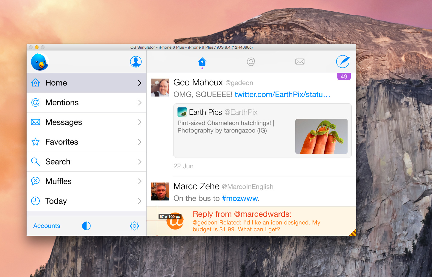
In our recently-released update to Twitterrific (version 5.12), we made the decision to redesign our in-app notifications. Our work on Twitterrific for Apple Watch opened our eyes to some of the ways that we could display more information to the user while they browsed their timeline. Designing a more robust notification system was a clear way to improve things.
Most new features in Twitterrific start with a set of mockups from a designer that are translated into code, and the new in-app notifications were no different. This implementation process is one of my favorite parts of development: being able to take a beautiful, user-friendly UI layout from a designer and make it interactive and alive. Sean Heber had been working on the new notifications based off Gedeon Maheux’s designs, but had moved on to focus on some of the other major features we were fitting into this release. I was tasked with finalizing the notifications and making sure they were as much like the design mockups as possible.
Adjusting the layout of the in-app notifications was going to be a relatively time consuming task. We tend to shy away from using Storyboards in Twitterrific, mostly due to legacy code reasons. This means I would have to tweak the layout of on-screen elements through code instead of rearranging them by hand. Compound that with the number of different notification types we provide and things start to become more complicated.
I had been using xScope to measure the placement of UI elements in the in-app notifications, recording placement values using the Dimensions tool and adjusting those code values in comparison to the mockups. After doing that for a couple of the notification types, I realized there was a faster way to handle layout comparison using xScope’s Overlay tool.
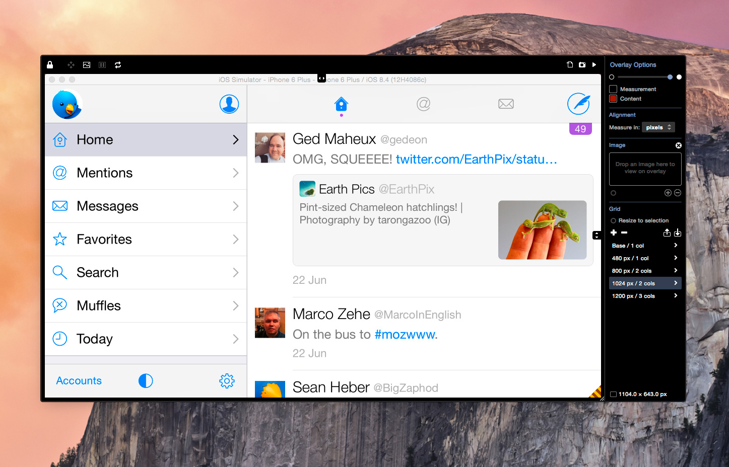
By attaching the Overlay tool to an iOS simulator window, I was able to drag and drop the mockups I had received into the Overlay window, displaying them overtop of a running version of Twitterrific.
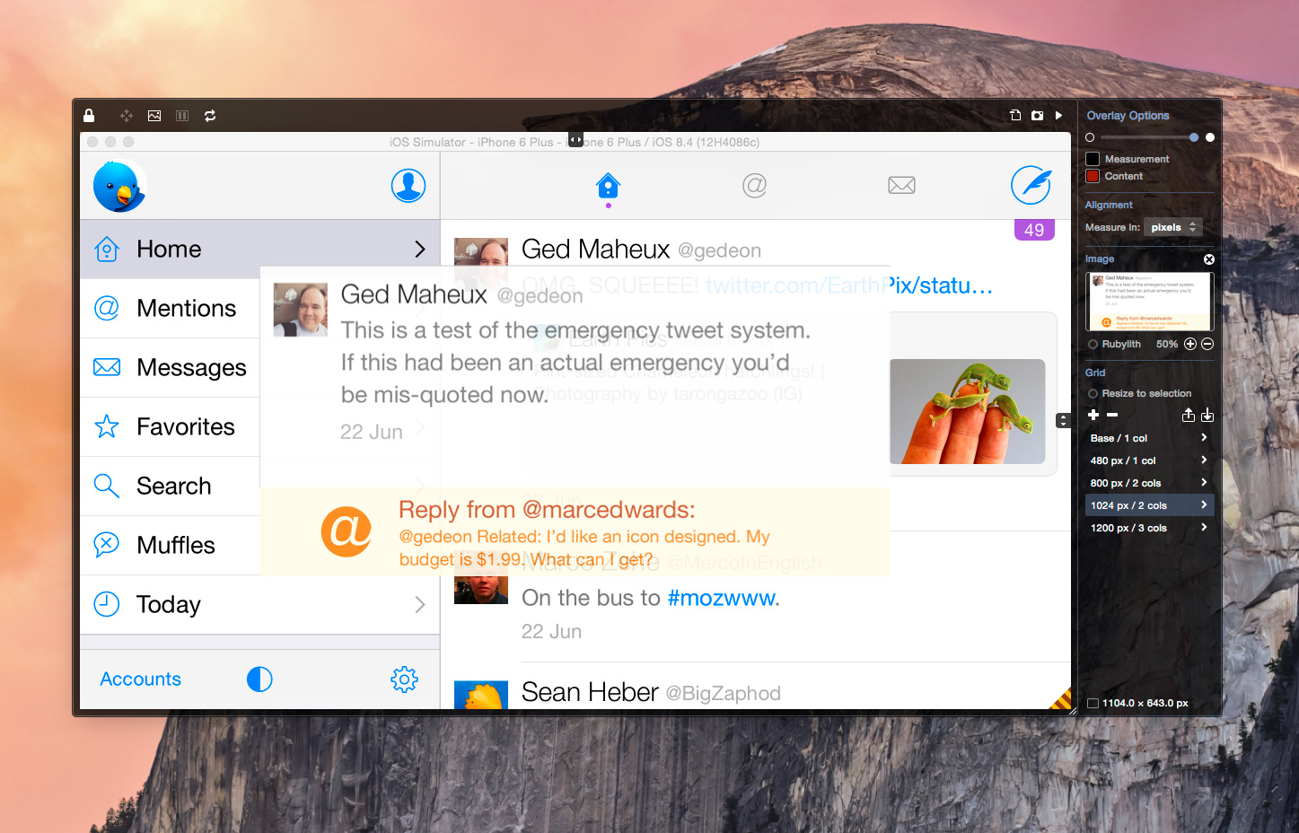
I then used the top and side sliders in the Overlay tool to adjust the location of the mockup image, aligning it properly with the in-app notification’s placement at the bottom of the simulator window.
After that, I lowered the opacity of the overlayed mockup image, allowing me to see both the designer’s vision and the currently-running application. This is the main benefit of using the Overlay tool for UI layout. It allows you to adjust transparency on the fly, quickly fading back and forth between the simulator and the mockup.
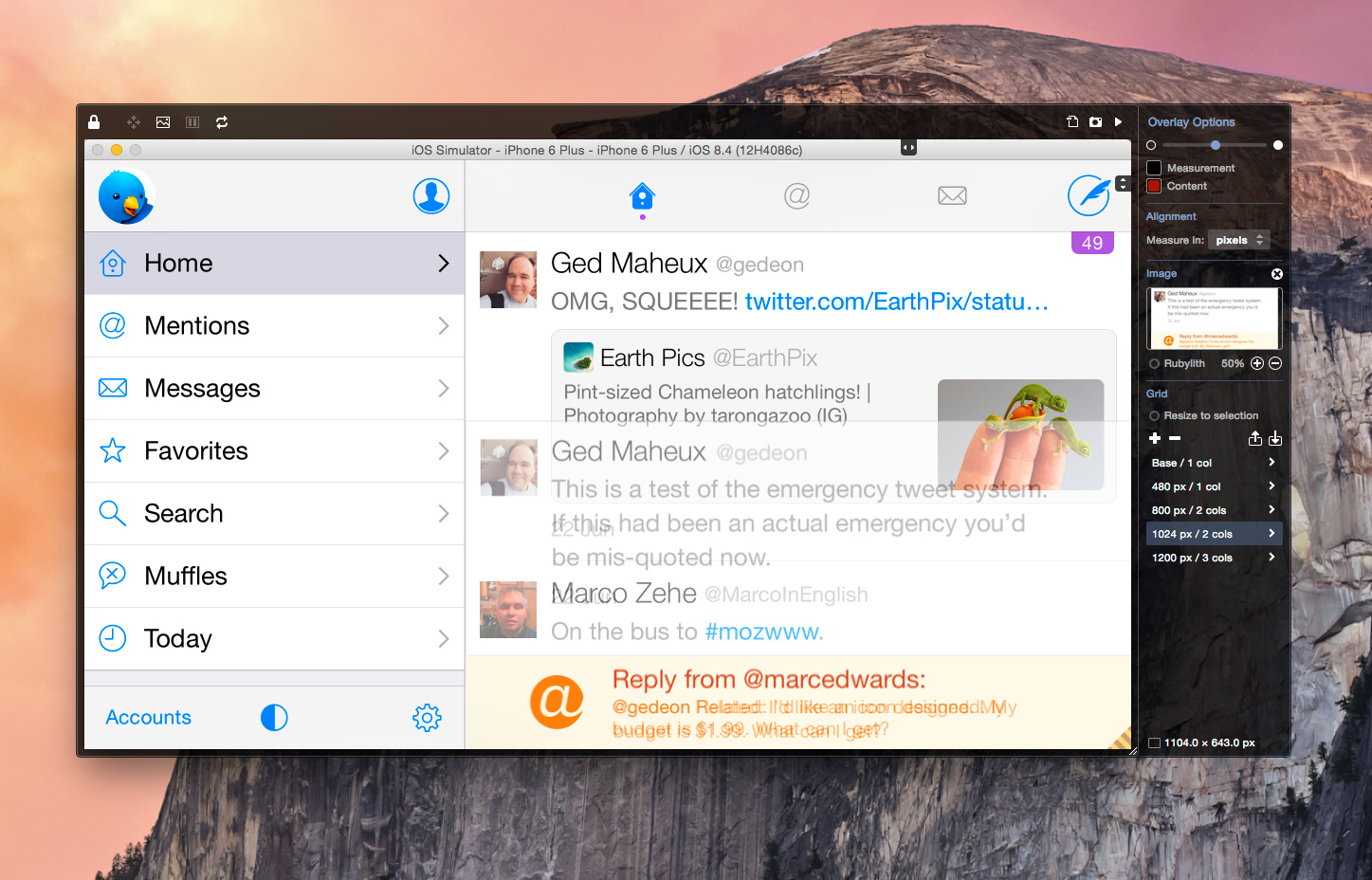
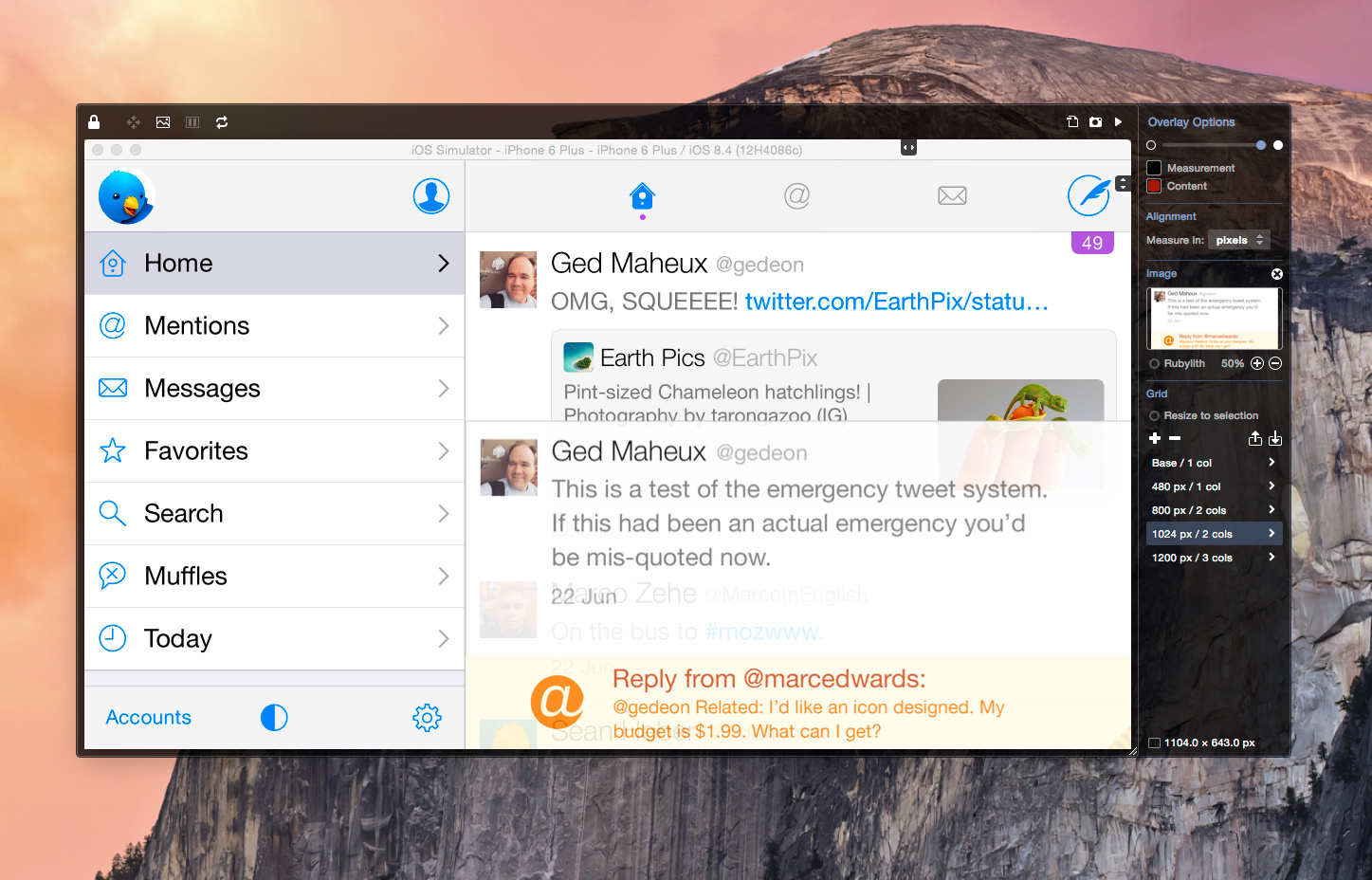
Visualizing the UI in this direct manner quickly pointed out the ways the notification layout needed to be adjusted. Even better, comparing layouts with this method made things easier with each measurement. There was no need to measure origin points and width/height values a second or third time to readjust, since the UI either aligned properly with the overlaid mockup or it didn’t.
Since this realization, I’ve found xScope’s Overlay tool more and more useful in speeding up my UI layout tasks. Hopefully this trick makes your front-end development work a little easier as well.

