At the last Apple Event, a seemingly simple thing was announced: a True Tone display on the 9.7-inch iPad Pro. This device also uses a new LCD panel and sports “a color standard big enough for Hollywood.”
As with most things released by Apple, there is an amazing amount of underlying technology that makes this new display shine. This new product is also a glimpse of how our screen technology will evolve over the coming years, so now is a good time to start understanding how these changes are going to affect our products.
As a developer, you’ll quickly realize that the scope of these changes will make your update to Retina graphics look like a walk in the park. At the end of this piece, you’ll also learn how I can help guide you through this process.
Wider Gamuts
Since the late 1990’s computer displays have almost universally used the range of colors specified by sRGB. The standard was developed to match typical viewing conditions in a home or office. My home and office have changed radically since then, but this standard has not.
The world of color science has notoriously bad acronyms and you’re about to become familiar with a new one: DCI-P3.
The “DCI” in the name stands for “Digital Cinema Initiatives”, a consortium of major motion picture studios. This new standard was published in 2007 by the Society of Motion Picture & Television Engineers (SMPTE). They’re the folks responsible for the test patterns on your TV and the time codes in your footage.
Today, there’s a symbiosis between the motion picture and computer industries: as celluloid film goes away, devices in various forms are now used to show movies. Computers are also indispensable for effects and editing in cinema production. Both groups benefit from excellent display quality.
In fact, the DCI-P3 standard was established as a way to control the quality of digital projection systems. It makes sense that iMacs and iPads can display the same range of colors as your local theater.
From your point-of-view, the important thing about DCI-P3 is that it can display a wider range of color. Apple’s promotional literature states that the new iPad Pro has “up to 25% greater color saturation than previous models”. The diagram below lets you see this difference:
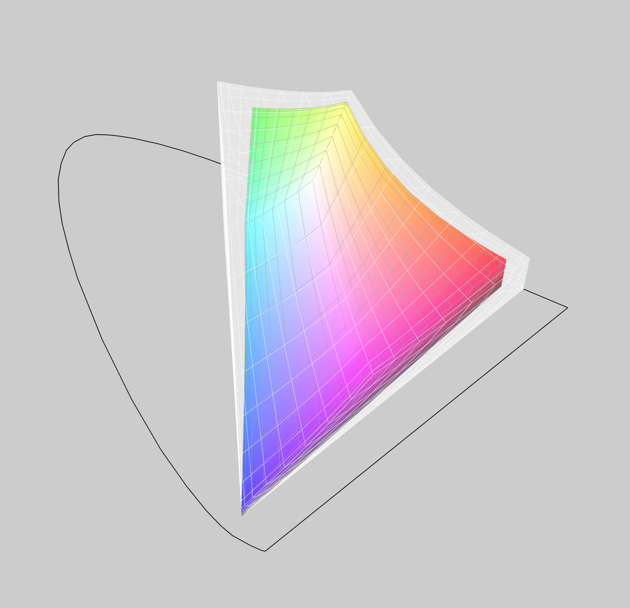
Comparing the gamuts of sRGB (colored shape) and the new 9.7″ iPad Pro (white area)
The polygons represent the range of color and are often referred to as “gamut”. The white area shows the additional color that can be displayed by the new iPad compared to a more typical sRGB display. The black outline indicates the maximum range of color our eyes can see (it’s the locus of the wavelengths captured by the long, medium and short cone cells in the retina.)
More importantly, this is just a hint of things to come. Ultra-high-definition television will use something called Rec. 2020 to display color (yet another great acronym!) Someday your Apple TV apps will be using this:
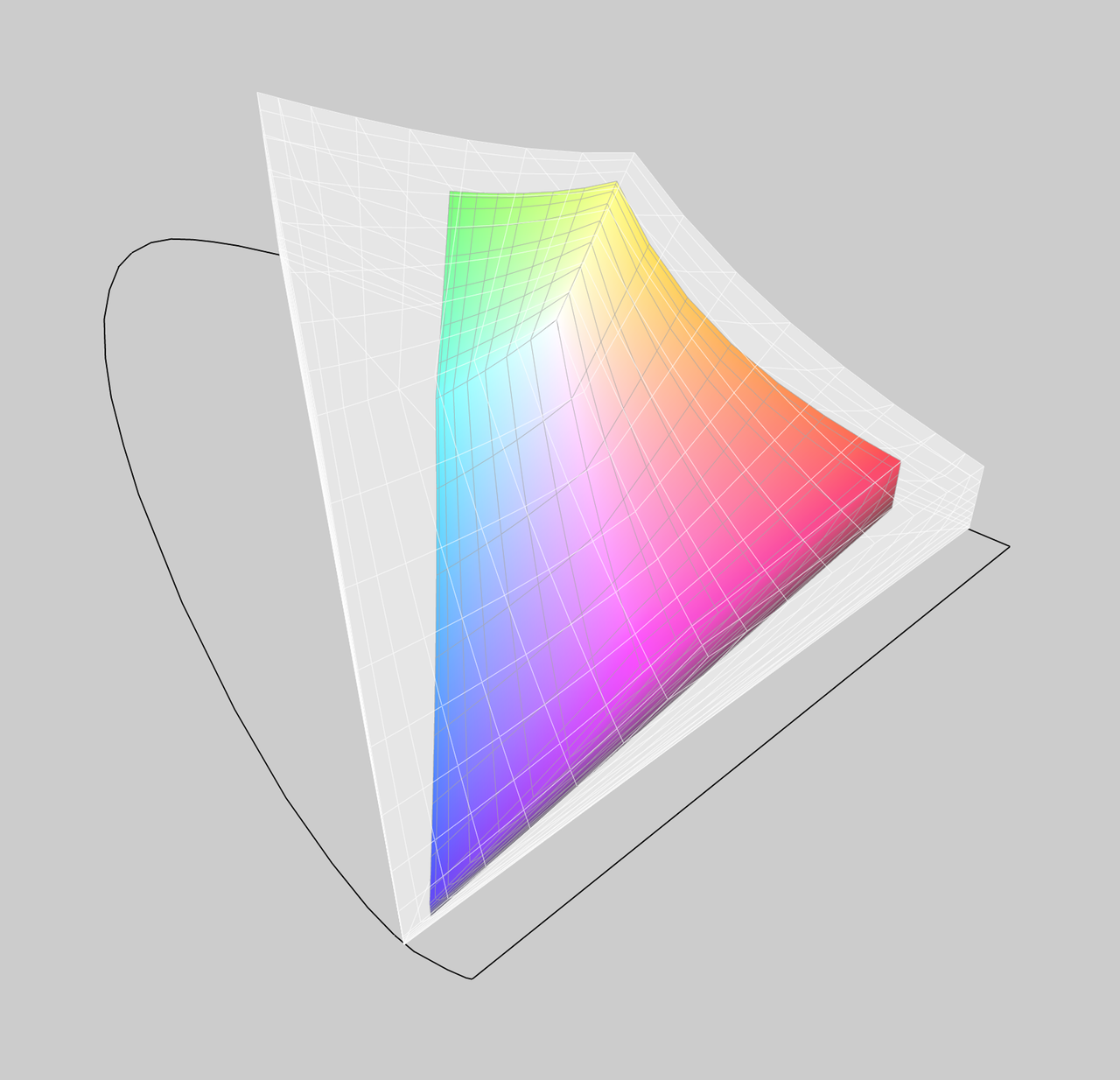
Comparing the gamuts of sRGB (colored shape) and Ultra-high-definition TV (white area)
Over the coming years, displays that only show sRGB are going to feel as antiquated as ones that can only display @1x resolution. And the only way you’re going to be able to cope with all these new kinds viewing environments is with a thing called “color management.”
Smart Displays
Unless you’re a color scientist, “chromatic adaptation” means nothing to you. Yet, you experience the phenomenon thousands of times every day. The cool part is that your iPad Pro is now mimicking your eye’s behavior.
Here’s what Apple says about the new display:
See things in the best possible light. Whatever the lighting.
People love using iPad everywhere. That’s why the new 9.7‑inch iPad Pro has a True Tone display. It uses advanced four-channel ambient light sensors to automatically adapt the color and intensity of the display to match the light in your environment. Which means reading is more natural and comfortable — almost like looking at a sheet of paper.
Specialized neurons in our brain do the same thing to adjust the information received by the cone cells in our eyes. When you look at a sheet of paper, the “gain” of our color receptors is adjusted so that constant color is perceived. Amazingly, this effect is seen with both the global illumination of your environment and the local illumination of what you’re focused on (this is why the checkerboard shadow illusion works.)
On the iPad, there’s some heavy-duty math being done on the GPU in real time. The colors of what you are viewing are transformed into a numerical model based on the wavelength responses of your retina’s cone cells. Those, in turn, are transformed into colors that are adjusted by sensors hidden behind the top bezel of the device.
Again, color management is the thing that makes it all work.
The Advantage of Managing Color
Today, we’re in a pleasant situation where displays don’t need to get any denser. Thanks to the Retina display and others like it, we can’t see the pixels that are on our screen.
There’s only one way for manufacturers to improve displays and gain a competitive advantage. They need to make the displays “deeper”; able to show a wider range of color. It’s also clear from Apple’s work that they see smarter displays, with things like True Tone technology, as a way to distinguish themselves in a crowded market.
Apple is in a unique position with regard to color management. They own a technology called ColorSync that first saw the light of day in 1993 with System 7.1 on the Mac. It’s also been integrated at a system-level for all of the OS X releases. It’s a very mature technology that recently made its way to mobile in the iOS 9.3 release.
On the other side of the coin, Android has no color management. Companies like Samsung are going to find it impossible to pull off something like True Tone and DCI-P3 without the aid of color management.
There are open source color management systems and profiling tools, but integrating them system-wide is a large undertaking. Also, color management can’t be an “add on”: most users won’t be aware it exists or how to enable it. Windows is a good example of that phenomenon—apps rarely use color management because developers can’t rely on it being available.
But I Can’t See It!
Apple has a bit of a problem with selling these new displays: the vast majority of people looking at promotional materials can’t see the wider color gamut. It’s physically impossible for the sRGB display on your current iPad to show off the increased saturation of the new iPad.
Even when you come in face-to-face with this new screen it’s hard to describe in words. Smart folks who can normally summarize their feelings in a few choice words end up saying things like this:
There is something about this new screen. It’s beyond me but it’s striking.
I had the same reaction and decided to look at the display in more detail. With the help of some sample wide-gamut images by Jeff Carlson, I decided to dig into the effect DCI-P3 was having on my eye. The result is a web page to compare color gamuts:
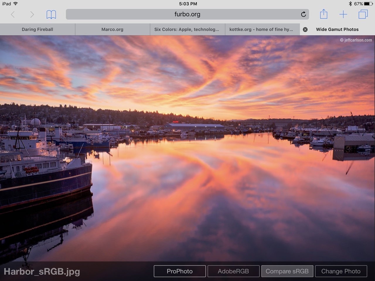
Click on the image to explore the capabilities of the new 9.7″ iPad Pro display
Be careful on that web page: unless you’re looking at it on a 9.7” iPad Pro, the ProPhoto and AdobeRGB images will actually look worse than the traditional sRGB image. But if you’re on the new iPad or iMac you will quickly appreciate what a talented photographer can do with more color saturation.
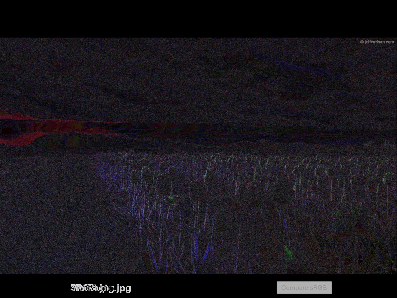
The harbor image is where this effect is most obvious, but the increased saturation occurs in all the images. Highlights are subtlety stronger, contrast is better, and gradients don’t flatten out as they get brighter.
To illustrate this, I used Photoshop to analyze screenshots of the page. I created a base layer with the ProPhoto image then overlaid the sRGB sample using the difference blending mode. This setup highlighted pixels that were different between the two screenshots (which I emphasized by adjusting the levels.)
Here are the differences between the two harbor images, where it’s clear that the orange gradients are rendered more faithfully:
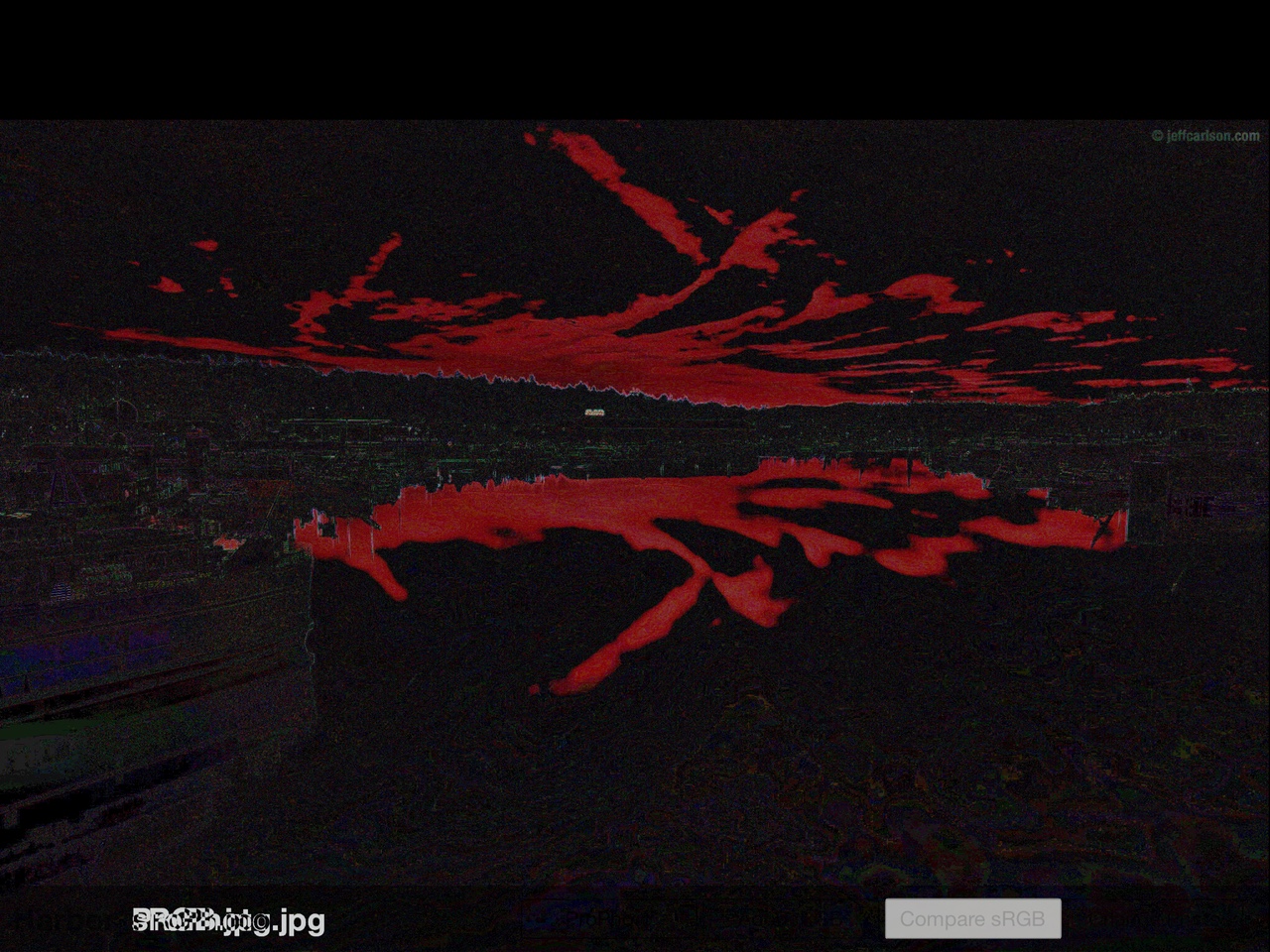
Some differences between the DCI-P3 display and a traditional display are obvious
But when I examined the differences in the tulip image, I saw this:
Other times the differences between the two types of displays are much more subtle
If you look closely, you’ll see how the highlighted areas affect the tulips. But as you learned above, our eyes are amazing sensors. I think the additional detail gives our brain a better appreciation of the image even if it can’t put things like chromatic adaptation into words.
After using this iPad for a couple of weeks, I’ve realized it’s like the advances of Retina in an important way: I never want to use a lesser display again. And as with higher density, I think it’s obvious that Apple will eventually update all its products to use this improved screen technology. I can’t wait!
It also wouldn’t surprise me to see these wider color gamuts coming to the cameras in our devices. All iOS devices currently create images in the sRGB gamut, while professional gear can produce images in ProPhoto or AdobeRGB. High dynamic range (HDR) photos need a wider range of color, too.
We’re quickly reaching a point where more pixels don’t make better photos. Think about how much Apple likes to tout the camera and how better saturation improves photos. These new displays are the first step in a process where wider gamuts become a part of the entire iOS photography workflow. The number of places where your code assumes everything is sRGB will be both surprising and painful.
For more information on wider gamuts from a photographer’s point-of-view, this post analyzing the DCI-P3 display on the latest iMac has a ton of good examples.
Color Management is Hard
We’ve all seen the color management controls in Photoshop and thought “Hell no!”.
There’s no getting around the fact that color is a complicated subject: you’re dealing with both the physics of electromagnetic radiation and the physiology of our eyes and brains. The things that produce and sense color in our world are inherently complex.
For the past 20 years, we’ve had it easy. We could rely on just red, green and blue to get the job done. But as displays become deeper and smarter, that’s about to change.
We’re all going to have to face the music.
Personally, I had to confront my fears of color management in 2014 for the release of xScope 4.1. In the Mavericks release of OS X, Safari’s colors started looking different than Chrome’s. This is what I currently see in both browsers on OS X:
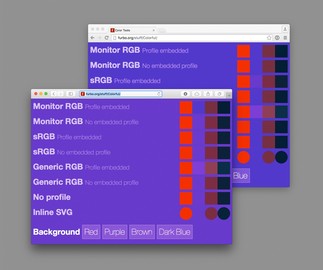
Color differences in two popular browsers: Safari (left) and Chrome (right)
One browser is using color management for the display of CSS colors, the other is not. (And don’t tell me it looks fine on your display: that’s like saying “it works fine in IE 6!”)
Besides being a big change to my web development workflow, I had to deal with these color differences in xScope’s Loupe tool. I was faced with learning about color profiles and how colors are transformed between spaces.
During this learning process, I experimented a lot and kept notes. I thought I’d do a blog post about color management, but as you’ve seen above, writing about color can quickly get out of hand!
When Apple released the iMac with the DCI-P3 display, all of the work of the WebKit team quickly came into focus. They were laying the foundations for a world with more color. And my draft folder kept getting bigger.
A Book Apart
When I reached 10,000 words, I knew I had a problem and approached my friends at A Book Apart with a proposal to write a book about color management. Luckily, they agreed that this was a topic that would benefit many designers and developers. Over the past year, that draft has been refined, simplified, and become something I’m very proud of.
We’ve strived to make a book that helps you understand color in laymen’s terms, to use color management with step-by-step instructions for popular apps like Photoshop, and guides you with the work necessary to create great looking web and native apps.
We’re on the cusp of big changes with color management in our work. A new color-gamut media query is about to drop in Safari, UIImageView and UIColor both support color profiles in the latest version of iOS, and the differences in color processing across platforms continue to widen. The timing for this book couldn’t be better.
We’re not at the point where we can announce a release date, but if you’d like to know when the book is finished, sign up for A Book Apart’s newsletter (scroll to the bottom of that page.) It will be worth the wait.
In the meantime, check out the new iPad display at your local Apple store. You’ll be looking at the future.

