It’s clear that this year’s WWDC is going to be a doozy. We’ve written here previously with our thoughts about Dark Mode, now it’s time to talk about iOS apps coming to the Mac.
Of course I’m talking about Marzipan, a technology Apple introduced with few details during last year’s Keynote. We knew that some apps in Mojave used the new technology and that was about it.
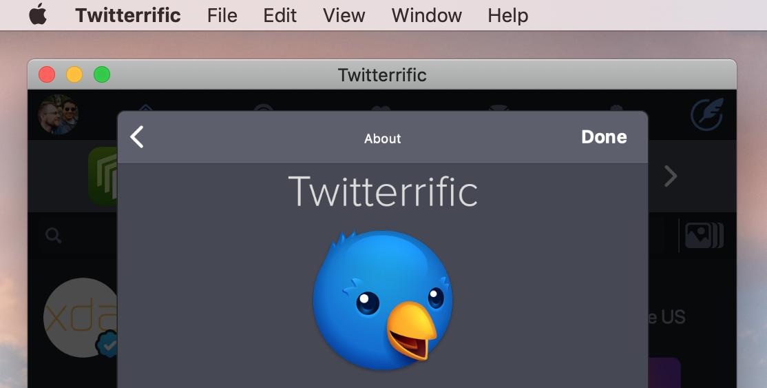
The iOS version of Twitterrific running on macOS thanks to Marzipan.
Thanks to the hard work of Steve Troughton-Smith, we have a much clearer view of what’s happening behind the scenes with application architecture and available APIs.
What I’m going to focus on today is how this new technology will affect product development, design, and marketing. I see many folks who think this transition will be easy: my experience tells me that it will be more difficult than it appears at first glance.
For the past year, I’ve been working on a new product that runs natively on three operating systems: iOS, tvOS, and macOS. As a result, I feel like I can talk with some authority on the differences between these platforms. My biggest takeaway from this project is how different interaction models have a ripple effect throughout a product.
(We’re not ready to talk about this project in public yet, but Patreon supporters are getting sneak peeks.)
A Little Bit of History
Before we get into the interaction details, let’s take a look at tool and framework transitions on the Macintosh. Marzipan may be something new, but it’s certainly not a first.
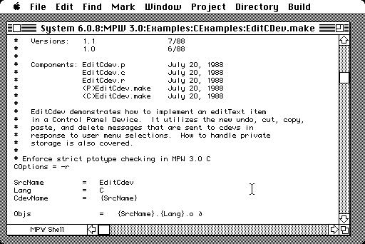
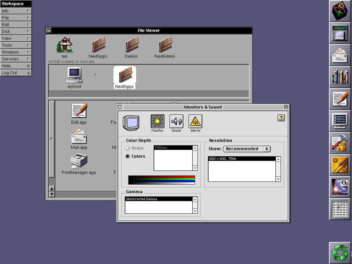
I’m old enough to have been around when the Mac first shipped: in 1984 you could buy some floppy disks to write code in Pascal or 68K assembly code. After a few years, the way you made these revolutionary computer interfaces evolved into MPW, the Macintosh Programmer’s Workshop.
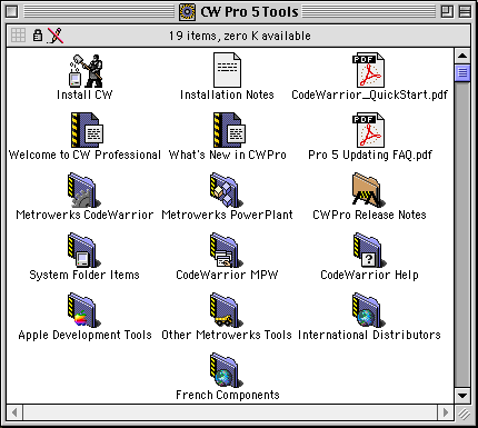
Fast forward a few years and things had moved on to a new language and tools. Many folks were using CodeWarrior and C++ to build their Mac apps. I developed the Iconfactory’s first software product using this environment.
The modern era then arrived with NeXTSTEP in the year 2000. It brought an unfamiliar language called Objective-C, a new IDE called Project Builder, and awesome new frameworks named Foundation and AppKit. These tools have served the Mac well for many years and even provided a foothold for iOS with UIKit in 2007.
And now a modern macOS toolkit will include Swift, UIKit, and Marzipan. Or, as we like to call it, Chameleon 2.0 :-)
As you can see, the stuff that you use to build Mac apps has changed radically over the past 35 years – but it’s important to note what hasn’t changed during that same period of time. You still use a bitmap display for output with a keyboard and mouse for input. The interaction model has changed, but only slightly. There are enhancements and refinements, like trackpads and gestures, but a Mac is completely usable using nothing but the basic concepts that were laid down by the original team.
It’s All About the Interaction
It’s likely that getting your iOS app to run on a Mac will just be a matter of flipping a switch in Xcode. Steve Troughton-Smith has been converting apps using nothing more than a Simulator build, his marzipanify tool, and a lot of clever tweaks with frameworks.
It will be exciting for a lot of developers, including yours truly, to press that button. But it’s also important to temper this enthusiasm with reality: that build setting is just the first step on a long and complicated road. Good interaction doesn’t come for free.
As you saw above, the Mac has seen a lot of tool and framework transitions. But this is the first transition which involves a large group of developers who don’t have any experience on the platform they’re targeting. A Mac developer moving from CodeWarrior and C++ to Project Builder and Objective-C didn’t have to learn anything new about conventions: they were still on a Mac. That can’t be said about iOS developers who are starting to use Marzipan.
In the early days of the iPhone, there were many apps developed by folks who brought their sensibilities from Windows or the Mac to a new platform. Those apps felt wrong and have largely disappeared because everyone has figured out that different interactions are needed for a small, handheld device. Don’t let the same thing happen when you bring your iOS expertise to a Mac.
If you’ve been developing on iOS for any period of time, you’ve probably had the “flip a switch” experience when starting an iPad app. It’s fairly easy to get things up and running, but then you realize that there are a lot of design and code changes needed for a larger screen. You’ll start reworking things with master/detail views and auto layout constraints. You might even need to adapt your app to support input from a Smart Keyboard.
Look at how many user interface idiom checks you have and you’ll start to get an idea of what lies ahead for a macOS app. If you’re someone who’s decided that an iPad version of your app is too much extra work, you’ll likely think the same thing about all the conditional checks required for a Mac.
Many of the thoughts in this essay got their start while developing a tvOS app: I found that having a common user interface toolkit wasn’t much help. It’s nice to have familiar UIKit items like UIImage, UIColor, and UIButton, but in the end I found that little code was shared between platforms. Some views could be ported directly between platforms, but anything involving a controller was out of the question. Why?
Put simply, the interaction on a TV app consists of six things happening: up, down, right, left, select, and back. Pointing anywhere on screen is not an option: your controller has to guide the customer around as they use these simple interactions. Code to navigate between buttons and collection view items is entirely different. Similarly, UIKit on macOS won’t magically solve your problems when someone wants to use the tab or arrow keys to navigate views in your iOS codebase.
You’ll face similar issues when you encounter a customer who needs to select multiple items by dragging a mouse, open a context menu with the right mouse button, use a keyboard shortcut to make their work quicker, or customize function keys for common actions.
How do you drag a selection when your code assumes that pointing at the screen is to facilitate scrolling? Is a right mouse click like detecting a different finger? Is there going to be a new mechanism for defining keyboard shortcuts and creating items in the menu bar? Will there even be a way to link in Carbon event callbacks?
I don’t know the answers any of these questions, but I can guarantee that these new interactions will require additional work in your app.
It’s also likely that you’ll suddenly find classes like UIResponder a lot more important. Routing events through your app becomes more difficult when they have to pass between multiple view and window instances, a menu bar, and an application delegate.
To get an idea of the scope of the project you’re about to embark on, I would suggest getting a head start by reading the macOS Human Interface Guidelines (HIG). These guidelines have been around since the original Mac, are easy to understand, and provide a valuable reference for every Mac developer.
How is this standard macOS control going to work on iOS?
Besides learning what you don’t know, you’ll also get a chance to think about how something simple and familiar on the Mac, like the pop-up button, might be implemented for both iOS and macOS. That simple control doesn’t have any analog on iOS, but someday it will, and you’ll be using it for code on two platforms.
Design Considerations
Coders will not be the only ones affected by Marzipan. As a designer, you’re going to face challenges, too.
The guidelines mentioned above should be your first stop: there isn’t any code and the descriptions often have great visual examples.
The most obvious design element that will change as you move from iOS to macOS is the screen. If you’ve designed for the iPad, you already understand the challenges of a larger display surface and adapting your views as that size changes. It’s not easy work, but an alternative design that’s just “a big iPhone” is highly unsatisfying for a customer.
The Mac alters this scenario slightly because your app is presented in a window that’s resizable: you might be running with the constraints of an iPhone SE one moment and the expansiveness of an iPad Pro the next.
These resizable windows will also let you show more than one view at a time. On iOS, you’re accustomed to owning the entire screen and only having to accommodate for the user’s attention in one place. The Mac, on the other hand, has many applications that are vying for input and output mechanisms.
On macOS the notion of “window focus” is used to highlight anything that’s currently receiving user input. Some of this will be automatic, such as with the window chrome, but you’ll also want to improve the experience in your own views by guiding the user’s actions. If controls aren’t active because they’re in a background window, they’ll need to be de-emphasized.
The notion of “focus” also leads to a less obvious design change: an omnipresent keyboard.
On a Mac, you always have a keyboard and folks have developed many habits that revolve around this input device. With iOS, working with a keyboard is an enhancement, and many apps don’t bother to make use of it. Using Marzipan means you’re adopting a new interaction mechanism that goes beyond pointing at a screen.
Since it’s your job to define the user experience, you’ll be responsible for creating items in the menu bar. Apple has many recommendations for menus, but you’ll get off to a good start if your menu items use verbs for actions and adjectives for states.
Think of menu bar items as a way for people to discover capabilities in your app: Mac users often scrub through a new app’s menus as a way to see what can be done. It’s also important to determine the most common actions in your app and assign keyboard shortcuts that will speed up the customer’s work.
Menus may feel a little odd at first: they’re basically a user interface element that’s hidden until needed. As such, it’s easy to neglect this important part of the experience, but your new customers will let you know when it’s not right :-)
The final interaction change you’ll need to consider is that a mouse isn’t a finger. On iOS you’re either touching the screen or you’re not. A mouse pointer has a third state: apps can know when a pointer is hovering over a view. This new capability can greatly increase the usability of your app by highlighting important elements in your interface when the customer’s mouse gets close.
As far as assets are concerned, you’ll have some new graphic files to produce. The most obvious is a Mac desktop icon, which should be similar to, but not the same as, your iOS icon. Utility applications typically get a round icon, while document-based applications get a perspective treatment. Unlike iOS apps, the Mac also has a separate icon for documents that appear on the desktop.
![]()
Examples of macOS and iOS icons done by the Iconfactory.
Another thing to be aware of is that Marzipan currently displays your design about 30% smaller than iOS – a 100pt image gets rendered on screen at 77pt. This is done automatically at runtime to accommodate the Mac’s larger perceived size and smaller hit areas. A mouse pointer is more accurate than a finger and needs less room to operate.
Hopefully this will change in the public release so you can specify platform-specific images. If not, you’ll need to ensure that designs with fine details render correctly. Hairlines and other pixel-level drawing are likely to be problematic.
And speaking of pixels, there may be a need to support @1x screens again. Everything on iOS is @2x these days, but you’ll encounter many customers on the Mac who still use a non-Retina display (especially as a secondary monitor.) Yay.
We’ve saved the biggest design challenge for last. It’s who you’re designing for – the person who’s going to use a Mac version of your iOS app.
A Different Kind of Customer
You’ve been creating apps for people who drive automobiles. Now you have a different kind of customer: one who drives a truck. These folks have a wholly different set of expectations for your product.
And rightly so: why use your app on a Mac when all it does is replicate the functionality of their mobile device? Sure, there’s some convenience involved, but giving that customer a more powerful environment plays more towards their wants and needs.
To get an idea of what this type of customer looks like, take a moment to listen to a recent episode of the Accidental Tech Podcast (ATP). The subject in the segment is iTunes, but it could just as easily be about your app.
Minimalism has always been an appropriate goal on an iPhone. Your target audience doesn’t need or want distractions from their basic tasks.
This started to change when the iPad debuted; apps became more immersive because you could do more with a bigger canvas. Now, with a Mac, folks are going to expect even more powerful interactions. Listen to John Siracusa, a guy who knows just a bit about macOS, as he talks about table views and you’ll start to understand your new goals. Let’s call it “unminimalism”.
These folks also form a user community that’s different than what you might have encountered previously. It’s a warm and kind bunch who will become great supporters when you show a passion for their platform of choice. They can also become critics if your efforts aren’t up to snuff.
Keeping two wildly different groups of customers happy with a single app won’t be an easy task, but it’s one that you’re going to be taking on with Marzipan.
Which leads to the final, and most important, topic. How are you going to fund all of this work?
Show Me the Money
Products need to make money or they cease to exist. But if making a Mac app is just a matter of flipping a switch, why should customers pay for that?
It’s my opinion that Universal apps were the worst thing to ever happen for the iPad ecosystem. There’s no way for a developer to recoup the costs for new interactions and the extra work needed for more sophisticated apps. Apple makes it easier for a customer up front by offering a single download, but at the same time they make things worse because a Universal version of the user’s favorite app isn’t financially viable. Apple has few customers who pay directly for their software, so this aspect of third-party products may be a blind spot for the company.
My biggest fear for Marzipan is that Mac apps become a part of a universal download. Nothing could kill my enthusiasm for the project more quickly.
The Future Repeats Itself
At this point, I think it’s clear that this is going to be a long process for both designers and developers. And customers, too.
I think it’s good to look back on the early versions of Mac OS X: how many iterations did the NeXT software go through before it felt Mac-like? It depends on who you talk to, but for me it took a couple of years before this new system felt comfortable.
It was a mess, until it wasn’t.
Along the way, long-time macOS users will lose some things forever. Other changes will be uncomfortable at first, but we’ll adapt, even if things like ⌘N muscle memory hold on for a decade.
But make no mistake, everyone is going to be adapting, even the new kids on the block. And like what you’ve experienced recently with a new programming language, there will be bumps in the road and you’ll find yourself dealing with unexpected changes.
In the end, we’ll have something new and wonderful that we all love.
Hopefully this post has helped prepare you for what lies ahead with Marzipan. Remember that we’re here to help as needed, whether it’s an app icon, assistance with user interface design, or consultation about making great Mac apps. We’ve been doing this stuff since 1997, so let our experience help guide you!

