Today we’re happy to announce the release of Tot 1.0.5 for both iOS and macOS. If your eyes work well, there’s not a lot to get excited about. But folks with vision difficulties will have a wholly different outlook.
The initial releases of Tot didn’t have great accessibility. We knew it needed improving, but experience has shown us the folks who need these features have great ideas and happily share their opinions. Over the years, this feedback has driven our development with VoiceOver.
This time around, one of those people was our pal Jason Snell. Shortly after Tot’s launch, I got a few text messages:
This is going to break your app but one piece of feedback I would give is about accessibility. Well, it won’t break your app, it just hurts the metaphor a bit.
I have “Differentiate between color” turned on in accessibility because I’m color blind. The nice thing about “differentiate without color” is it only affects the UI for those who turn it on.
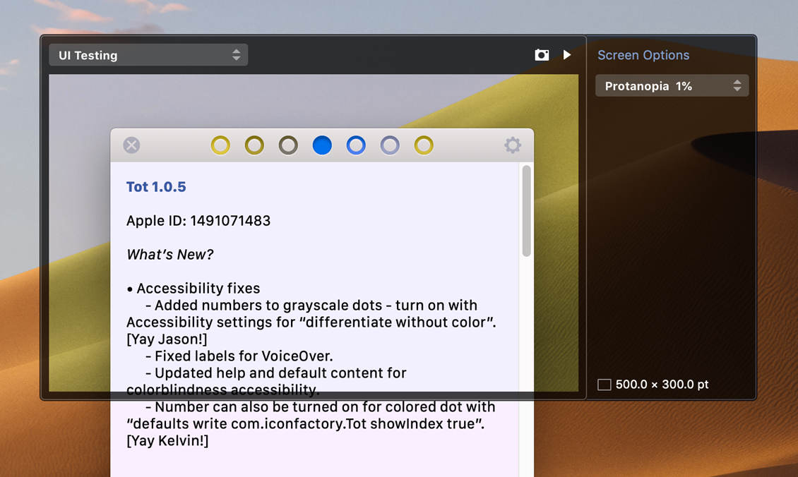
Luckily we have a tool that let me approximate what Jason was seeing. xScope’s vision defect simulator confirmed that Tot’s colored circles had serious issues. We had a new kind of accessibility problem and one that went to the heart of the app’s visual design:
This began an exploration on how Tot’s colorful rings could change, while keeping the existing “dot” metaphor, a strong visual navigation element.
Since we draw Tot’s dots in code, our first approach was to differentiate using shapes, much like iChat did many years ago. But varying the number of sides on polygons didn’t pan out: it felt impossible to quickly differentiate between a hexagon and pentagon. And the angles of a heptagon are just plain weird.
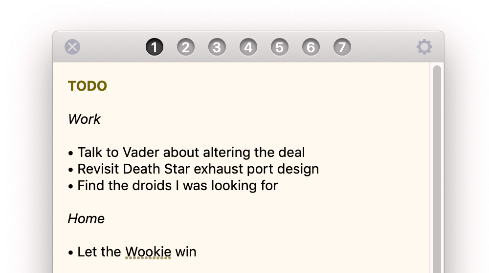
Then a lightbulb went on. We refer to dots by a numerical index as often as by hue. Numbers have unique shapes, and like color, are largely immune to localization issues.
Ged and I went through several iterations of this design. Initially, we thought that the colors and numbers could coexist, but that quickly led to issues with contrast.
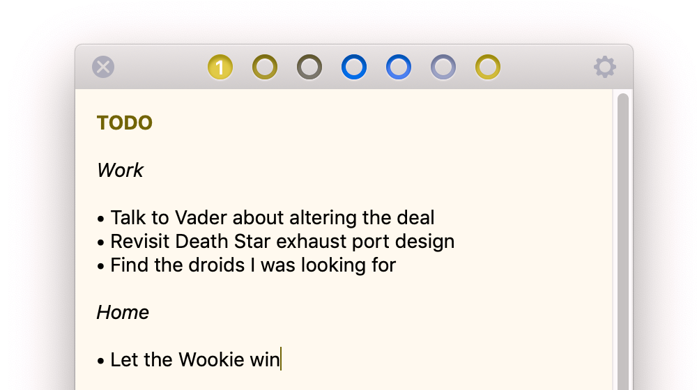
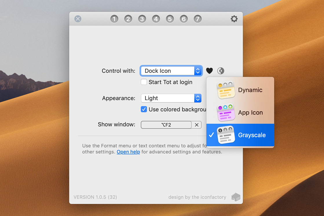
Eventually we landed on grayscale values as a good way to etch the dots into the app’s titlebar:
Implementing the same color accessibility on iOS was simple: we could reuse all our drawing code. Getting a boolean value for the customer’s setting on macOS and iOS isn’t rocket science.
It’s also a part of our DNA to make sure these changes make their way to the product’s desktop or home screen. As a result, there are now Grayscale app icon choices available in Tot’s Settings:
So while there may be little for the majority of you to appreciate in this latest release of Tot, there is something very important for those who need it. You will also see the benefits of our accessibility work as we continue to make that list of custom app icons longer :-)
We have a full list of the accessibility and other changes in the release. If this is the first time you’re hearing about Tot, take a look at its product page. Enjoy!

