Sometimes a design project can hit a roadblock and stall out – a point where for some reason it becomes difficult to leap over a certain potential solution in order to arrive at an even better one.
Brushed Pixel came to us for help with this very situation. They had developed a solid starting point for the design of their digital asset management application, Musebox, but enlisted our expertise in taking it further. The concept – a transparent cube containing a small tree – needed to be realized while at the same time ensuring the graphic treatment would work well within the macOS app icon aesthetic.
We decided to take the floral elements of their existing concept art and focus it specifically into a Bonsai cherry tree. These trees are both very beautiful and graphically distinctive at the same time, so it felt like a good choice.
Brushed Pixel wanted a decisive look for the tree trunk itself, so after building the cube container in a macOS style and palette, we started there.
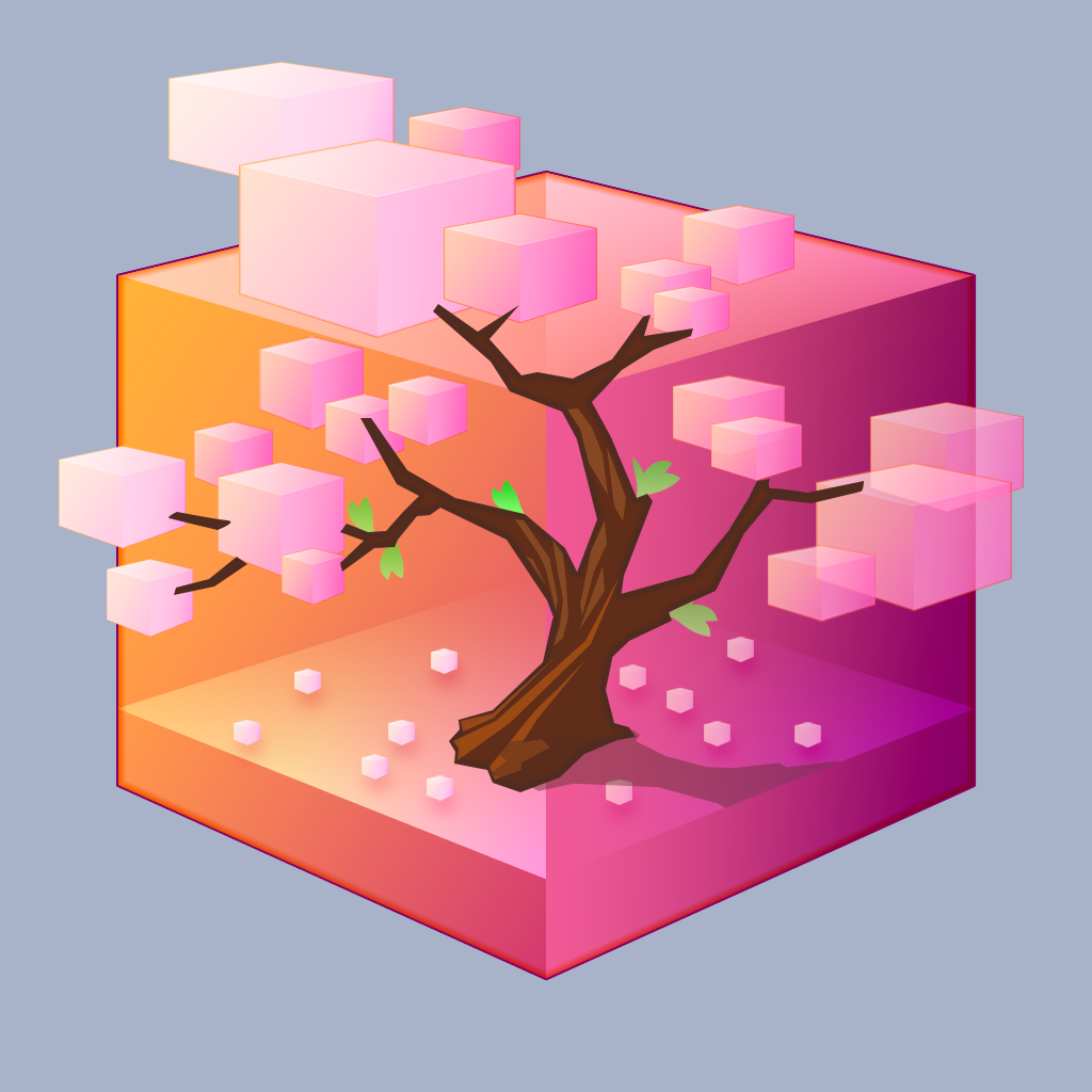
Some quick geometric shapes were suggested how we would populate the branches of the trunk. This graphic could be reduced to get an idea of how the overall design might appear when seen very small. Although the shapes were fun, they weren’t organic enough to be part of a design solution in this case.
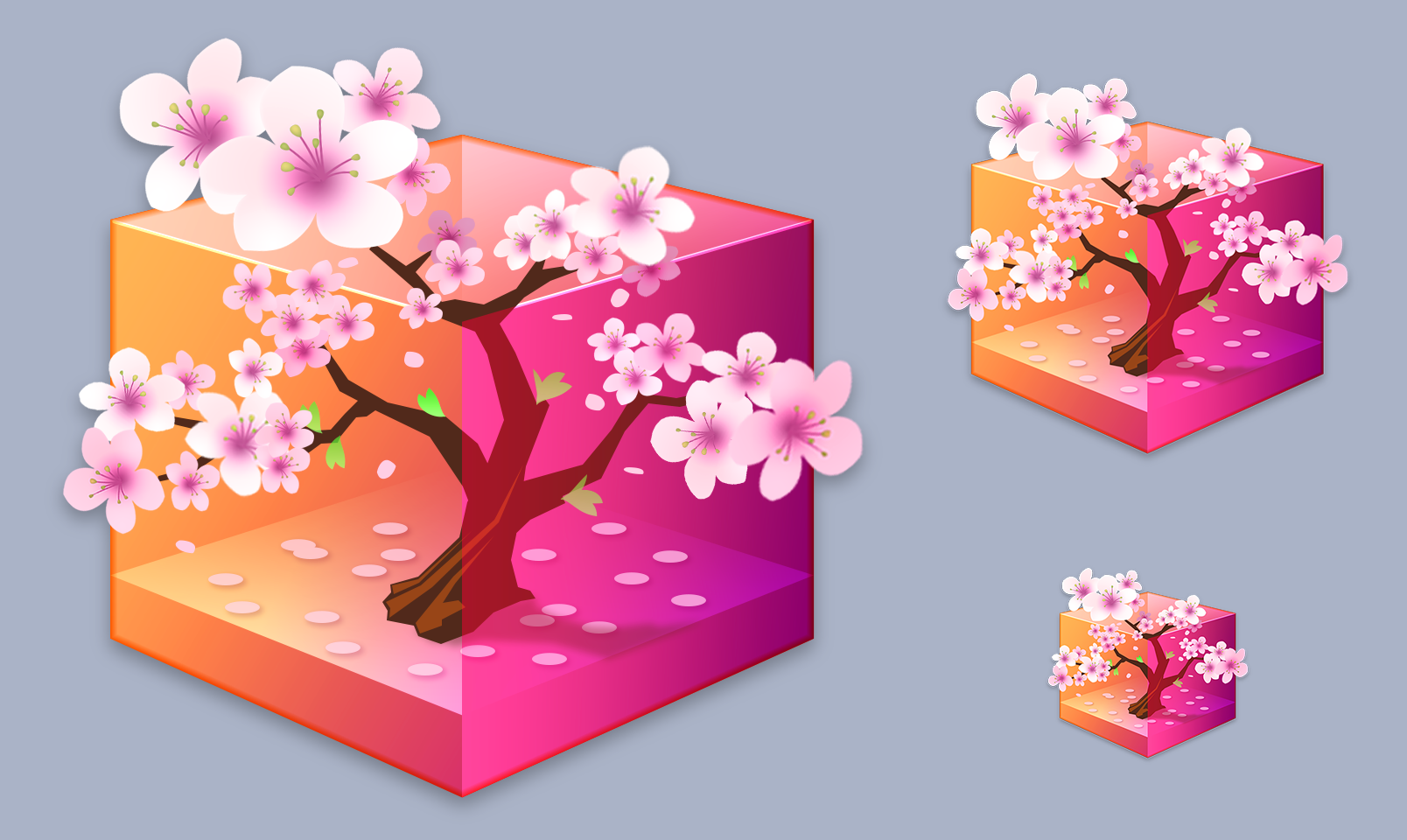
Next, a comp was created with further detail, showing more realistic blossoms in place. These were simply one blossom graphic that was transformed and repeated across the design, with a bit of shading added.
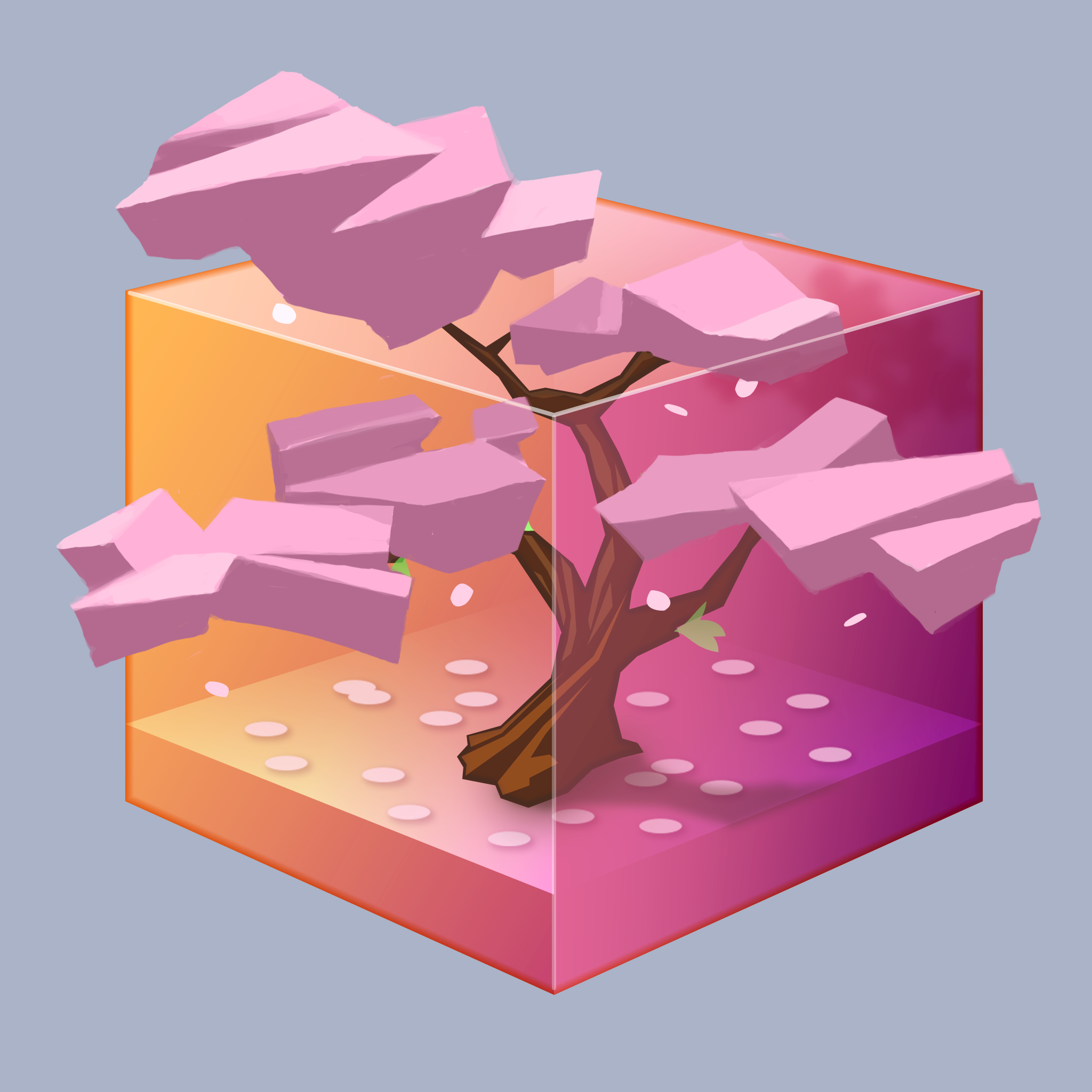
The client was pleased but felt the variations in blossom size might work against the realism. We also needed to make sure everything would still read well at small sizes, so a “volume and lighting” comp was roughly painted. This would be our guide in creating the different groupings of blossoms.
We received a green light for this approach, and next adjusted our vectors to replicate it in organic detail.
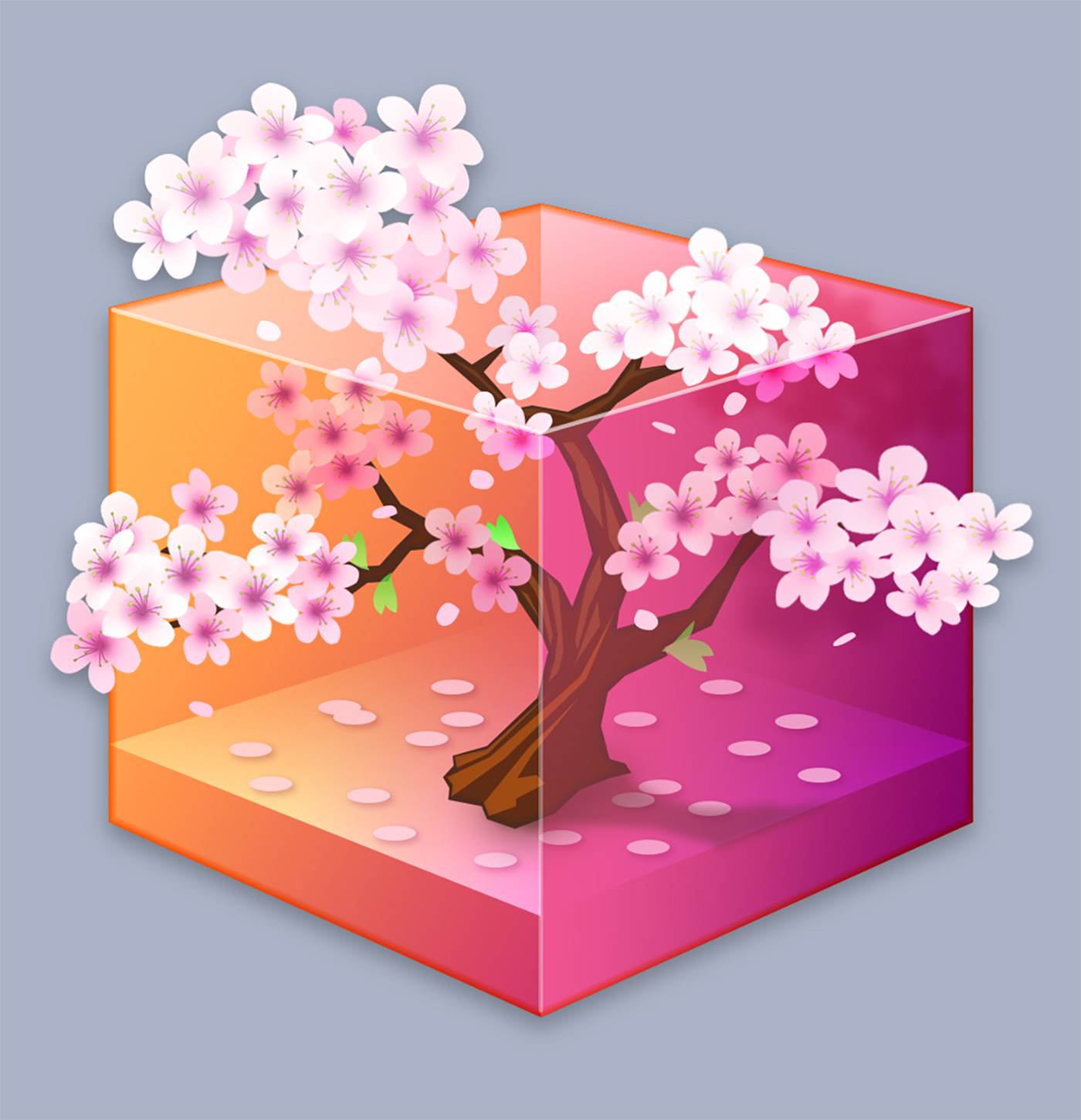
Creating every unique blossom in vector form was possible but daunting in terms of time and effort. The decision was made to hand-paint these elements, as well as the trunk itself, which would be much faster and would bring even more of an organic feel to the icon. Shading could easily be painted in on a clipping masked overlay in a non-destructive way.
The finished design combines the painted trunk and blossoms with the vector-created transparent box, with lighting and shading effects to suggest that the tree is growing outside of the boundaries of the container.
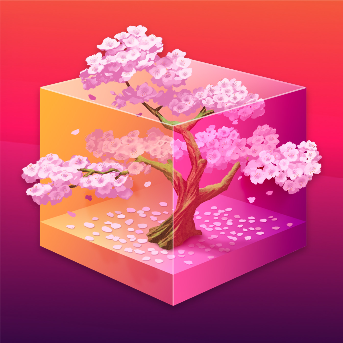
The public response to the Musebox icon has been fantastic! We’re very happy to have been able to provide what was needed to take the design the final distance to completion in the way that Brushed Pixel originally envisioned. If your team is looking to overcome design challenges with any aspect of your app’s development we’re here to help.