
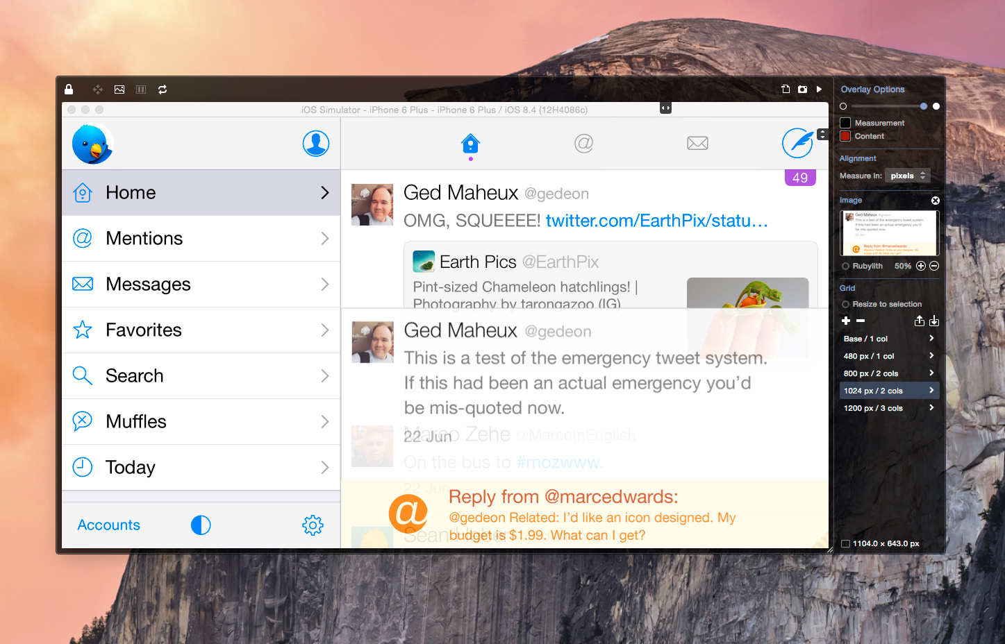
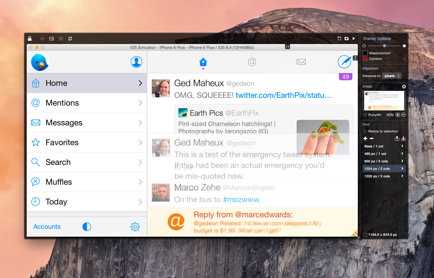
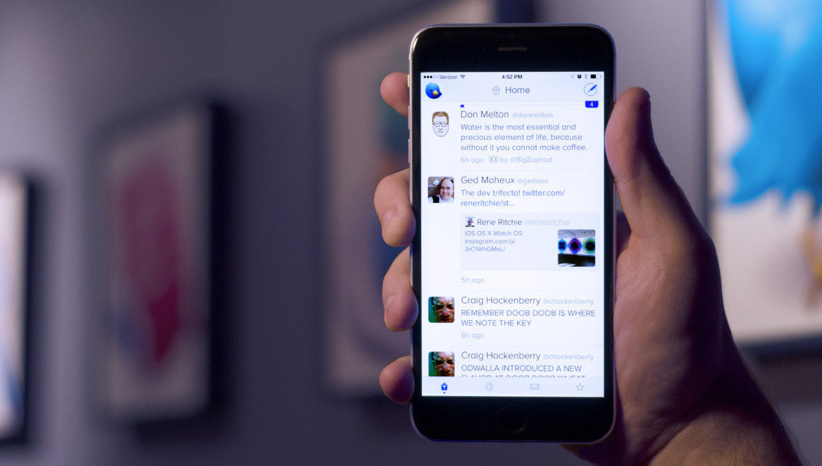
The latest update to Twitterrific builds upon previous releases and also adds a host of unique new features that users are sure to love. By far the coolest of these improvements is the use of Apple’s facial recognition APIs to improve image previews. What does that mean exactly? It means that as Twitterrific displays media thumbnails in the timeline (pictures, videos, etc), the app tries to detect faces and frame the thumbnail so faces are always showing. In short, if Twitterrific sees a face in a tweet, it tries to make sure you see it too!
The effect when scanning through your list of tweets in the timeline can be dramatic. Previously Twitterrific always framed thumbnails on the center of images, but many times people’s faces aren’t in the middle, especially on portrait shots. Check out these before and after comparison screen shots to see the difference facial framing makes in the timeline:

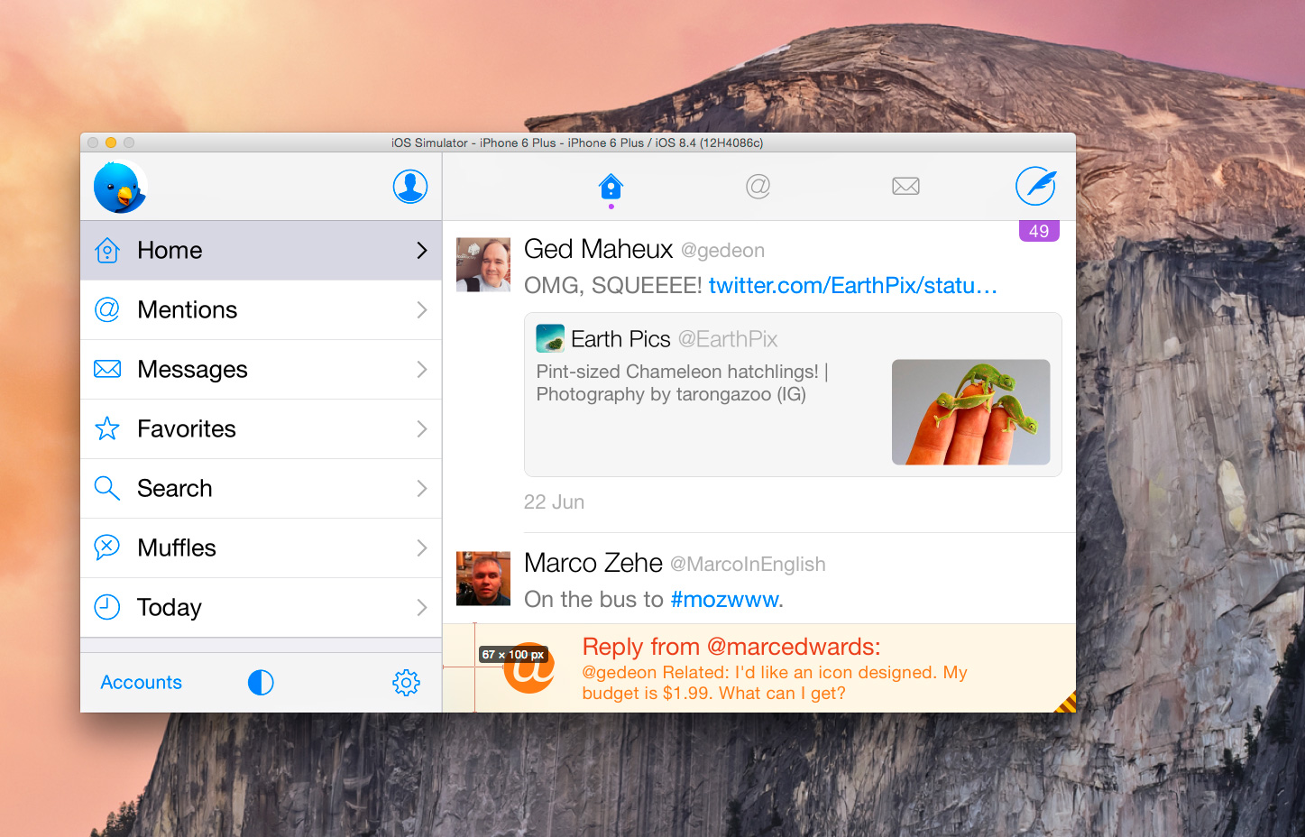
Next, we’ve added the long-requested ability to swipe to go back in modal views. Now when you’re viewing a conversation, user profile or even the in-app browser, you can swipe right from off the left edge of the screen to either go back to the previous view (if you’re in a stack) or close the view completely. This makes one-handed use on devices with large screens like the iPhone 6 Plus a breeze.
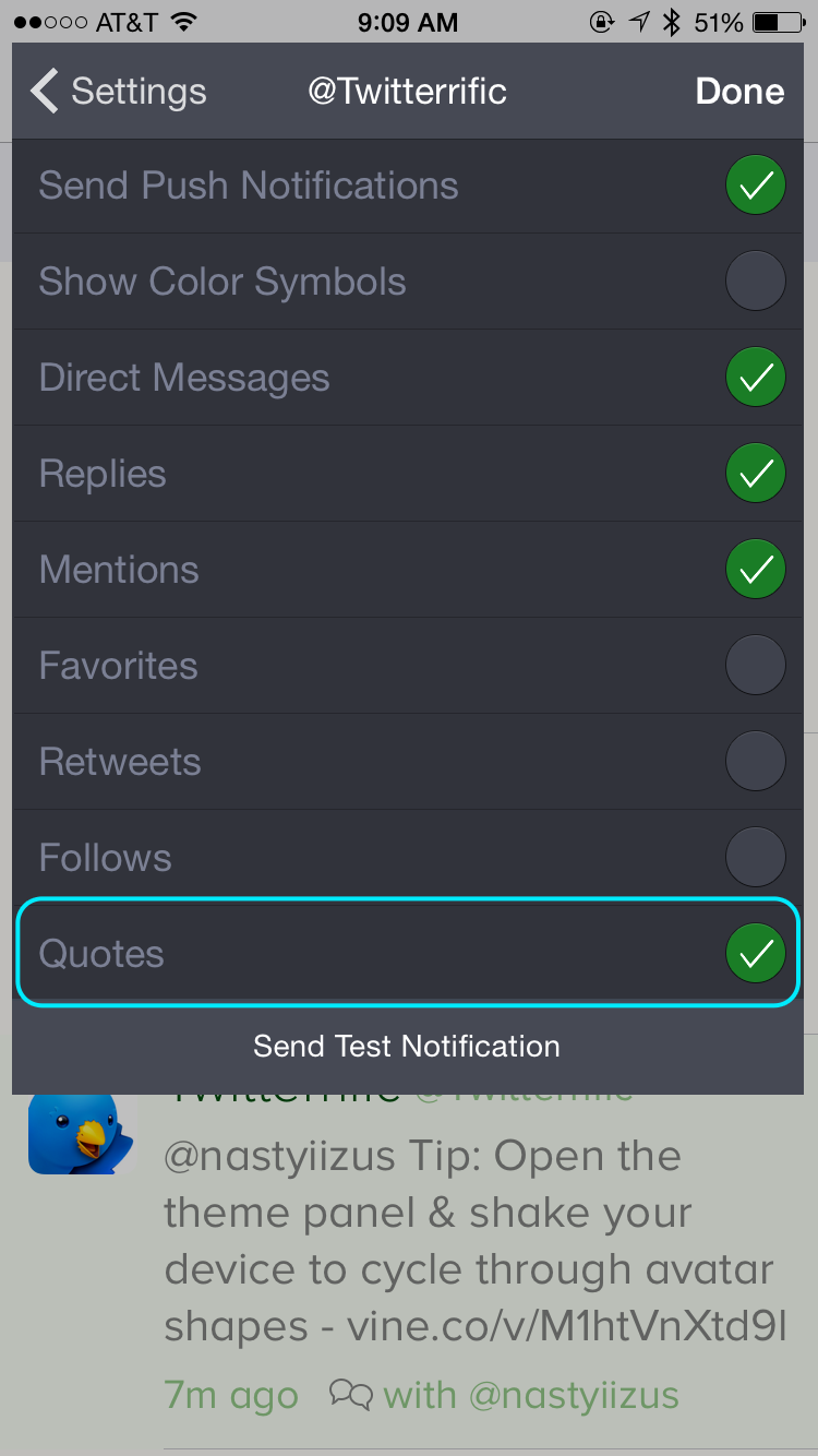
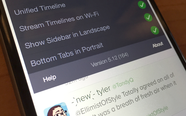
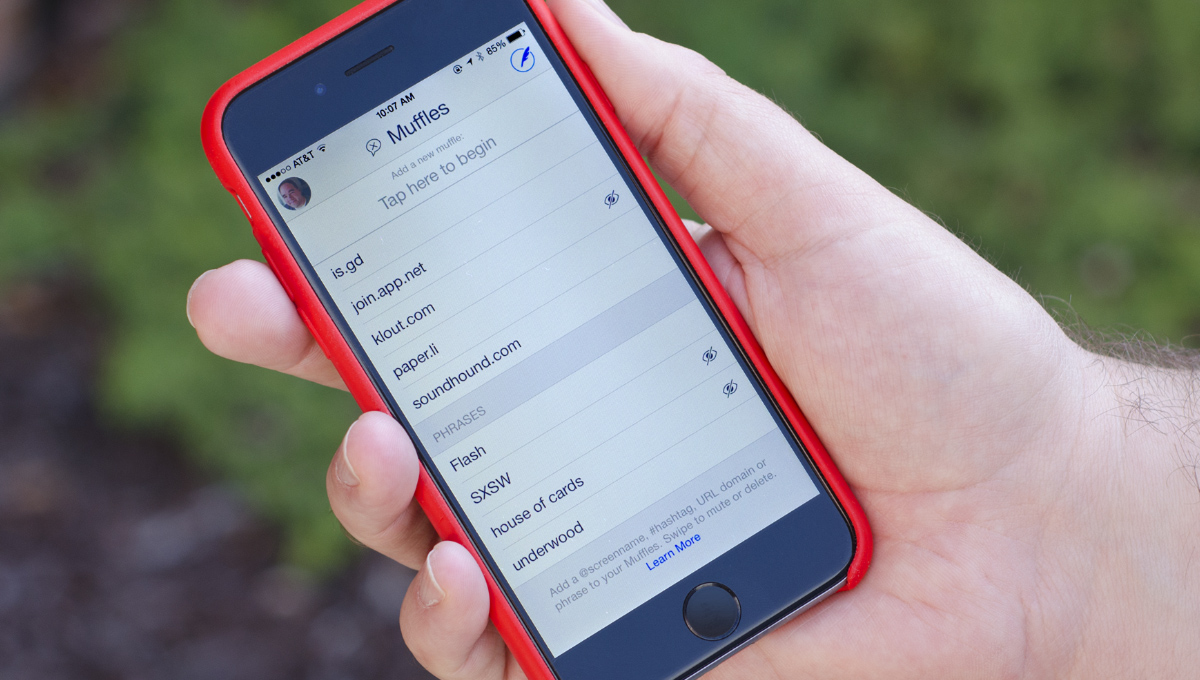
Finally, Twitterrific now offers push notifications for quoted tweets. Now when someone quotes one of your tweets to their followers, you can be instantly notified of it, just like mentions, retweets or any of the other notification types in Twitterrific. To turn notifications on for quotes, simply open the sidebar by tapping on your round user avatar, then tap the Settings gear icon at lower right. From there, access your account’s notification settings and make sure Quotes is activated.
As always, be sure to visit Twitterrific’s version history page for the complete list of new features, improvements and bug fixes. Twitterrific 5.12.1 is free to try via the App Store and is universal for iPhone, iPad, Apple Watch and iPod touch. Advanced features such as tweet translation, ad removal, and more are available via in-app purchase.


