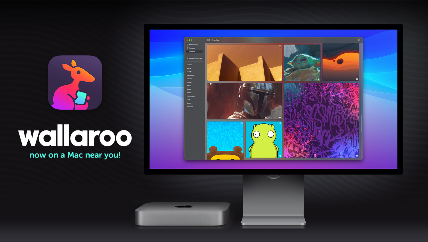
Last September we released a completely new app that makes getting wallpapers on your devices a breeze. Wallaroo was written entirely in SwiftUI. We learned a lot writing it and Sean Heber spent five days covering the highlights.
But this initial release was only available on iOS. From the get go, we had planned on making the product work on multiple platforms. So why no macOS version?
Put simply, we still had a lot to learn.
Introduction
In this blog series, we’ll again explore the challenges and solutions we encountered during our development, this time on the Mac.
A comment I made early on in our Slack channel got used repeatedly:
SwiftUI makes the hard stuff easy and the easy stuff hard.
We have a View in the app that uses SceneKit to display a 3D scene with a confetti flourish after a customer starts a subscription. I was expecting stuff like that to take a lot of effort to get working on the Mac. Instead, it ran 100% out of the box with no modifications at all.
And the stuff that I was expecting to be easy, like a settings view, buttons, and menu commands, turned out to be hard. To put that “hard” in context, it took me about a month to go from an app that we were proud of on iOS to one that we were equally proud of on macOS:
You’ll see a lot of problems with SwiftUI mentioned in these posts, but the overall experience was wonderful. This new way of building apps gets a wholehearted recommendation from our entire team: designers and developers alike.
We also found that many of the issues encountered on macOS were things we had done wrong on iOS. Porting the app to the Mac made both platforms better. We’re also rethinking our View architecture so things that are currently Mac-only can be used to improve the iPad experience.
I’d encourage you to look at Wallaroo on both iOS and macOS. It’s a FREE download and will give you context for some of the choices we talk about in the following sections.
You’ll also want to check Apple’s own sample code for creating a macOS app using an iOS app as a base. Unfortunately, I discovered this excellent tutorial towards the end of our project. I’m sure that we’re not the only developers who were oblivious to the needs of macOS while creating a codebase for iOS. Apple’s sample project can help if you’re just starting out on iOS with macOS as a future goal.
One final thing before I finish up this summary: everything that follows was originally recorded in Tot. The bullet points in some sections reflect that — it was easy to create a short snippet with the thought of “someone else will need this”.
The SwiftUI team at Apple has also shown a great willingness to receive feedback and I was happy to provide these bullet points of real world experience. In turn, a lot of what you will read below was shaped by their feedback.
(And if you haven’t discovered Tot as a way to keep track of what you’re doing, get with the program! It’s a FREE download and makes a great addition to your development toolkit.)
So let’s get started. Here are the things we’re going to cover in the coming days:
- Expectations – Stuff that doesn’t work like you think it will.
- Ugly Code – You hate writing it, but do it anyway.
- Non-Obvious Things – Surprises along the way.
- Mac-assness – Fit & finish for the desktop.
- Tooling Problems – Tools and frameworks aren’t perfect, you know?
- TestFlight – The last major hurdle.
- Documentation – Knowing what you don’t know.
Expectations
We all have expectations on how things should work based on our experiences on iOS. A lot of those assumptions don’t hold true as soon as you start working on macOS.
As we work through these issues, I’ll be using a sample project called SwiftUITest — this blog post is a narrative, but you’ll want to see the details, too. Download the code, build for iOS and macOS, and when you see this breadcrumb trail:
You can open the SwiftUITestApp file, look for the ContentView in a Window, and check out the .onReceive view modifier. In some cases there is conditional compilation or a configuration variable that let you compare approaches: tweak to your heart’s content!
#if os()
You’re going to have platform-specific code. More than you realize: certainly more than I expected!
Sometimes this check is just to skip over an API that’s iOS-only. Sometimes it’s to fork huge swaths of code. These directives are unavoidable, but you should be careful about where you place them: they can make code hard to read and a future maintenance burden.
I ended up doing a lot of #if os() refactoring towards the end of the project. You’ll use them with abandon at first: it’s a good idea to rein them back in as you start to see patterns emerge.
Scene Out of Phase
One of the first things you’ll encounter is in your app’s Scene body. On iOS, many apps use the scenePhase environment variable as a way to know that a customer is about to see the app. ScenePhase.active is where things get refreshed and new state is established.
But on macOS, a Scene only becomes active when a window is created. Conceptually, this is a very different state than on iOS. It’s likely that you’re more interested in knowing that the application has become active.
We accomplished this by observing NSApplication‘s .didBecomeActiveNotification and using this as a point to refresh models. Another code path for iOS continued to do the same thing with Scene.active — which means we’re approaching that code smell of refreshing our model in two places. This is what I was talking about in the previous section: #if os() is your friend, but can also be your enemy.
Windows or Not
One of the things in your iOS Scene is a WindowGroup. On macOS, as on iOS, this gives you multiple windows, each with their own ContentView.
But on macOS, you have a new option: Window. This creates a “single, unique window” — for many iOS apps this is a better choice. You’ll see a lot of recommendations on developer websites to replace CommandGroupPlacement.newItem with an empty implementation because early versions of SwiftUI didn’t have Window. If you need to get rid of the “New” menu item, the new single window instance is a better choice.
It was for us, and guess what? It’s an #if os() fork!
In our experience, the App body is a good place to have platform-specific customizations. Not only will you be having a different container for your ContentView, but you’ll also need separate delegate adaptors, a place to handle menu bar commands, a mechanism for URL processing, and many other tasks.
ScrollView, Still
Our well documented trials and tribulations with a PagingView continued on macOS.
We’re using a TabView as a way to switch between Content and couldn’t find an easy way to swipe. We also found the paging dots that we had implemented at the bottom of our custom View were too small as a click target, so we added big arrows to move between images.
A nice little addition we made here is a keyboard shortcut on the arrow Button:
.keyboardShortcut(.leftArrow, modifiers: [])It’s one line of code and it acknowledges that every customer who will use this app can interact using a keyboard.
Swiping would obviously be nicer for devices that have a trackpad capability. Ideally there would be a way to detect this via the environment and adapt the View layout accordingly. We have submitted feedback for this: you should, too. (FB12071140)
Buttons! Is This a Prank?
The first time I ran Wallaroo on macOS, I saw this:
I had no idea what was going on here, and thought we had a lot of work cut out for us. We thought SwiftUI was going to make things easier! This was depressing and I lashed out in frustration. (I regret that tweet and the length of this treatise may be related.)
Then I added one line of code that fixed everything!
.buttonStyle(.plain)If you look closely at the screenshot above, you’ll see that macOS is drawing a bordered button with a fixed height by default. It’s doing the right thing, but it’s also the unexpected thing.
Buttons can be too platform specific when a developer is bringing an existing app to macOS. This is compounded by our assumptions about how buttons are rendered and ends up causing major layout issues.
We’ve been reading the Human Interface Guidelines for years and know that buttons on macOS should have borders. But those baked-in borders cause issues when you have an app designed around buttons without borders. To wit:
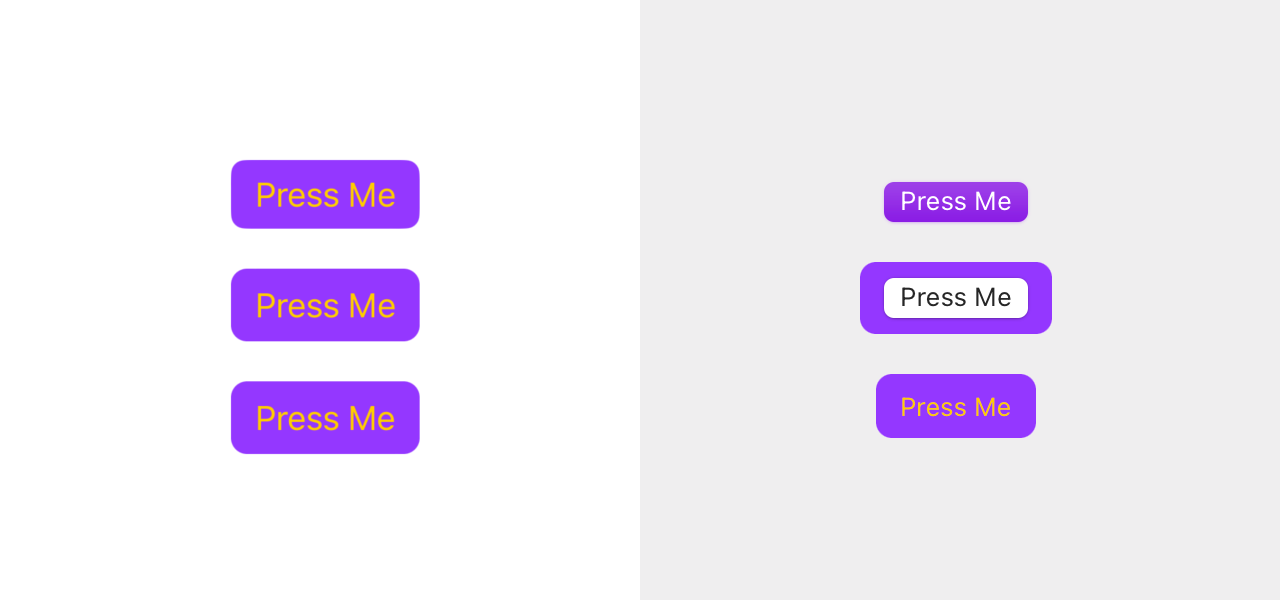
The buttons on the left use common iOS techniques like prominent borders and backgrounds with RoundedRectangle.
And like all of you, we’ve copied “solutions” from Stack Overflow that are just plain wrong. You may be looking at that middle button on the right and saying “hahaha SwiftUI is so dumb!”. Instead, it’s me who’s dumb.
Additionally, these buttons appear as a part of an integrated whole: the top-right example on macOS looks correct in many places, but if you have a finely tuned iOS user interface, chances are good that it will stick out like a sore thumb.
The solution in these cases is to use a custom button style. With the right configuration, you can get something that makes sense on both platforms. The lower-right macOS button is an example.
One thing we found with our custom button styles is that the 12 point corner radii that we were happy with on iOS looked too chunky on macOS. Buttons on the Mac have an 8 point radius, so we split the difference and went with a 10 point radius on both platforms.
As soon as you start making buttons that look like they do on iOS, you want them to work the same, too. If you expand a button .frame on macOS it expands the container, but it does not expand the clickable area. The solution is to change the label frame width instead.
If that “wider button” uses a clear background, the clickable area doesn’t change. You have to use .contentShape(Rectangle()) to have a click register.
Buttons in a .grouped Form are rendered as bordered buttons without any extra style. A lot of the other elements in that Form conform to an iOS appearance (such as Toggle changing from a checkbox to a switch). It feels like form rows with Button content should get a tint and extend the width of row (and highlight it when clicked). This is where we discovered the “wider button” issues mentioned above. (Feedback submitted: FB12071157)
A related “button” issue is with Link in a Form. Its .tint can’t be adjusted, so you try to use .foregroundColor and find that you lose the highlight while the mouse is down. Links that don’t highlight are bad, and so is blue text that appears in the middle of a well crafted UI. Luckily you can use a Button, buttonStyle, and openURL to solve the problem.
One final Button difference on macOS – they don’t change size because there is no accessibility setting to set Dynamic Type. This does not excuse you from testing for accessibility: more on that later.
Settings Ouch
After the shock of seeing buttons subsided, we opened our Settings view. It’s a View that’s presented as a sheet on top of the main ContentView. Things were not looking up:
The first problem here was relatively easy to fix. That wonky layout was caused by using the wrong container. All our settings views were Section in a List on a NavigationStack. Something like what you see in the ListView of the sample code.
The easy fix here was to change the List to a Form and add the .formStyle(.grouped) modifier. This immediately gets you a look that matches what you see in Ventura’s System Settings.
Then we had a new problem: it wasn’t possible to push a view onto the NavigationStack while it was presented in a sheet. (This has since been fixed and is in the latest macOS beta release.)
We started looking at alternatives and explored a Settings window style recommended by the HIG. It was quickly apparent that this wasn’t going to be a good solution for our preferences — and it would be difficult to implement.
Why?
A View on iOS is designed to fit in a ScrollView which can vary widely depending on the size of the device and text display settings. These views tend to be vertically oriented with multiple levels of hierarchy.
On the other hand, traditional macOS setting panes are laid out horizontally, with a fixed size, no scrolling, and only a single level of hierarchy. We also found that naming the panes was problematic: the names we used were long because they could take up an entire Form row on iOS. But there is little space below the icons in a traditional window toolbar.
As a result, this was another area where we did a big #if os() fork. Luckily, the only thing that needed to change was the top-level View presented as a .sheet. We used a NavigationSplitView for the setting items in the left sidebar and the views we had created for iOS in the detail view (sized approximately as they would be on the iPad).
Not being able to push content on the detail view turned out to be a blessing in disguise. We found that a flatter navigation hierarchy (like with a traditional settings window) worked better for finding what you need. One of our complaints with the Mac’s new System Settings is that it’s easy to get lost: flat navigation prevents that.
The result is reminiscent of the System Settings in Ventura with a .cancellationAction ToolbarItem to make it feel at home in a Mac app. It doesn’t follow the HIG and we don’t think anyone will care:
This new settings layout, with a NavigationSplitView, also feels like something that we’ll want to adopt on iOS, especially for the iPad. A case of a SwiftUI change to accommodate macOS that benefits all platforms. And we get to remove an #if os() check during the refactor.
Commandeering the Menu Bar
Now that we’ve covered two of the hardest things in making a Mac app, buttons and settings, let’s look at a harder one: the menu bar. One of the easiest things in AppKit is complex in SwiftUI. Making a menu bar item do something is painful.
(See what I mean about that easy/hard comment popping up a lot?)
Your Window or WindowGroup view will have a .commands modifier where you supply CommandMenu implementations. That’s straightforward and easy to implement.
But you eventually have to make that menu do something. It took me three days to hook up a Save menu item and have it work reliably.
Mapping CommandMenu to view state is confusing. To me, it feels like the binding relationship is backwards: views should have a way to establish a relationship with the menu bar commands. Instead FocusedBindings and FocusedValue establish a relationship from the menu to the view.
When I first started looking at FocusedBindings it looked like they would cause a lot of changes in model objects to make them Observable (they didn’t adopt this protocol because the information is static). I also found FocusedValue to be incredibly fragile on views that aren’t controls and have Content whose state changes asynchronously. FocusedValue on an Image is fine. FocusedValue on a cached AsyncImage is not.
Focus elements also behave differently based upon the user’s setting in System Settings > Keyboard > Keyboard navigation. If you’re using the Tab key to move between the controls, the view you worked hard to make .focusable is not.
To make matters worse, iOS developers have never even seen this navigation method: it’s only supported on macOS, tvOS, and watchOS. There’s a huge learning curve for something that honestly doesn’t work very well.
At the end of my three days of frustration, I put some state in an EnvironmentObject and exposed that to the CommandMenu. When the state was right, the menu item was enabled and a notification was posted when the item was selected. That notification was received by the View and the file was saved. Not proud of this code, but it felt good to be done battling the focus system.
I love the way .keyboardShortcut can be attached to any View: I’d love to see something similar for menu commands. Feedback submitted (FB12071179).
Whew!
We’re at a good place to stop for a rest. We covered a lot of the difficult stuff today, so good work making it here! More tomorrow in Part 2…