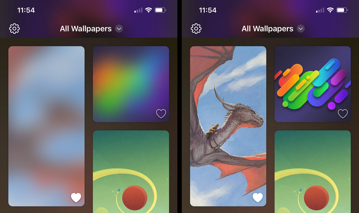
In the last post, I talked about overcoming some issues with Wallaroo‘s main gallery view, but unexpectedly even the simple wallpaper detail screen held its share of challenges!
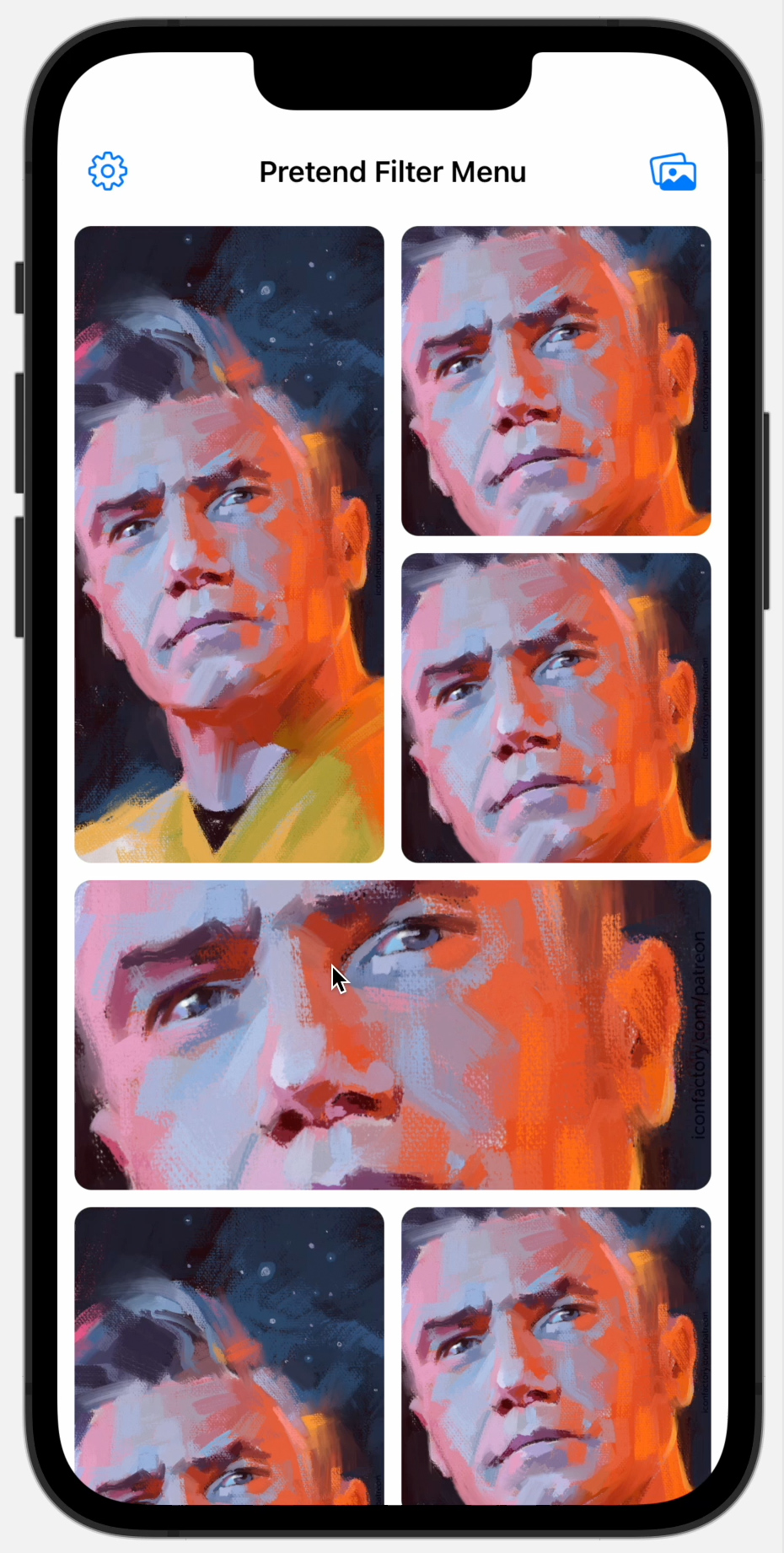
The biggest surprise for me was how much trouble I had implementing the paging view to swipe left and right between wallpaper variants. In UIKit it’s trivial to enable paged mode on a UIScrollView to get this behavior, but I couldn’t find a way to do it in SwiftUI for some reason. I ran across a bunch of tutorials that were manually implementing panning gestures and paging and I was flabbergasted. Did I really need to do all of this myself from scratch?
I tried a few different open source paging view implementations I found on GitHub but they were all lacking in one way or another.
The most glaring problem with them tended to be that the scrolling physics felt entirely wrong. The swipes didn’t have the same momentum that Apple uses everywhere else and the resistance on the rubber band effect (if it even had it) was never quite right. I started going down the road of adapting one of the better ones with more correct physics after I discovered this gem of a project which meticulously deconstructed the formulas necessary to get an Apple-like scroll view feeling. Still, though, nothing about this approach felt right.
Eventually I decided that maybe I should just wrap a UIScrollView to accomplish what we needed and started to dive into that.
I was pretty far into this when I accidentally stumbled across a Stack Overflow comment noting that SwiftUI actually does have a native paging view – it’s just cleverly hidden as a TabView style!

OMFG.
I wasted most of a week on approaches to this before I managed to discover that, lo and behold, SwiftUI actually does have a way to do it – and it’s a single line of code: .tabViewStyle(.page).
I was supremely pissed off at myself for somehow missing this. Despite all of my searching, I never managed to notice any reference to it in the documentation and apparently didn’t remember anything about it from any of the WWDC videos I had watched, either. I suppose perhaps my search terms were too laced with an assumption that it’d be a part of ScrollView somehow or that it would exist as its own view?
I soon learned that SwiftUI didn’t always include support for a paging view – which is why there were so many outdated tutorials and open source projects out there for me to accidentally find instead of the official API. Argh.
SwiftUI changes so much every year and I can’t count the number of times I found an accepted Stack Overflow answer for a thing that was completely wrong as a result. (This is also true of Swift itself – although it’s getting better over time as they’ve become more resistant to source breaking changes.)
There’s also something off about how SwiftUI documentation is written and organized. It frequently feels next to impossible to find the name of whatever view modifier you might be needing unless you more or less already know what you’re looking for. To make matters worse, the fact that SwiftUI’s view modifiers almost all exist as function extensions on View means just pressing the period key and browsing autocompletion suggestions tells you nothing about what might or might not make sense to use in your current context.
The plethora of tutorials, Medium articles, YouTube videos, and books also mostly have a feeling of “magical thinking” to them – as if you just need to memorize incantations to spells rather than learn any of the actual science behind the effects you are trying to achieve. I find that aspect of the SwiftUI ecosystem extremely frustrating and disappointing.
All together these things make SwiftUI feel very difficult to learn and master.
So anyway, after discovering TabView‘s support for paging, I threw away everything I had been working on for a week and used it instead.
Unfortunately it is extremely buggy.
I don’t want to get in to every single problem I ran into with it or this blog series would be about three times longer than it is already, but suffice to say there were a lot. My source file has 6 different bullet points of issues I ran into!
Luckily I was able to workaround them all (one dumb issue was needing to wrap the TabView inside of a ScrollView with scrolling disabled in order to get it to stop jumping around when it first appeared which then of course ended up requiring a second workaround to fix an issue with that workaround…), but the worst, by far, was a memory leak/retain cycle!
We discovered the memory problem around the time I was working on the AsyncImage replacement I mentioned earlier. I had implemented various caching schemes for the images and I kept modifying my approach because it turned out the app was eating RAM and the most obvious culprit was the cache. In fact the initial reason I ripped most of the caching out and revisited it was in an attempt to hunt down this leak!
Unfortunately even with all caching removed I was still seeing a huge memory leak somewhere. I tried using Instruments to find it, but I had no luck deciphering where it was coming from – other than to see confirmation that memory was indeed leaking like crazy.

I spent two days on this problem.
I don’t mean two work days – I mean pretty much two entire days stopping only for food and sleep.
I was trying everything I could think of to narrow it down. I first started by commenting out random stuff and manually running through the very long sequence of events I had found that could reliably consume the memory. Over… and over…. and over… (And over and over and over…)
Eventually I discovered (around 1am on the second day) that using a selection binding on the TabView was keeping the entire TabView instance alive somehow even when the view that contained it was destroyed.
So over time, after viewing a bunch of wallpapers and scrolling through the variants, all of those huge images were staying in memory even when you went back to the gallery view and loaded a different wallpaper! Slowly, with regular usage, the consumed memory climbed and climbed until iOS killed the app.
My paging view was its own standalone view that had a TabView inside of it. To expose the currently selected tab to the wallpaper details view, I passed in a binding which was in turn used by the TabView. Somehow, though, this is what was causing the problem because when I commented that part out, it wouldn’t leak – but I needed the selection binding to be passed along from the detail view to the inner TabView somehow!
On a whim I tried doing something more indirect and added a new state variable to the paging view which would hold the selection and passed that to the TabView as a binding instead. Then I used .onChanged to note when the selection state variable changed and updated the original binding that was passed into my wrapper view from outside. This appeared to break whatever retain cycle was happening.
I don’t know exactly why this worked (I can only speculate), but some part of my tired and sleepy brain thought to try it and it turned out to solve the issue in the end – but not without some pretty serious frustration and anger.
I feel like I should send Apple a bill for the pain and suffering I endured on this one.
Since this caused me so many problems, I decided that I would share my PagingView code to maybe save someone else some time or see if anyone has any better ideas. (And if we’re really lucky, maybe a SwiftUI engineer will see this and fix it!)
Now that this rather unexpected battle with the paging view was behind us, we were surely on the homestretch! Wallaroo was nearly fully functional – except for one minor detail…