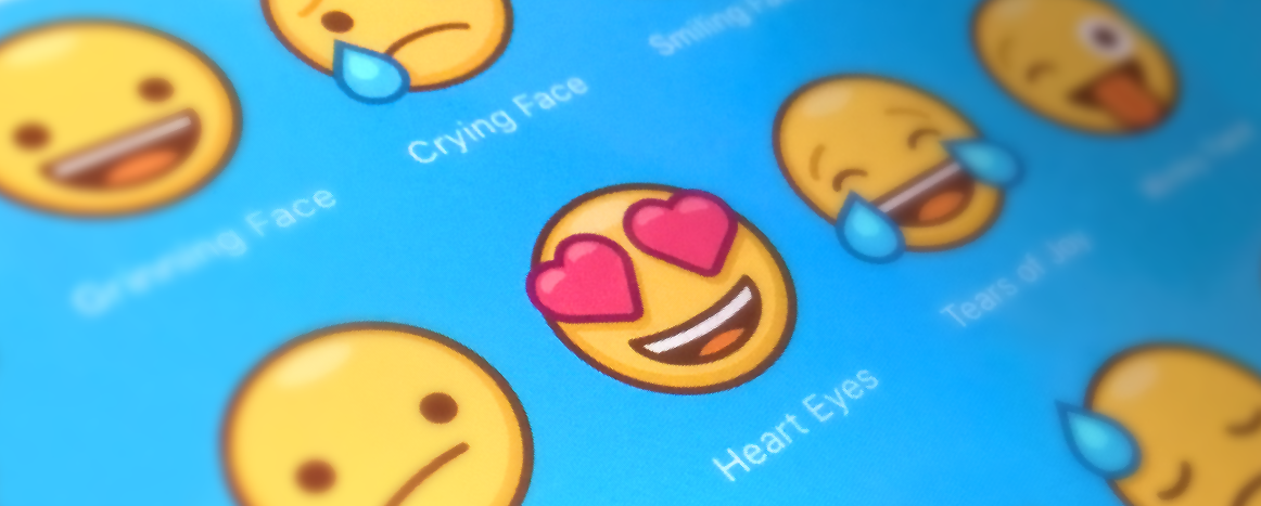
You’ve heard of Emoji and use them every day, right? Even an old fuddy-duddy like me has swapped out :-) for 😀.
Something just as big is about to happen on iOS and they’re called “stickers.” When Apple touts them in the first sentence of the press release, it’s a pretty good sign of things to come.
Over the past several years we’ve been designing Stickers for clients, but it wasn’t until after the WWDC keynote that I realized Stickers share an important trait with Emoji. Both became a huge hit in Asia first and then that popularity carried over to North America and other continents. People are people and we love to communicate visually — it’s easier than typing and has a lot more personality!
This development has some significant ramifications for our business. This includes the apps we sell on the App Store, the apps we develop for others, and the design we do for clients.
But more importantly, it’s also going to affect your business…
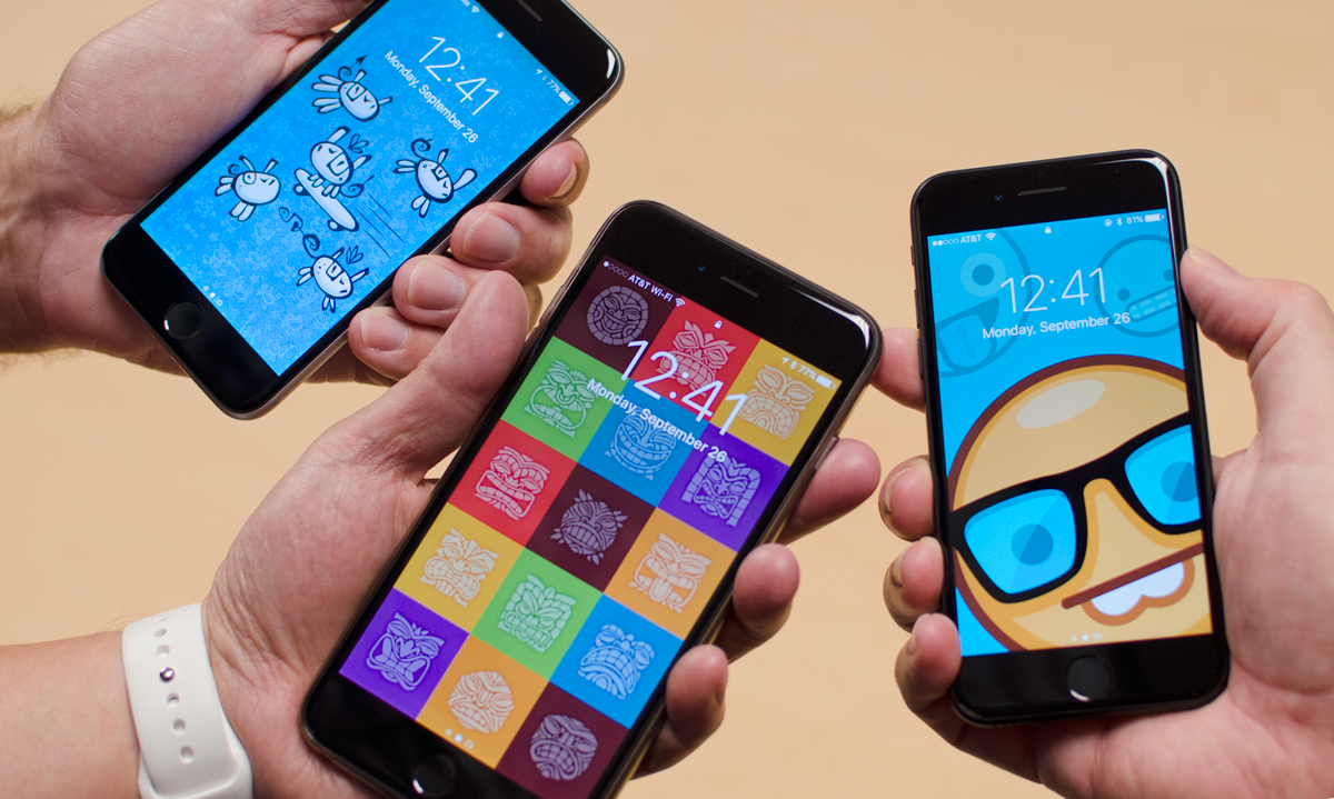
What are Stickers?
The first step in understanding Stickers is looking at how they’re already being used in Asia. This overview by Connie Chan at Andreessen Horowitz is essential for understanding this trend in popular culture.
In the Line chat app, Stickers are a $270 million a year business. With numbers like these, it feels more like selling accessories to personalize your phone than the software we’re used to providing on the App Store.
Stickers have created new marketplaces for selling artwork, added a new dimension to character development and storytelling, and given brands a fantastic way to attract attention for products.
And you’re about to see the same thing happen here in North America.
Taking Advantage of Stickers
One of the easiest ways to leverage the power of this new medium is with promotional material. If you want to build buzz for a project, think Stickers!
Promotion is all about getting people to talk about your product. There’s no better place to do this than in a chat application like Messages. Instead of brand awareness in the one-to-many model of Twitter or Facebook, you’ll be using the one-to-few model of messaging. It’s more personal and more powerful.
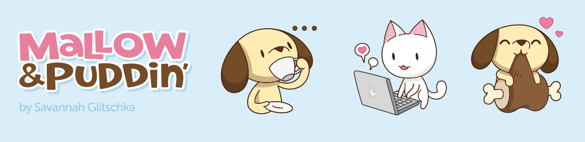
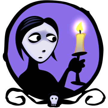
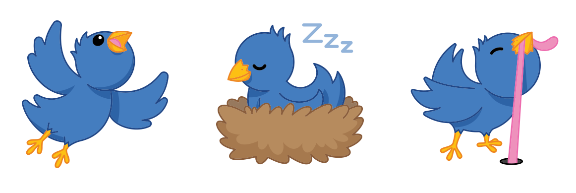
Imagine you’re a movie studio with a summer blockbuster coming up. How great would it be to have people exchanging graphics like this or this during the run-up to the release? People will learn about the films during the normal course of conversation.
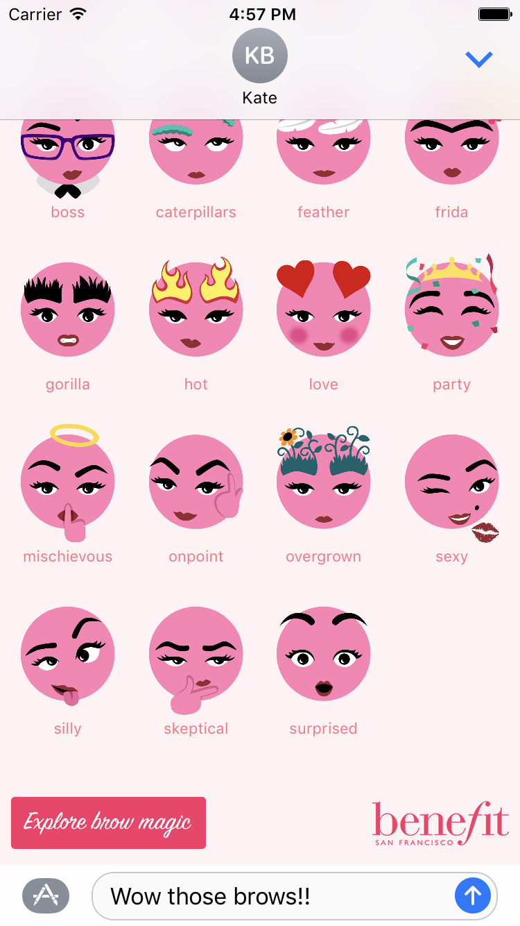
Don’t think this kind of promotion is limited to multi-million dollar budgets. We’ve seen that Stickers are a great way for smaller brands to raise awareness. Want to sell products to young people who have grown up with texting as a primary form of communication? Follow the lead of Benefit Cosmetics.
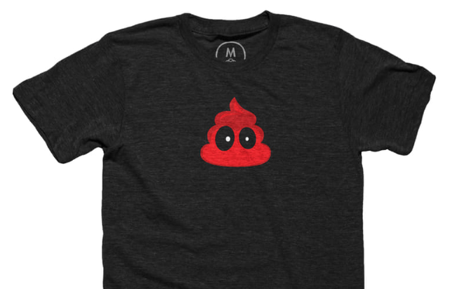
Even developers who sell traditional software on the App Store can take advantage of Stickers. If there’s a choice between a FREE app that has cute graphics embedded versus one that does not, which one do you think customers will download? Yeah we’re on that.
And if you’re a company that already has a well established presence on the App Store, imagine the ways you can delight your customers with chat images bundled in your next app update. With all all the work we’ve done with Emoji, we often get inquiries about doing “custom Emoji” for apps. Brand managers, Stickers are your answer.
Let Us Help
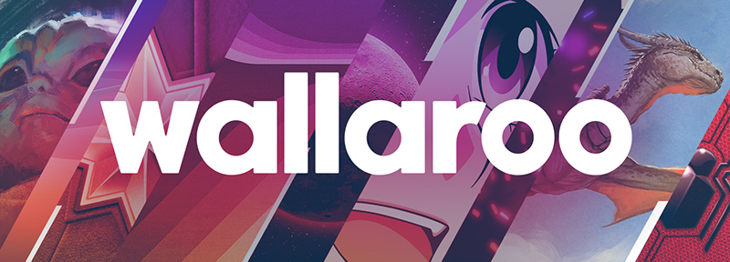
As you can see, the Iconfactory is well equipped to create Stickers. We’ve been designing these kinds of things for over 20 years. We’ve also been on the App Store since day one.
It shouldn’t come as any surprise that we have our own Sticker packs planned for the iOS 10 release. While creating these sets, we’ve learned a lot about how this new technology works.
There’s a lot you can do to transform Stickers from a static experience to one where customers interact with the brand or product itself. For example, imagine a pack for Star Trek or Indiana Jones with buttons that let you see a preview and order tickets.
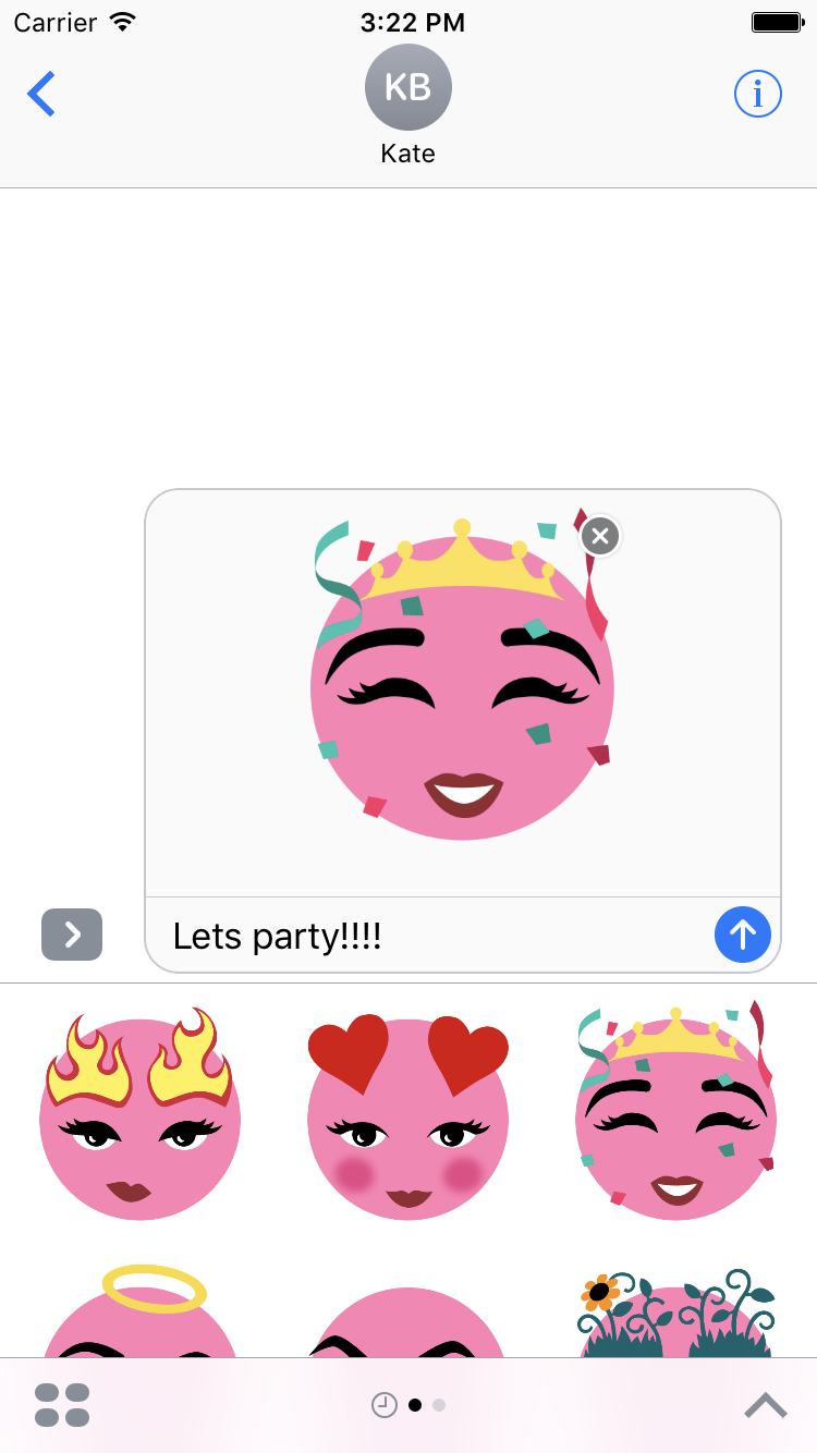
Or how about a Sticker set that lets a gal pal know it’s time to get her arches in line by sending some flaming brows? The Sticker image is your entrée into a larger conversation with your customer.
If Stickers sound like something that can make your product shine, while boosting loyalty and awareness, we’d love to hear about it!