
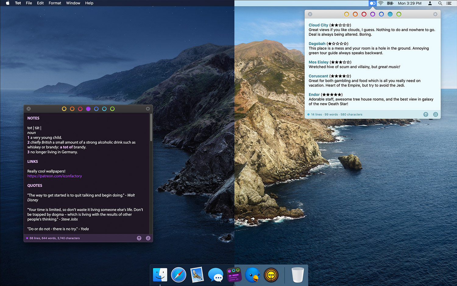
We’re happy to announce a new version of Tot with some features frequently requested by the app’s legion of fans.
The main focus of today’s release are system extensions that allow Tot to co-exist with other apps. To this end, we’ve added a Sharing extension for both iOS and macOS. Additionally, there’s also a widget for iOS that lets you quickly access any of Tot’s dots. Like everything else in Tot, attention was paid to minimizing friction, allowing information to be collected as quickly as possible.
These new extensions are easy to set up:
- On macOS, go to System Preferences > Extensions > Share Menu and enable the checkbox next to Tot.
- On iOS, use ⋯ in the Share sheet’s list of app icons to add Tot.
- On iOS, use Edit at the bottom of widget view to add Tot.
Once enabled, you can share any text or link with Tot. Here are few ways we’ve started using the functionality:
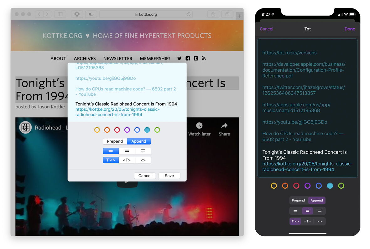
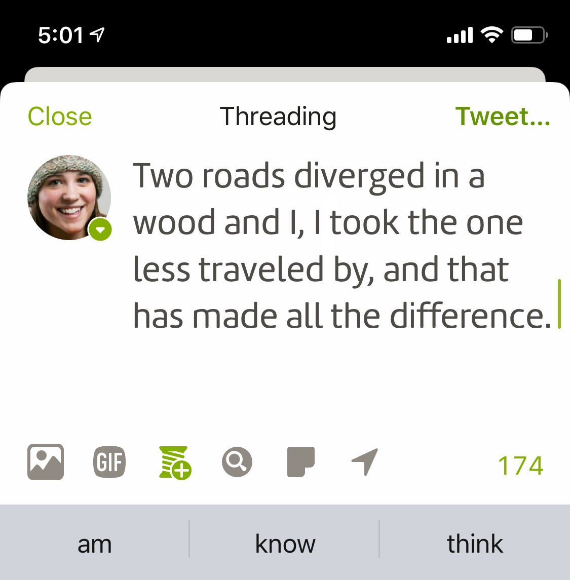
- You find a link while on iOS and want to check it out later on your Mac: just tap the Share icon in the middle of Safari’s tab bar, select Tot, then a dot, then tap Done. You can then format the text and link separately using “T <>”, combine them with”<T>”, or create a bare link with “<>”.
- The opposite direction works great, too. Control-click on a link in Safari and use Tot from the Share submenu. Tot’s quick syncing makes the link immediately available from the comfort of the iPad in your living room.
- If you have some text in a Mail or Notes that you want to move into Tot, just select the text and use “Share…” in the context menu. This works on both macOS and iOS.
Besides selecting a dot, Tot also gives you an option to to put the information at the beginning of the text and add some line padding.
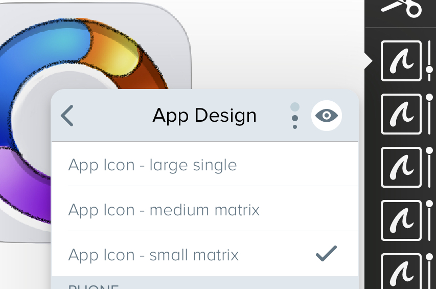
Other notable changes in this release is our continued commitment to VoiceOver accessibility and hot new icons for everyone else.
If you haven’t tried Tot yet, give the FREE macOS app a try. There’s also a companion app for iOS. You can also learn more about both apps on the Tot website. Enjoy!


