Today’s update to Linea Sketch for the iPad brings a great new feature that makes customizing the appearance of the canvas easier than ever. Simply open the Layers palette, select background options > Custom Background and use the new eyedropper tool to select any color in your drawing.
The canvas changes in real time to reflect your choice. It’s a perfect way to experiment and find just the right background for your sketch. Linea also keeps a running list of recent colors in case you want to revert to an earlier choice at any time.
Linea Sketch 4.3.2 also fixes several important bugs when drawing with Clear Ink, corrects annoying problems with time-lapse recordings and fixes a bug that broke tool options on the iPhone when full Keyboard Access is turned on. Visit Linea’s version history page for the complete list of what’s new, and then head on over to the App Store and grab the FREE download of Linea Sketch.
We released the first version of iPulse on a new operating system called Mac OS X in 2002. Our unobtrusive and stylish system monitor showcased the features of Apple’s new OS and was a hit.
Now, two decades later, we’re happy to announce that groundbreaking product is coming to iOS and iPadOS. And just as it did with macOS, it’s taking a new approach with its user interface to get the job done.
An app that can monitor your device is a great thing to have when you need it, but can get in the way when you don’t. On iOS we solved this problem by using Picture in Picture technology.
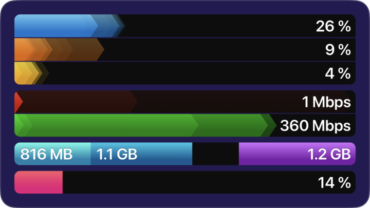
iPulse for iOS/iPadOS literally creates a movie of what’s going on inside your device and updates it every second. You can resize the display to fit well on your screen, or slide it out of the way completely. We were careful to use minimal system resources, such as CPU (3% usage) and memory (only 1 MB in size), while making the video.
iPulse provides answers to a lot of questions that were previously hard to figure out:
Why does playing this game use so much battery?
Why is this download taking so long?
Is anything syncing?
How much more video can I record on an external drive?
And more…
The movie that’s playing also generates sound effects: there are alert tones when CPU, network, or storage are exceeded. These sounds can be turned off in the app settings.
iPulse also provides an alternate view of your storage: the display you’re used to seeing in Settings > General > Storage does not include cached data used by iCloud and other apps. iPulse shows how much actual space is being used. It also provides a view of external storage – very handy if you’re recording video and quickly filling an external drive.
You can learn more about iPulse on the product website. The app is a one-time purchase that will run on both your iPhone and iPad. It’s a tool no developer or power user should be without: download it today!
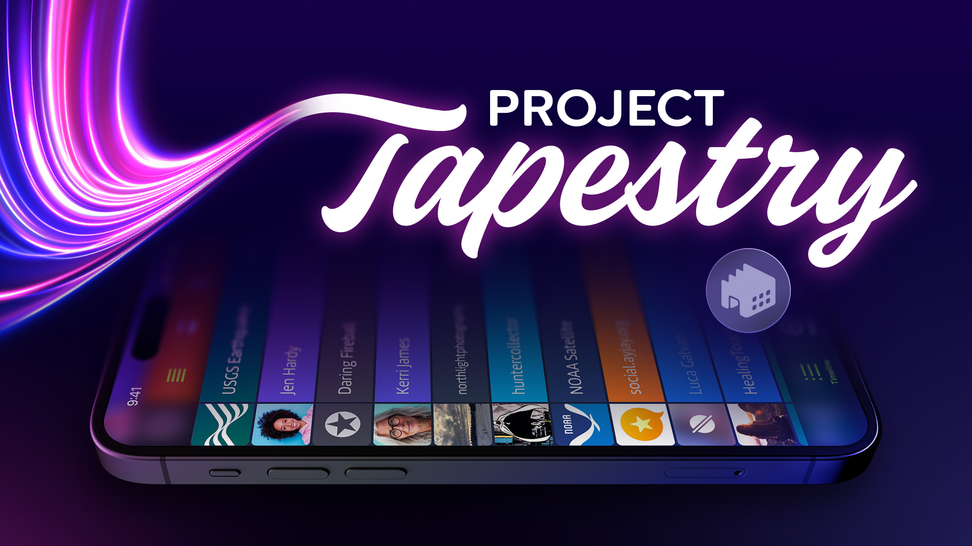
What an amazing ride this past month has been! We appreciate the support of everyone who backed our Project Tapestry Kickstarter as well as those who helped us spread the word far and wide. We couldn’t have reached our goals without your help and we’re so very excited to have an opportunity to bring Project Tapestry to life.
Thanks to you, the project is not only funded, but we even hit our first two stretch goals, which means we’ll be integrating muffling, muting, filtering, search and more, right from the start. We’ve already begun working on design and development during the Kickstarter campaign, so we’re well on our way to making Tapestry a reality. If you backed the campaign keep an eye on your email over the next few weeks and months regarding rewards and various Tapestry related goodness. You won’t want to miss out!
Be sure to follow us here at the Breakroom and on our Mastodon and Threads social media accounts for updates on Tapestry’s progress. Stay tuned – we’re just getting started and there’s a lot more to come.
Our Kickstarter to bring Project Tapestry to life is in the final stretch. The base project was funded within the first few days, but we’d love to add even more features. To do that we need to hit some stretch goals! We’re asking for your help one last time to spread the word or back the project if you can. We also still have a few pixel portraits available to add on to your pledge – get a hand-drawn custom image made just for you!
If you want to learn even more about Tapestry and get the inside story, be sure to check out these great podcasts:
Double Tap – The importance of accessibility in Project Tapestry and more.
Crossed Wires – What goes into developing an app like Tapestry and what’s next.
While the Kickstarter has been up and running, we’ve been busy laying the ground work for development to begin in earnest as soon as the project is funded. We’ve begun wire framing the app’s structure, planning user interactions, coding new plugins, and exploring how Tapestry will sync your data across devices.
Tapestry’s journey is just beginning and with your help, we’re confident we can reach our stretch goals and do our part to support a more open and accessible web. We’re all excited to get to work, so thanks to everyone who has supported the project this month – you’ve helped make Tapestry a reality.
Even in the early days of the Internet, finding and keeping track of the pages you wanted to read could be difficult. Back then, adventurous individuals created their own personal web pages to keep a public log of the latest things happening in their lives. These web logs (aka blogs) spread like wildfire, and soon there were hundreds for every topic you can imagine.
This led to a problem – there were too many of them, posting too often! Enterprising developers created a way to solve this: “Really Simple Syndication” or RSS. A blog that included support for RSS opened up a whole new possibility: apps could automatically check your blog bookmarks and let you know when one of them updated!
Suddenly it was easy to keep track of your friends, family, budding journalists, plucky pundits, and obscure hobbyists. All you needed was an RSS reader and your computer could do the rest for you. By the mid-2000s, this was a popular way to consume content on the web.
However, around this same time was the rise of what we might call the modern social networking era. Websites such as Facebook appeared that were, in a way, a blog of blogs. They made it easier to post updates and find the updates posted by your friends and family. Then came services like Twitter which, while looking a little different from Facebook, followed the same model: you can keep up with everyone as long as everyone comes here!
Soon there was a mass exodus from personal blogs to these centralized services. Companies, services, and individuals stopped posting on their own websites (if they even had one anymore) and started posting on social sites. Posts started disappearing from the web and got locked behind the doors of the giant companies.
While personal blogging never went away, it was greatly diminished as people began to rely on their Twitter timelines to find interesting news or posts. Following blogs or other online sources directly was rare.
And then Twitter imploded.
While plenty of people still use the service (now unfortunately named X), the company essentially closed its doors to outside access. Apps like Twitterrific were unceremoniously banned. Services and outside blogs that used to automatically post status updates were no longer allowed. Policy changes caused people to leave for other services, go back to their old websites, or just shut their Internet browsers never to return.
Almost overnight the online information landscape shattered and became more fragmented. Millions of people scattered in different directions. Links between friends, family, and random acquaintances were severed. It felt as if the hope for a single, convenient way to check for news, updates, and posts from friends on the web was forever doomed.
But we don’t believe the dream is dead.
RSS still exists and is widely deployed. Many other similar technologies and open protocols have joined the web publishing landscape. We can dust off some of the old ways, update them with modern capabilities, and rebuild what we used to have. We don’t need to go back to checking multiple websites or apps all day long – we have computers to help with that. And now it can all be done in your pocket.
Today, a growing number of people are taking back control of their social media presence by returning to blogging or moving away from the closed and centralized products of mega-corporations. Open platforms like Mastodon and Bluesky are popular destinations built on standards like ActivityPub and the AT Protocol. These services operate like small towns that communicate with their neighboring small towns to form a larger shared community that no one completely owns – just like the web itself.
Project Tapestry is our way of embracing the return of fragmentation and the messiness of a more open Internet. We’d like to create an app to help you weave a new fabric of diverse services and protocols together into a unified and chronological timeline, so you can see what you want when you want it. We believe that rather than demanding all of our friends and family move to the same gated neighborhoods, it would be better to visit them where they already are.
But, like any community, it’ll take everyone working together to make it great. Check out our Kickstarter for more details on what we’d like to build and how you can help. Pledge what you can and give us a hand spreading the word far and wide. Thanks!
It’s a bold claim to say you can make a universal timeline for the Internet.
But you can. And we have.
This post will explain the technology behind Project Tapestry and how we tested it as a prototype. We’ll keep this discussion at a fairly basic level: if you’re a web or app developer, you’ll have no problems following along.
And if you think I’m going to describe RSS feeds now, think again! We’ve come up with something completely new.
Overview
The key to this project was to use the same technologies as modern web development. Namely, the JSON data format and JavaScript for processing.
That is not to say that Project Tapestry is a web app. It is fully native and implemented with UIKit and SwiftUI.
Our insight was to use the web technologies as a way to extend Tapestry when it talks to the Internet. These plug-ins are built with JavaScript that is executed as needed by the native app. JSON files are used for metadata and configuration with the app.
When you add a plug-in to Tapestry, you are creating a place where JavaScript can be executed. For example, there is only one plug-in for Mastodon, but each time you use that plug-in for an account, a JavaScript environment is created. This lets Tapestry support multiple accounts or use a single plug-in for multiple RSS feeds.
Our goal is to make an app that can gather any publicly available data: if it uses an IP address and HTTP, we feel confident that it can be woven into Tapestry’s timeline. If you have a Raspberry Pi in your garden that generates a CSV file with the current level of a water tank, it can be a part of your beautifully designed universal timeline.
Data
Tapestry does not communicate directly with the web. Instead, it asks a plug-in to fetch data and place it into JavaScript objects. There are three types of objects in our prototype:
Post: A unique piece of content gathered from the Internet. Its uniqueness is guaranteed by a Uniform Resource Identifier (URI). It must also have a timestamp so it can be displayed chronologically. The content of the post is text with HTML formatting. The formatting is lenient: we’re big fans of Postel’s Law.
Creator: The entity that created the post. For a social media post, it’s a person, but for a satellite image it would be the name of the spacecraft. This object also uses a URI to guarantee uniqueness. (John Doe on Mastodon will be different creator than John Doe on Bluesky). Each Post object has a single creator.
Attachment: A piece of media that can be displayed with a post. The only requirement for an attachment is that it contains a URL to display. It can optionally have accessibility text and a thumbnail image. A Post can have multiple attachments.
These JavaScript objects are just used to transfer data. The app itself uses Swift objects to display the timeline and eventually persist the data.
Security
This separation of data between an internal state (Swift) and an external state (JavaScript) has another important advantage:
The JavaScript code has no knowledge or access to login credentials or other data in the timeline.
Each plug-in calls a function named sendRequest which returns a JavaScript Promise. There is no Fetch API or XHR in the plug-in’s environment, so this is the only way the plug-in can access the Internet.
The sendRequest function is implemented by Tapestry and it adds any required authorization (either OAuth or JWT) before contacting the server. This makes it easier to develop plug-ins because the authorization dance is handled automatically as tokens are needed (including after expiration).
Data in the timeline is also protected by JavaScript’s strict sandbox. It’s just like one web page’s JavaScript not knowing about what’s going on in another page. The plug-ins only have enough information to perform their own tasks.
In Practice
JavaScript code turns out to be an excellent pre-processor for Tapestry’s universal timeline. It’s a natural environment to filter and massage JSON data coming from a URL. And by extending JavaScript’s built-in functions with a mechanism to convert XML to JSON, we can handle all modern structured data. (It’s how we handle Atom and RSS for blog feeds.)
To give you an idea of the effort involved: a plug-in to get recent earthquakes was implemented in about an hour. It was done with no prior knowledge of the API or data formats involved.
Supporting Bluesky took a bit longer: about a day including adding support for JSON Web Tokens (JWT).
There is a GitHub repository with full documentation of the JavaScript API and sample plug-ins. We think you’ll find that it’s a robust and extensible system, just like the web itself.
We’ve also created a developer tool called Tapestry Loom that lets you debug a plug-in using Safari’s Web Inspector. This Mac app makes it easy to inspect data coming from an endpoint and make sure the right objects are being created. You can download it, and experiment with the plug-ins, all from the project page.
Our long-term goal is to make these plug-ins user manageable. Something akin to installing Shortcuts on Apple devices. But while the plug-ins themselves may be easy to create, building a secure distribution system is not: it’s a stretch goal for our Kickstarter.
But Wait, There’s More!
Join me in a screencast that shows you all these pieces working together and expands on some of the concepts we’ve presented above. This 30 minute video will hopefully make our fellow developers as excited about Tapestry as we are!
So there you have it: the overall architecture of our universal timeline. With your support, we can make it a reality.
It’s getting more and more difficult to stay up to date with friends and our favorite sources of news and information. There are so many different social networks and personal blogs these days that it’s a bit of a struggle keeping tabs on everyone and everything.
We think there’s a better way.
Today we’re launching a Kickstarter campaign for Project Tapestry: A new iOS app that aims to gather your most important social media services, RSS feeds, and other sources into a single universal timeline. All updates and posts together in one place, in the order they’re created, with no algorithm deciding what you should see or when you should see it.
Our goal is to use public Internet standards to gather the information you care about, and present it to you in one place, without a middleman and on your own device. This means that not only can the app collect posts from social networks with open APIs such as Mastodon or Bluesky, it could also include webcomics, posts from blogs, the latest photos from NASA, headline news, or anything else with an accessible feed.
It’s important to us that this project is supported by a community. Social products that are funded with venture capital, even ones with altruistic goals, eventually lose their way trying to keep investors happy. We don’t need to do it that way.
Our plan is to ship the first version this fall, but we won’t be able to do it without your support. Head over to our Kickstarter page for more details, backer levels, rewards, stretch goals (with additional features!), and more.
Two of our most popular developer tools were updated this week. It’s not just our website that’s getting the love!
xScope
Our primary focus with xScope version 4.7 was to update the screen recording code. Alerts in the Sonoma beta gave us pause and we noticed an increase in crashes with the older APIs. There were even significant bumps as we replaced code.
Most tools use the current screen image in one way or another: the Loupe to magnify the pixels and sample colors, Dimensions to determine the distance between interface elements, and even things like the Crosshair automatically adjust contrast depending on where your mouse is located.
This modernization effort wasn’t easy, but we were able to increase the speed of the tools and the app got more reliable. And that inspired us to keep going!
Measuring the screen with Dimensions was redesigned with a new algorithm that takes color perception into account. Detection on subtle patterns, gradients, materials, and other modern UI design is much better now and and it’s sensitivity is much easier to tweak with a new Settings UI.
We also spent time improving support for Dark Mode, adding new reticle modes for the Loupe, making it possible to delete Guides with a shortcut, and much more.
All-in-all, it’s a great update to an app that just had it’s 20th birthday!
WorldWideWeb
Our newest developer tool also got an important update.
We use WorldWideWeb for all our HTML/CSS/JavaScript development. Whether it’s a static page or something dynamically generated with PHP and Rails, automatic refresh saves everyone time as we implement and tune a site.
With a major redesign of our home page, we used WorldWideWeb a lot. And that’s when we started noticing a crash every few hours. There seemed to be no rhyme or reason to these failures, except that they all happened on the web server’s background threads.
So we started running the app with Xcode’s thread sanitizer enabled. And within a couple of hours, we identified several data races between the main UI thread and the web server’s background work. If you haven’t run your app with this tool, you’re probably missing some bugs that are notoriously hard to track down, but relatively easy to fix.
Both updates are FREE. If you’re not familiar with either app, a free trial of xScope can be downloaded from the website and free versions of WorldWideWeb are available on the iOS and Mac App Stores. Give them a try today!
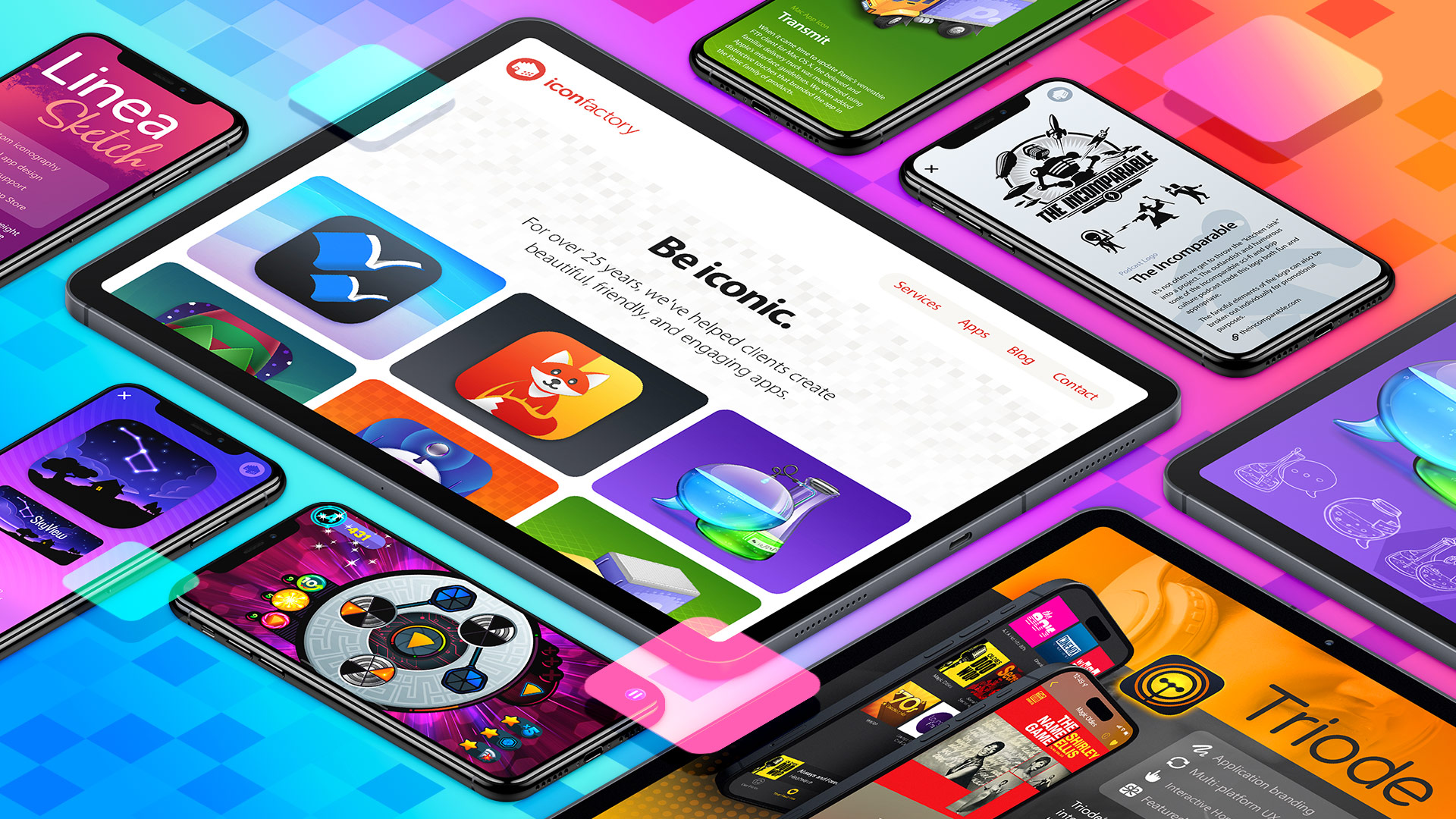
Someone recently was excited to learn we offered design services to clients – something we’ve been doing for over 25 years and is a significant part of our business. It was clearly time for a refresh of iconfactory.com so we could highlight that aspect of our work.
In tackling the redesign, we started with the very same process we use with clients and our own apps – design first, code later. This approach lets us experiment with the design quickly and easily before a single line of code is written. Throughout the entire process we kept in mind that the site needed to be responsive and work well on a wide range of devices.
The new Iconfactory has a singular focus. We’ve been leaders in the design industry for decades and the new site puts our attention to detail, our award-winning apps, and our extensive development services at center stage. In short, we want to help you build the best apps you can, and whether you’re a Fortune 500 company, or an indie developer like us, we’re here for you. The new site explains why we’re the ones you should call on, and it does it with plain language and gorgeous examples.
So, this is us, tooting our own horn. We invite you to explore the all-new Iconfactory.com and see what we have to offer. No other company has been helping designers and developers as long we have. Isn’t it time we worked together?
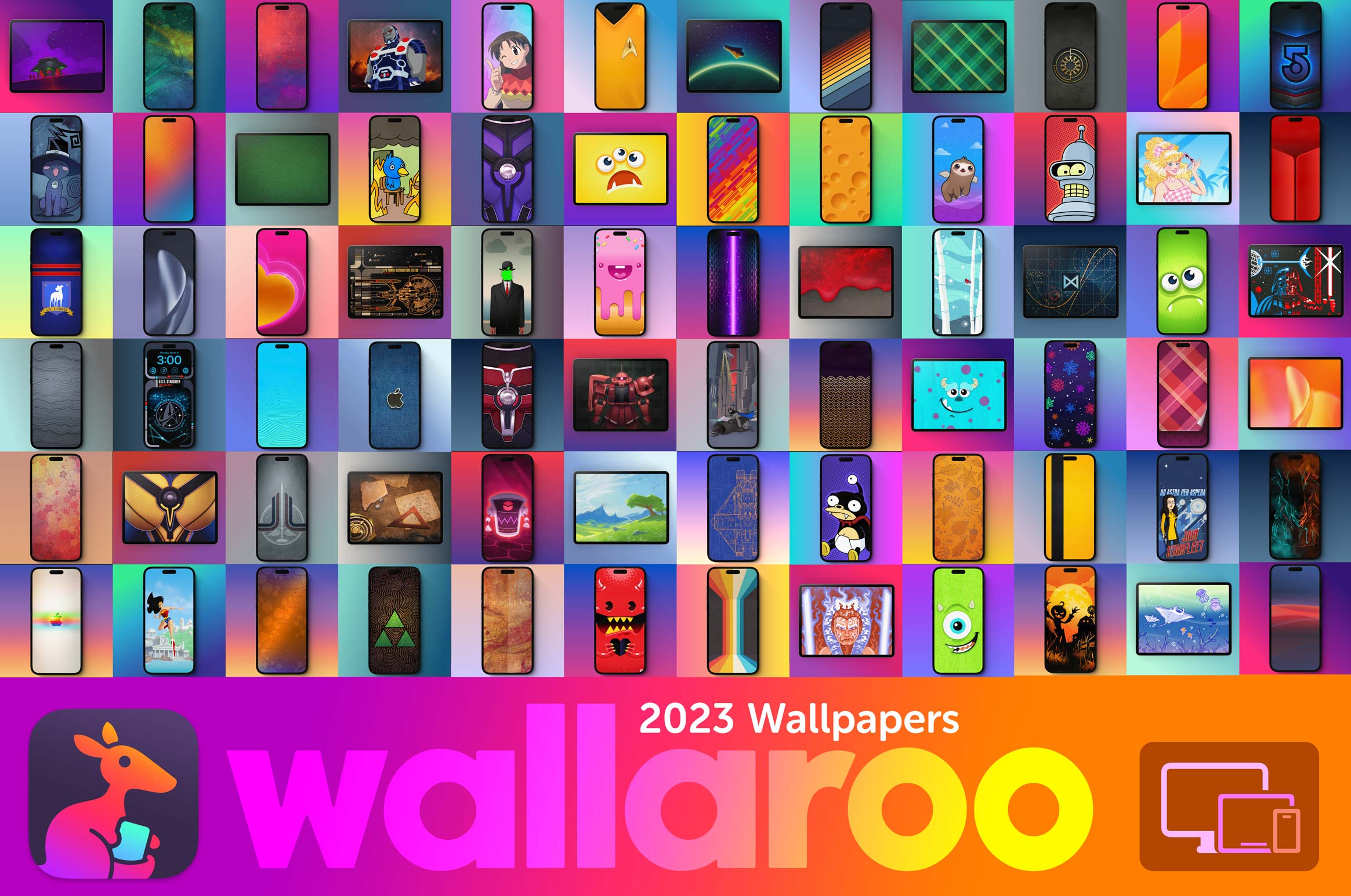
It’s been a little over a year since we launched Wallaroo and to celebrate we’re offering a special discount for new customers. Taking advantage of this sale is easy. Just head to the App Store by opening this link on your iPhone or iPad to receive a 35% discount off the annual subscription price. And don’t wait – this offer is only good until January 19th!
In 2023, Wallaroo subscribers received hundreds of new wallpapers, each designed specifically for iPhone, iPad, and macOS. These joined hundreds of others from previous years with no ads or sketchy schemes – just great wallpapers.
There’s never been a better way to customize your screens than Wallaroo. We hope you’ll discover the fun as we bring new and exciting wallpapers to screens near you throughout 2024!