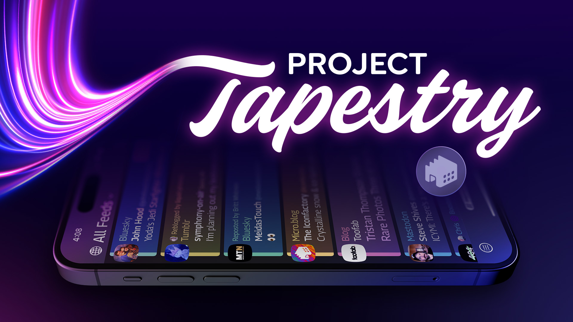
Since Tapestry’s launch, customers have been enjoying the app’s ability to combine content from across the open web into a personal, chronological timeline. And Tapestry continues to get even better thanks to a bevy of useful connectors, created by talented third party developers.
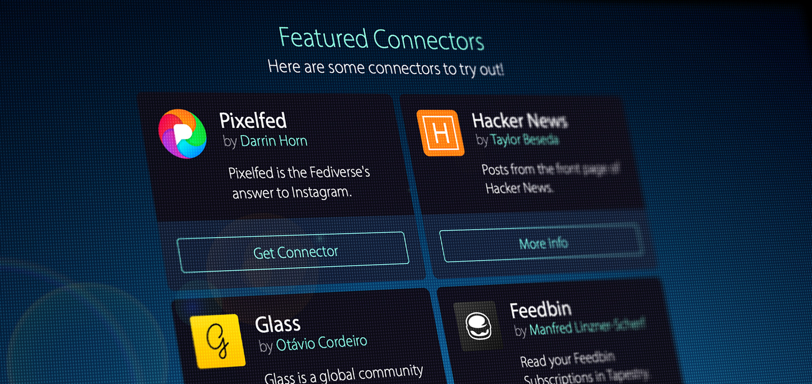
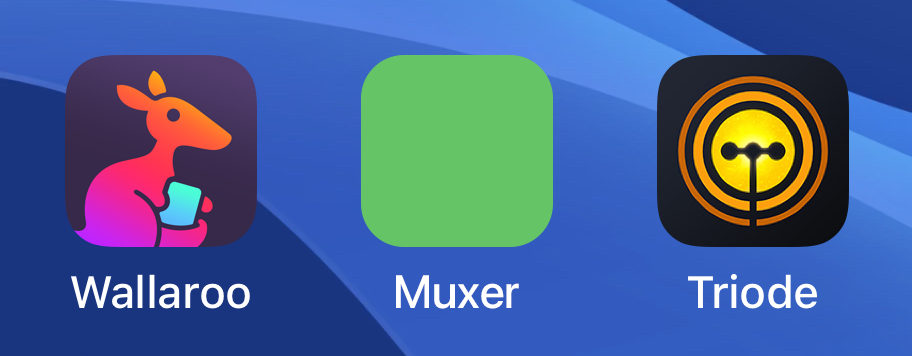
Connectors retrieve the content that gets woven into your Tapestry timeline. The app ships with a wide-range of built in connectors to grab posts from Mastodon, RSS, YouTube, Bluesky, Reddit, and many other services. For those sources that don’t come built into Tapestry, third party connectors like the ones we’re highlighting today allow specialized content to flow right into the app.
Two connectors are available to follow and browse the work of photographers: Pixelfed by Darrin Horn and Glass by Otávio Cordeiro. Feedbin users will no doubt want to try the great new connector by Manfred Linzner-Scherf that quickly imports your content into the Tapestry timeline. And Simon Størving’s fun App Store connector highlights the App of the Day and helps you discover great new software in the App Store.
These and other fantastic connectors are available to download today. Installing a custom connector is quick and easy: just follow the instructions on the Tapestry Connectors page.
So get ready to start a journey to a more powerful version of the app everyone is talking about. Enjoy!
After a successful Kickstarter campaign, and ten months of development, Tapestry is finally an App Store reality.
Tapestry presents content in chronological order, with no algorithm or other person deciding what you should or shouldn’t see. Content can come from social media services like Bluesky, Mastodon, or Tumblr, as well as RSS feeds, podcasts, YouTube channels, and others. All in the palm of your hand with no tracking.
Now that Tapestry has launched, we wanted to take a few minutes to share some of the things that happened behind-the-scenes.
The Backstory
A few folks have asked how we launched a Kickstarter that not only hit its original goal, but nearly doubled it. We knew that we needed a strong concept to gain support. To help us refine our pitch, we worked on a rough prototype that showed us, and others, what was possible.
Thankfully, this proof-of-concept convinced our amazing supporters that Tapestry was worth backing.
While still in development, we constantly looked at ways to make Tapestry a sustainable product. Our goal has always been for the app to be a source of information and discovery – and we want that to be accessible to the widest possible audience. We had to give users the richest experience and features without gating content. Ultimately, we decided to make the product a free download and fund future work with both sponsored ads and premium features.
A Unique Approach to Ads
We hate internet advertising and so do you.
That’s why we made our own ad network for Twitterrific. With Tapestry, we’ve taken what we learned there and improved it for the better.
We’ve worked hard to craft ads that are harmonious, visually appealing, and for things you might want to see or use. But most importantly, we have done all this with your privacy in mind: there is no tracking and there never will be.
Sponsorships in Tapestry are tasteful, concise and designed with privacy in mind.
As small, independent creators, we know exactly how hard it is to get the word out about the work you’re doing. Our hope is that the community around Tapestry will want to know about exciting indie apps, blogs that are fueled by enthusiasm, and podcasts or YouTube channels that inform and entertain. We’ve also made it easy for folks to follow your work by integrating our Feed Finder into the ads.
We know exactly how small the marketing budget is for all of this :-) We’ve strived to keep the price low and the value high.
A Big Surprise
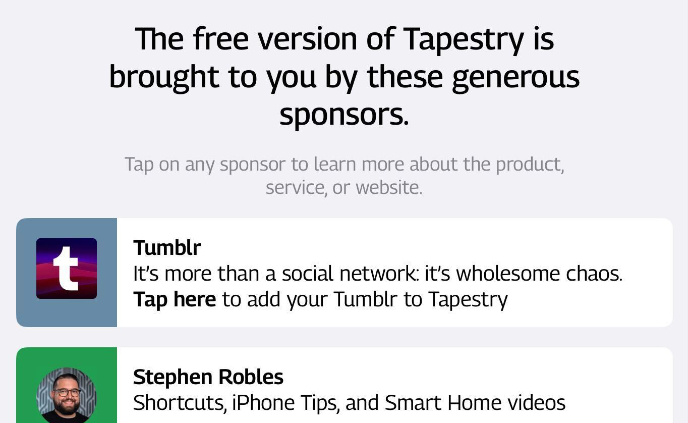
Several months after funding, and while we were well into Tapestry’s design and development, we received an incredible opportunity. Tumblr contacted us out of the blue with an email that started “Tapestry looks cool” and went on to say they were interested in supporting our efforts with a grant.
Wow! After our initial shock and disbelief, we realized that these funds allow us to build an even more robust app than what was possible with just Kickstarter. It also served as the spark for the current sponsorship program in Tapestry.
Thanks to Tumblr’s support, we are beyond excited to announce that we’ll soon begin work on what so many folks have asked for: native macOS support! We also have ideas for features that will benefit Tumblr as well as other services. Stand by for more surprises!
Gratitude
We are beyond grateful to Tumblr and how their support allows us to deliver a better and more robust product. We are also thankful for all the backers who believed in Tapestry’s potential and supported us at launch. Finally, the health of any software product depends on the direct support of paying customers like you. Without these is no bright future for any of our apps, so thank you.
Folks who love counting will be happy to know that Clicker has some useful new features on watchOS:
Added support for the Digital Crown – just turn it to adjust the counter. If needed, this feature can also be disabled in settings (tap the gear icon).
There is now separate haptic feedback when you reach a goal: a different sound and vibration are played. This is helpful for activities where you count with your eyes closed or without looking at your wrist.
Added a new setting to disable haptic feedback. No sounds or vibrations will be played as you adjust the count.
The complication can now display longer numbers: commas are removed when space is tight.
We also did a small, but important, update for Now Playing Plus. We fixed an issue where tapping on the watch face complication to see what’s playing would often show a blank screen instead of the player controls.
Apple’s built-in watch complications don’t work in the circular or corner positions: Now Playing Plus fixes that. If you’re like me and need to get at the controls quickly and reliably without fumbling around with screen navigation, it’s a great addition to your Apple Watch.
I use Now Playing Plus while riding my bike: a tap in the corner of my watch face, and then play/pause or adjust volume with the crown, all while keeping my eyes on the road! You can get it for FREE on the App Store.
We’ve been making apps for decades and have acquired the skills to build all sorts of great things. But even talented teams can be challenged, and our latest product has been the hardest yet.
It’s taken ten months since 3,369 folks agreed that the idea of putting all the things you follow online in one place was a good idea and funded our Kickstarter.
But that’s only part of the story. The idea for a new type of social media app began soon after a service we all loved began to implode. Before the Kickstarter, we spent ten months to prototype, refine the idea of a universal timeline, and figure out how to market such an original concept.
With a name and icon like this, there was nowhere to go but UP!
Today we finally made it and we’re all proud of what’s been accomplished.
A New Web
The web has always been in a state of flux, but the rate of change around how people connect has accelerated over the past few years. Centralized systems have shown their weakness and siloed content has as much a chance of surviving as “You’ve got mail!”.
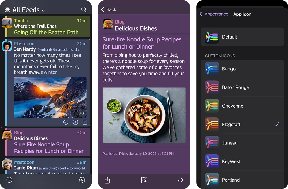
Tapestry was built with this change in mind. Your content comes from a lot of different places, and how that data is retrieved from a feed is entirely customizable. Our goal was to put RSS, social media, podcasts, and more into a flexible and easy-to-read timeline. Tapestry syncs this variety of feeds across devices in a way that is seamless, secure, and easy to understand.
Despite huge engineering and design hurdles, achieving Tapestry’s vision has had some wonderful side effects.
A Better Way
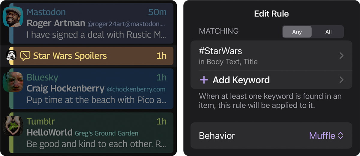
First, there is no shortage of stuff on the Internet we do not want to see. Whether it’s spoilers or idiots, some things are better left unseen. Tapestry’s muffling and muting filters are much more effective than other apps because they work simultaneously with everything in your timeline. One rule to rule them all.
Assembling this timeline from various feeds is also extremely private. There’s no single server tracking what you’re loading, no third-parties are watching as you scroll or search through content, and no one sees what you find interesting. Even the ads we show in the free version come from our own ad network that only registers impressions and taps. Tapestry is designed to stay this way.
The app also makes it easy to customize how you digest content from across the internet. Whether you are working, researching, or just goofing off, Tapestry makes it simple and fun to craft custom timelines to fit every need.
And, of course, we’ve done a lot of work to make your content look as good as it can. Customizable fonts, colors, and layout let you get the timeline looking just right!
Looking good, no matter what you’re looking at!
It Will Only Get Better
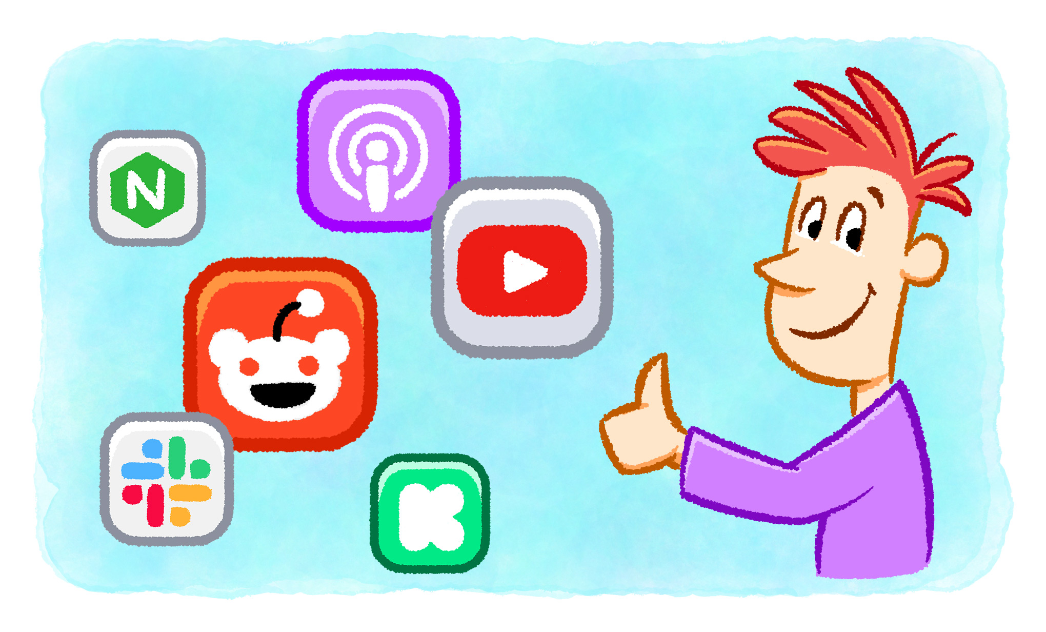
Like the web itself, Tapestry is extensible. At the core of the product are connectors created with web standards. This collection of text files can describe feeds and provide instructions on how to load them. They gather the data so Tapestry can display it in your timeline.
All of the connectors in Tapestry are open source: if you’ve done some JavaScript development, you’ll be able to figure out what’s going on. Our Github repository has everything you need.
If you’re not a developer, don’t worry, it’s super easy to install a connector written by someone else. As we move forward, we want to have a library of connectors that makes it easier for everyone.
The Future Is Bright
As we enter another ten month phase, there’s a lot to look forward to.
Thanks to support from Tumblr and our other sponsors, we will be working on some of the stretch goals that we didn’t meet during the Kickstarter campaign. That includes a native version of the app for macOS, a better experience when viewing and creating replies, and content overviews.
We’re also expecting that Tapestry users will see many excellent third-party connectors become available in the coming months!
But for now, we invite you to download Tapestry and give it a try. It’s free to use with an optional in-app purchase for premium features, so be sure to check it out today!
As we enter our 29th year in business (holy cow!) we once again turn to look back at where we’ve been and, of course, where we’re headed. This past year has been full of discoveries, challenges, and change.
We kicked the year off with a much-needed re-design of Iconfactory.com, bringing our app design services for clients into focus. The new site showcases our collective expertise in user interface design and branding, helping us connect with fellow developers who are looking to stand out in a crowded App Store. The re-designed site was a catalyst for new work in 2024 and reminded us of our passion for helping clients launch, re-imagine, and brand amazing apps.
Up, Up & Away!
This past year saw updates to several of our software products. In March we released a new version of Linea Sketch, adding the ability to quickly customize background and canvas colors. In August, we added support for the Apple Pencil Pro, and that’s changed the way we draw and create in Linea Sketch. In the coming year we’re looking forward to finding out if the rumors of a larger, foldable iPad are true, and what that may mean for Linea’s future.
In April we introduced a helpful and groundbreaking update to iPulse, our system monitoring app for iOS. iPulse 1.1 uses Apple’s picture-in-picture technology to give you a real-time glance at what’s happening behind the scenes on your iPhone or iPad.
iPulse’s picture-in-picture gauges give you a unique view under the hood of iOS.
iPulse lets you track processors, network, memory, and storage space as they are constantly monitored and displayed in a convenient graph that floats above everything else on the screen. It’s is a great way to troubleshoot problems and get a bird’s eye view of what’s happening behind the scenes on both macOS and iOS.
The Year of Tapestry
If we could sum up 2024 in a single word it would have to be “Tapestry”. Bringing our new social media app to life has been our primary focus and driving force this year. The vision of Project Tapestry began with the Kickstarter back in January, which was quickly funded by March. Since then, we’ve been working each and every week to realize the promise of a unified, chronological timeline for all your favorite Internet content.
From the outset we knew that Tapestry’s potential would be one of the biggest development challenges we’ve faced, and unsurprisingly, we were right. There’s a saying we toss around on Slack – “If it’s easy, it ain’t Tapestry™”. From its complex user interface design to syncing content across disparate social and internet services, Tapestry has continually asked us to rise to the challenge.
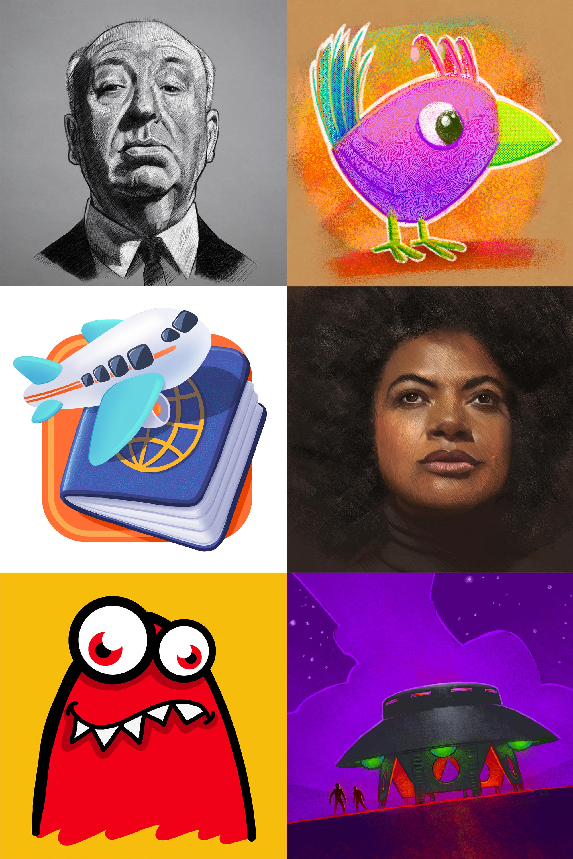
Despite this, we’ve had tons of fun bringing it to life and have been delighted for Fridays when the weekly TestFlight builds go out to happy Kickstarter backers. We also enjoyed pushing tens of thousands of pixels for the portraits we delivered throughout the year; delivering the last ones to patient supporters just this past week.
We’re in the Tapestry homestretch now and proud of what we’ve spent the year creating. We sincerely hope you’ll check it out when it comes to the App Store in early 2025. Stay tuned just a little bit longer!
The Road Ahead
As we journey into the new year, we’re very much looking forward to launching Tapestry as well as updating our other apps that have been patiently waiting in the wings. We’ll also be releasing new wallpapers for Wallaroo and Patreon each and every week just as we did in 2024. If you’re looking for a last minute gift, year’s worth of wallpapers for that special someone might fit the bill!
We look forward to continuing our work with clients old and new to help them create beautifully designed apps, icons, and promo images. Like the rest of you, we don’t know what 2025 holds for us, but we’re excited to find out. We hope you’ll join us, once again, as we venture into that undiscovered country together. Stay well and happy holidays, everyone!
With Inktober now in full swing, we thought it would be a great time for users to take nearly 50% off Linea’s annual subscription price. If you love to draw, sketch, or even just doodle, Linea makes the perfect companion – and now through the end of October, you get half off when you subscribe.
Linea makes sketching fun and easy, and puts your focus on quickly bringing ideas to life. Inktober’s daily drawing prompts are a great, low-key way to explore the app’s features including ZipShapes, texture layers, realistic brushes, and much more. Linea also comes with scores of helpful video tutorials built right into the app or on YouTube to help you get started in a snap.
Here are just a few examples of what folks have created with their iPads, Apple Pencil, and Linea Sketch:
Linea also creates time-lapse recordings as you draw. These short videos are a great way to pull back the curtain and share your creative process on social media, or directly with friends and family.
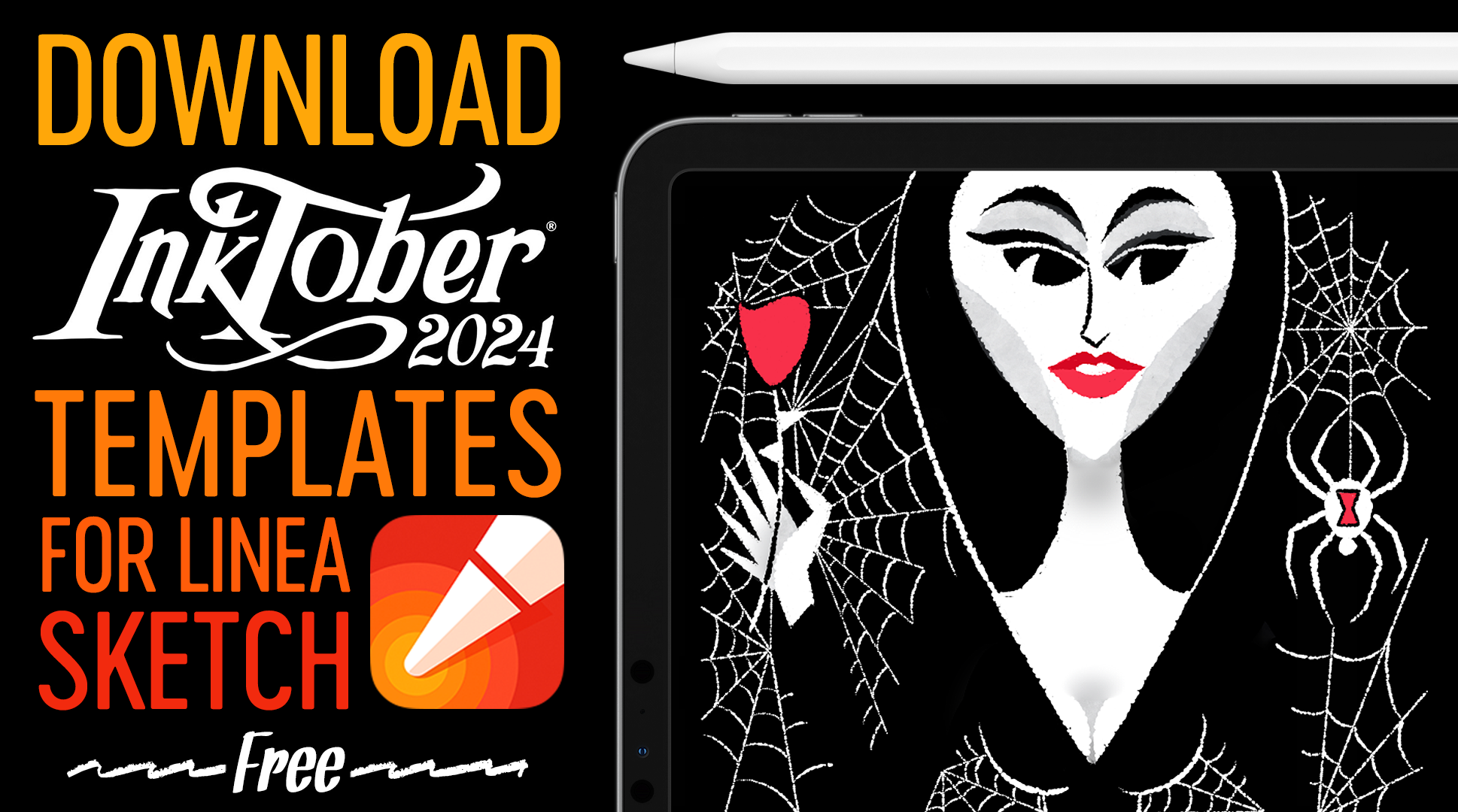
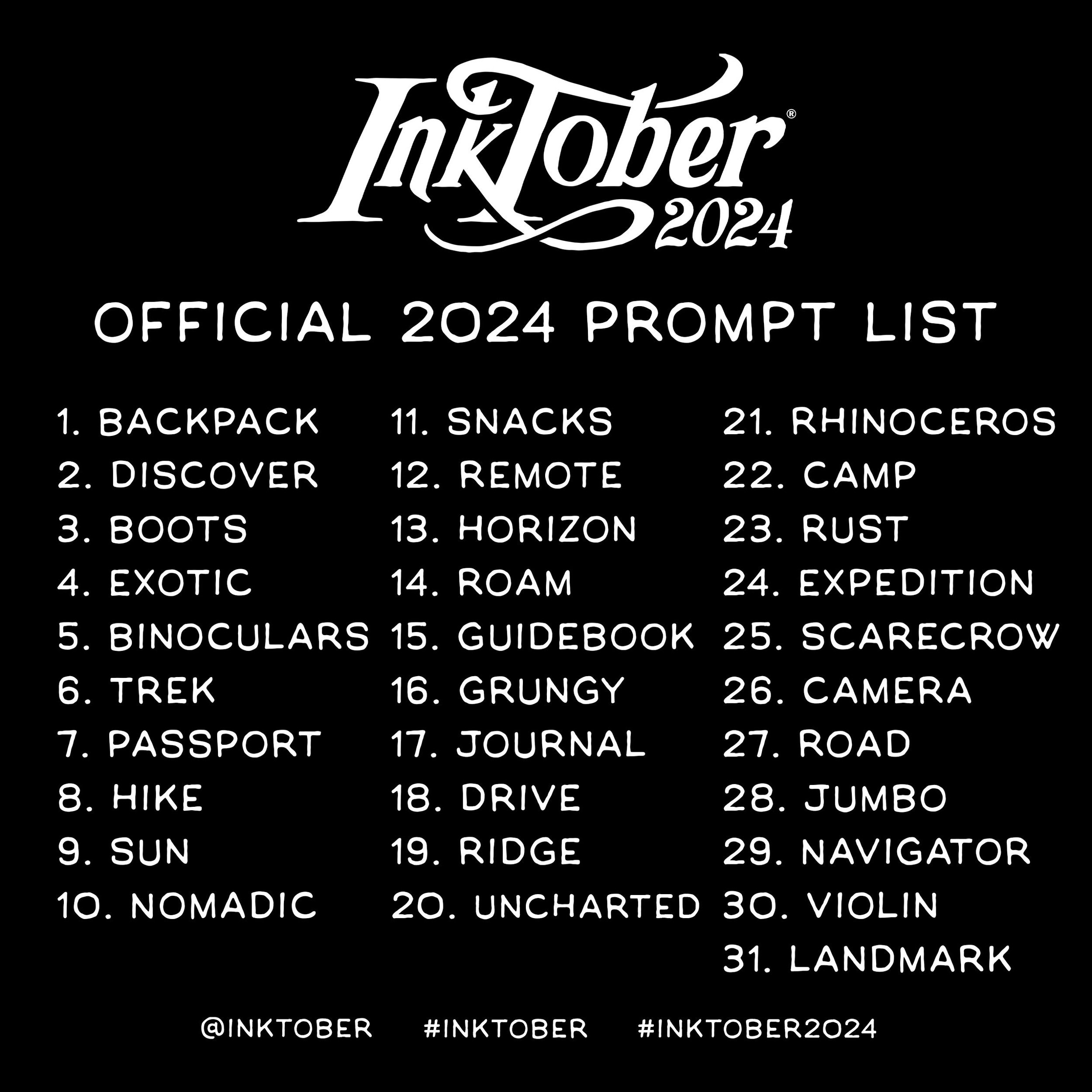
October is creeping in like a stealthy spider, and with it comes time to embrace our favorite creative tradition – Inktober. This annual event beckons artists, from novice to seasoned pros, to grab their pens, brushes, or Apple Pencils and conjure up something creative each day of the month. It’s the perfect opportunity to unleash your imagination and face the thrilling challenge of turning daily prompts into hauntingly beautiful sketches. Let’s dive into the spooky fun, one eerie doodle at a time!
For the sixth year running, we’re excited to contribute to the Inktober magic by offering a handy set of templates for Linea Sketch, outlining the prompts for all 31 days. This year’s templates are now available for download, with each page clearly labeled by day and prompt, making it easy to stay organized and inspired. Whether you’re aiming for a cohesive set of sketches or just want to keep your daily creations on track, these templates are the perfect tool to keep your creativity sharp and focused throughout the month!
As they are every year, Linea’s Inktober 2024 templates are completely free and easy to set up. Be sure to check out our short video tutorial on how to get the templates into Linea Sketch for the iPad, and you’ll quickly be on your artistic way.
Don’t forget to tag your posts with #LineaSketch on social media! We love sharing our favorite drawings on Linea’s Instagram throughout October, so it’s the perfect chance to shine. Get your screen protectors ready, charge up those Apple Pencils, and prepare to dive into a month of creativity—October will be haunting us before you know it!
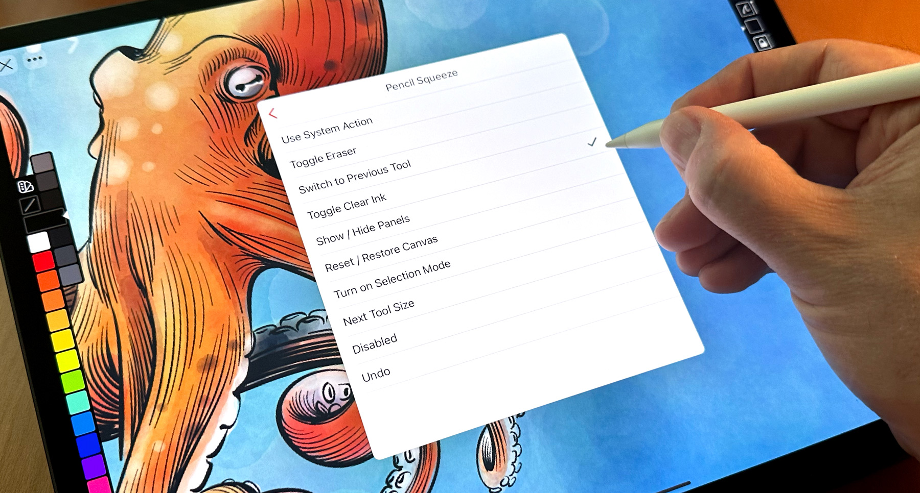
Today’s update for our handy digital sketching app for the iPad brings Apple Pencil Pro support, including new shortcut squeeze actions and helpful haptic feedback.
Choose from a range of sketching shortcuts like toggling Clear Ink on or off, switching to the previous drawing tool, cycling through tool sizes and even undoing the last drawing action. Squeeze actions work great and we find they are much less likely to be triggered accidentally than the older double-tap Pencil actions. Once you try it, you’ll be hooked! Linea defaults to your system-wide settings for the squeeze action, but you can choose a different action (or ignore squeezes) in Linea’s in-app settings.
Today’s 4.3.3 update also enables haptic feedback, giving you a satisfying but subtle bump when performing certain tasks in Linea, such as creating ZipShapes, snapping to rotation angles, scaling selections and more.
Linea Sketch 4.3.3 also fixes several important bugs, so it benefits all Linea users, even if you don’t own the new Apple Pencil Pro. Visit Linea’s version history page for the complete list of What’s New, and then head on over to the App Store and grab the FREE download of Linea Sketch.
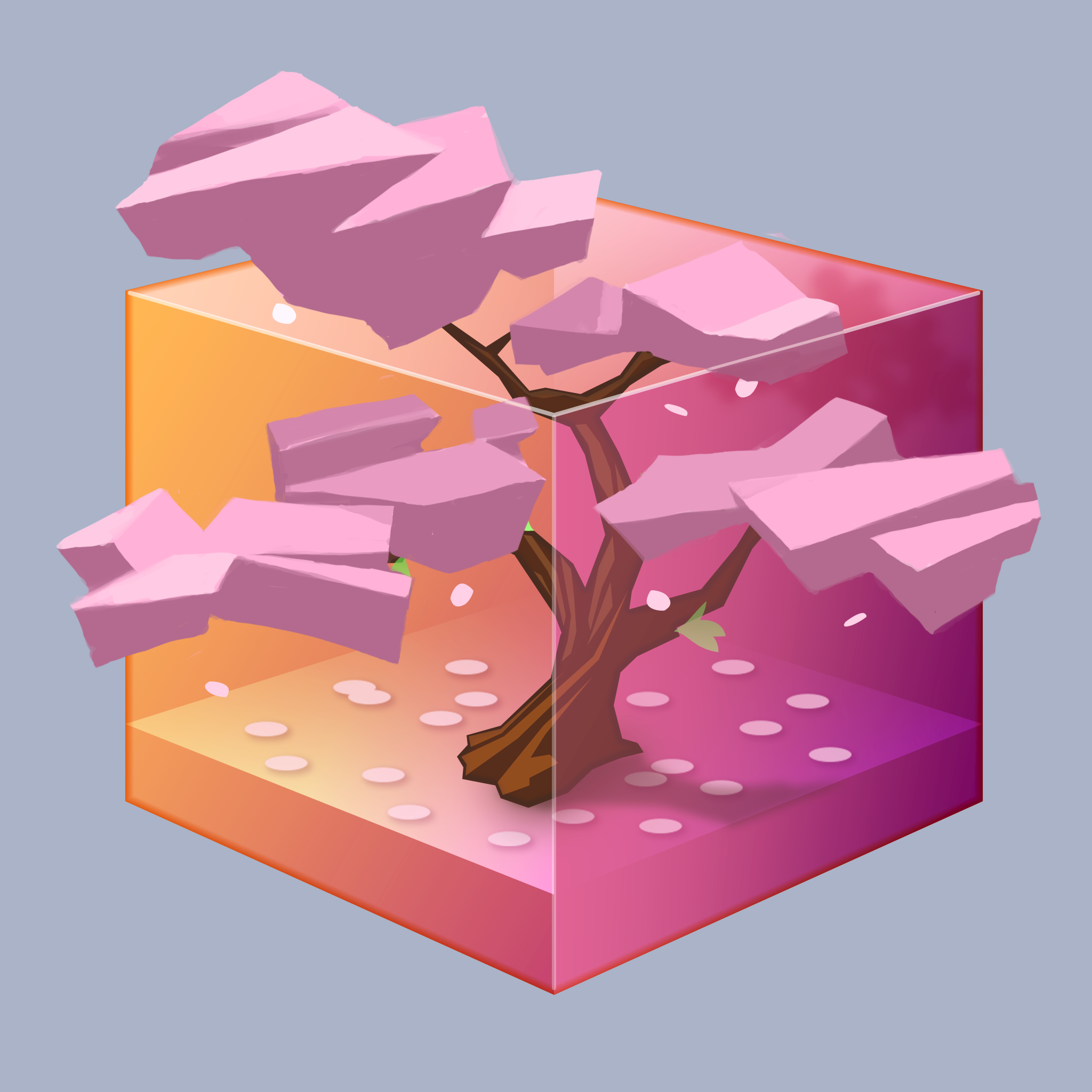
Sometimes a design project can hit a roadblock and stall out – a point where for some reason it becomes difficult to leap over a certain potential solution in order to arrive at an even better one.
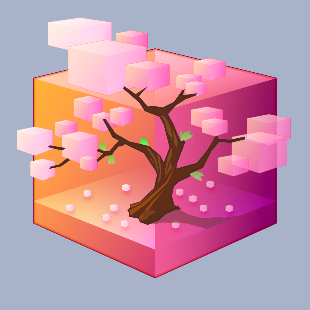
Brushed Pixel came to us for help with this very situation. They had developed a solid starting point for the design of their digital asset management application, Musebox, but enlisted our expertise in taking it further. The concept – a transparent cube containing a small tree – needed to be realized while at the same time ensuring the graphic treatment would work well within the macOS app icon aesthetic.
We decided to take the floral elements of their existing concept art and focus it specifically into a Bonsai cherry tree. These trees are both very beautiful and graphically distinctive at the same time, so it felt like a good choice.
Brushed Pixel wanted a decisive look for the tree trunk itself, so after building the cube container in a macOS style and palette, we started there.
Some quick geometric shapes were suggested how we would populate the branches of the trunk. This graphic could be reduced to get an idea of how the overall design might appear when seen very small. Although the shapes were fun, they weren’t organic enough to be part of a design solution in this case.
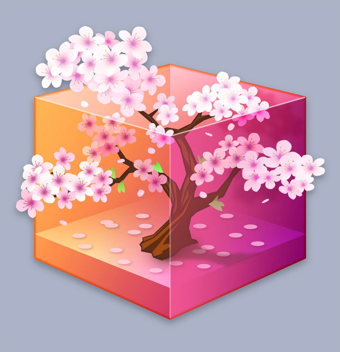
Next, a comp was created with further detail, showing more realistic blossoms in place. These were simply one blossom graphic that was transformed and repeated across the design, with a bit of shading added.
The client was pleased but felt the variations in blossom size might work against the realism. We also needed to make sure everything would still read well at small sizes, so a “volume and lighting” comp was roughly painted. This would be our guide in creating the different groupings of blossoms.
We received a green light for this approach, and next adjusted our vectors to replicate it in organic detail.
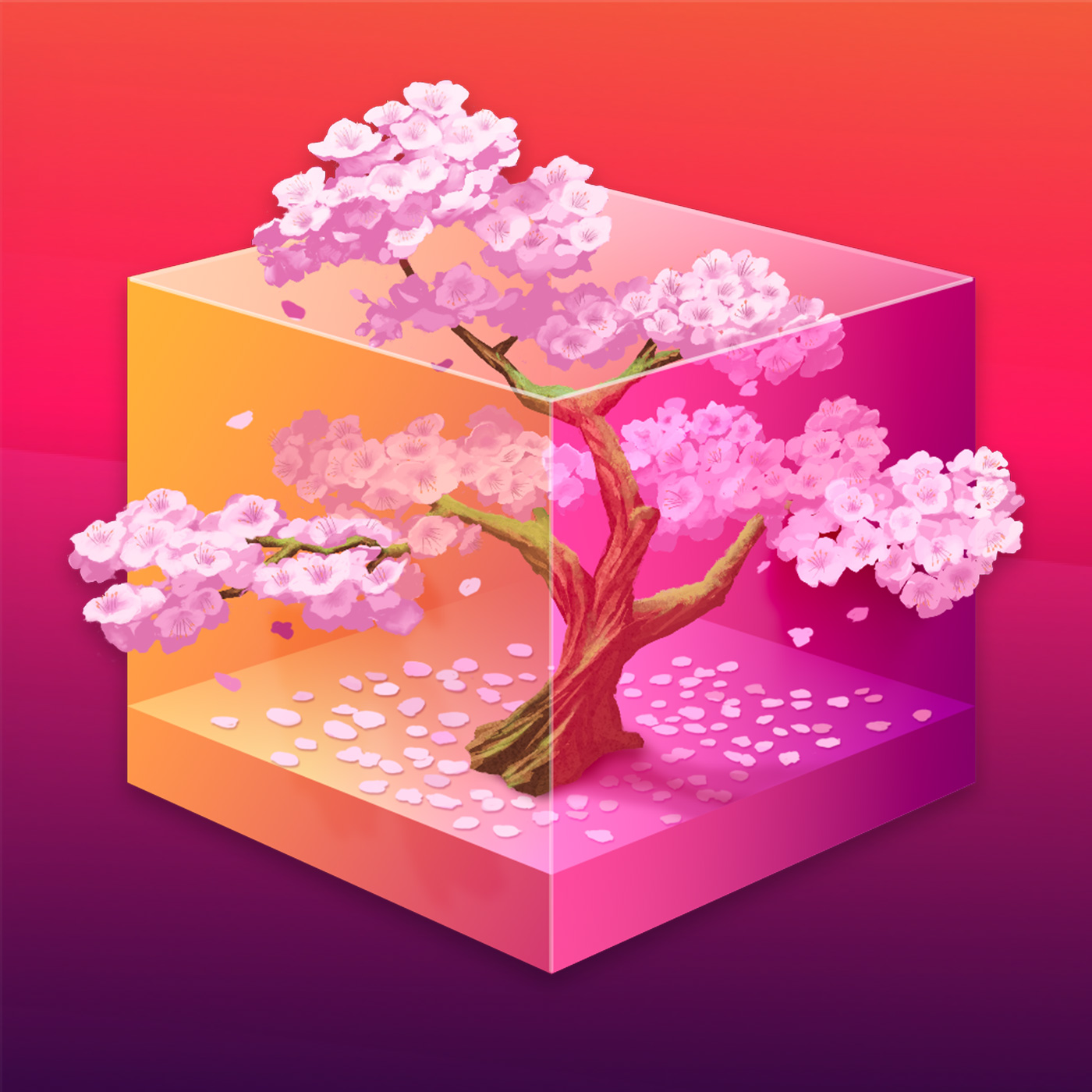
Creating every unique blossom in vector form was possible but daunting in terms of time and effort. The decision was made to hand-paint these elements, as well as the trunk itself, which would be much faster and would bring even more of an organic feel to the icon. Shading could easily be painted in on a clipping masked overlay in a non-destructive way.
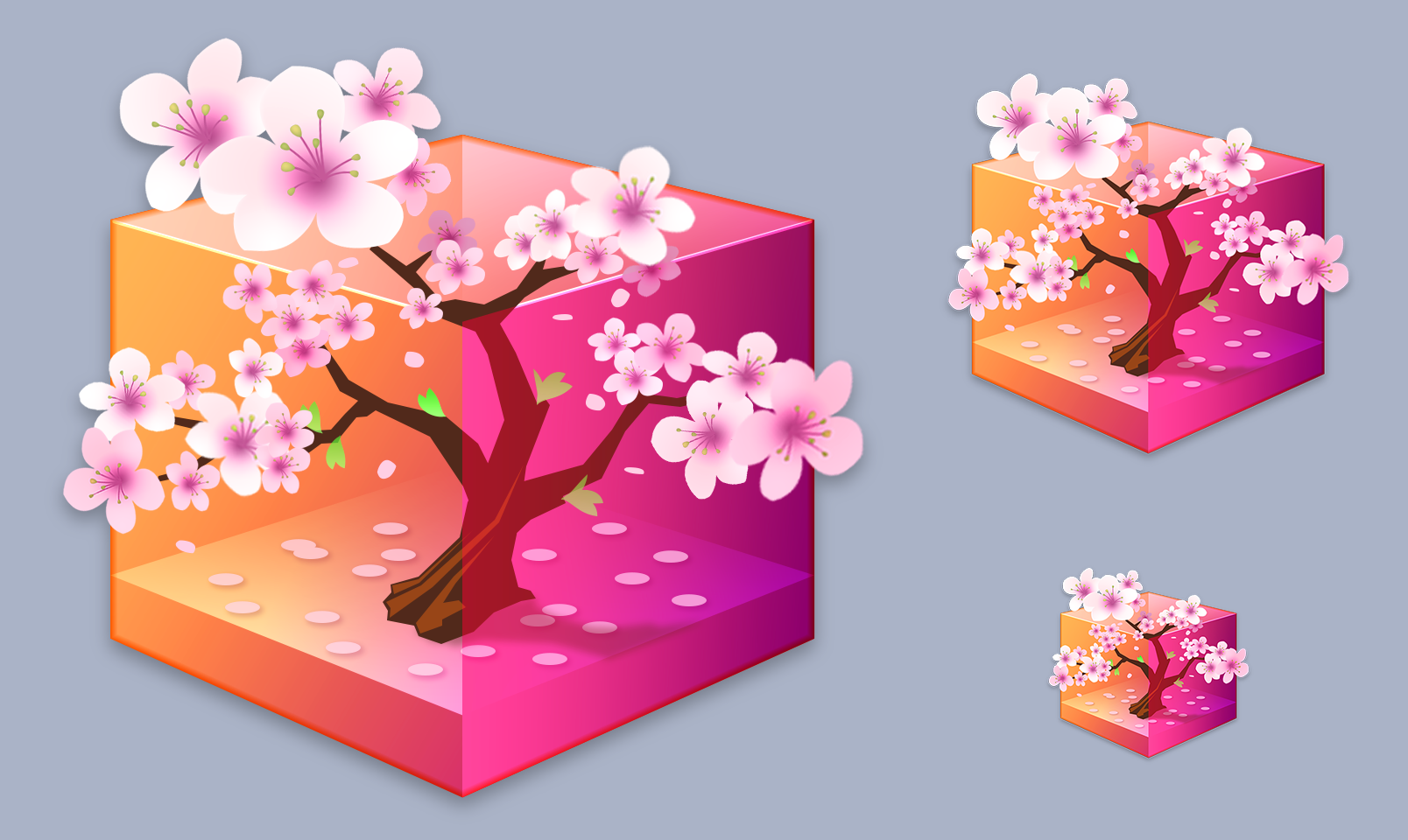
The finished design combines the painted trunk and blossoms with the vector-created transparent box, with lighting and shading effects to suggest that the tree is growing outside of the boundaries of the container.
The public response to the Musebox icon has been fantastic! We’re very happy to have been able to provide what was needed to take the design the final distance to completion in the way that Brushed Pixel originally envisioned. If your team is looking to overcome design challenges with any aspect of your app’s development we’re here to help.
Summer’s here! Stay cool by keeping things simple with Tot, our elegant and streamlined text editor for notes, to-dos, and so much more. Tot’s single window design and simple formatting controls mean no more hunting for that chunk of important text.
Tot’s already FREE on macOS, but now the iOS version is on sale at 50% OFF from now until July 8. Grab it in the App Store or find out more at tot.rocks.