Whether you’re a developer who’s working on mobile apps, or just someone enjoying the millions of apps available for your phone, today is a very special day. It’s the ten year anniversary of the original iPhone SDK.
I don’t think it’s an understatement to say that this release changed a lot of people’s lives. I know it changed mine and had a fundamental impact on this company’s business. So let’s take a moment and look back on what happened a decade ago.
There are a lot of links in this piece, many of which were difficult to resurrect on today’s web. Make sure you take the time to explore! I’ve also tried to avoid technical jargon, so even if you don’t know your Swift from a hole in the ground, you can still follow along.
Touching the Future
For many of us, holding that first iPhone at the end of June 2007 was a glimpse of the future. We all wanted to know what was inside the glass and metal sitting in our pockets.
Apple had told us what the device could do, but said very little about how it was done. We didn’t know anything about the processor or its speed, how much memory was available, or how you built apps. In many ways, this new device was a black, and silver, box.
As developers, we wanted to understand this device’s capabilities. We wanted to understand how our software design was about to change. We were curious and there was much to learn.
And learn we did. We called it Jailbreaking.
Breaking Out of Jail
Discoveries happened quickly. It took just a matter of weeks before the filesystem was exposed. A couple of months later, the entire native app experience was unlocked. Development toolchains were available and folks were writing installers for native apps.
This rapid progress was made possible thanks to the tools used to build the original iPhone. Apple relied on the same infrastructure as Mac OS. They chose a familiar environment to expedite their own development, but that same familiarity allowed those of us outside Cupertino to figure things out quickly.
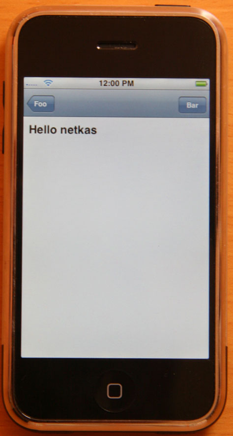
Hello world.
For example, much of the software on the iPhone was created using Objective-C. Mac developers had long used a tool called class-dump to show the various pieces of an app and learn how things communicated with each other. After getting access to the first iPhone’s apps and frameworks, this software gave great insight into what Apple had written.
The most important piece was a new thing called UIKit. It contained all the user interface components, like buttons and table views. Since they were similar to the ones we’d used on the Mac, it took little effort to make items for taps and scrolling.
Another important piece of the puzzle was the operating system: Unix. This choice by Apple meant that a lot of open source software was immediately available on our iPhones. We could use it to build our apps, then copy them over to the phone, and, most likely, view the content of LatestCrash.plist in /var/logs/CrashReporter :-)
I distinctly remember the first time I got a shell prompt on my iPhone and used uname to see the system information. I was home.
Early App Development
I was not alone. Thousands of other developers were finding that the inside of this new device was just as magical as the outside. It shouldn’t come as a surprise to hear that there was an explosion of iPhone app development.
One of the pivotal moments for the burgeoning community came at an independent developer conference called C4[1]. Held in August of 2007, many of the attendees had the new device and were discovering its capabilities. Most of us were also experienced Mac developers. We had just been to WWDC and heard Apple’s pitch for a “sweet solution”.
Amid this perfect storm, there was an “Iron Coder” competition for the “iPhone API”. The conference organizer, Jonathan “Wolf” Rentzsch, asked us to “be creative”. We were.
My own submission was a web app that implemented a graphing calculator in JavaScript. It epitomized what we all disliked about Apple’s proposal a few months earlier: a clunky user interface that ran slowly. Not the sandwich most of us were hoping for…
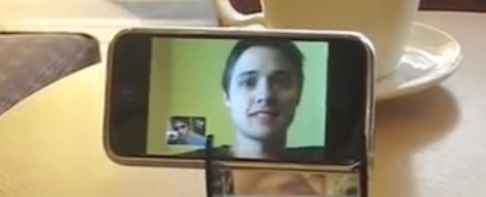
Video conferencing without a front-facing video camera.
On the other hand, the native apps blew us away. The winner of the contest was a video conferencing app written by Glen and Ken Aspeslagh. They built their own front-facing camera hardware and wrote something akin to FaceTime three years before Apple. An amazing achievement considering the first iPhone didn’t even have a video camera.
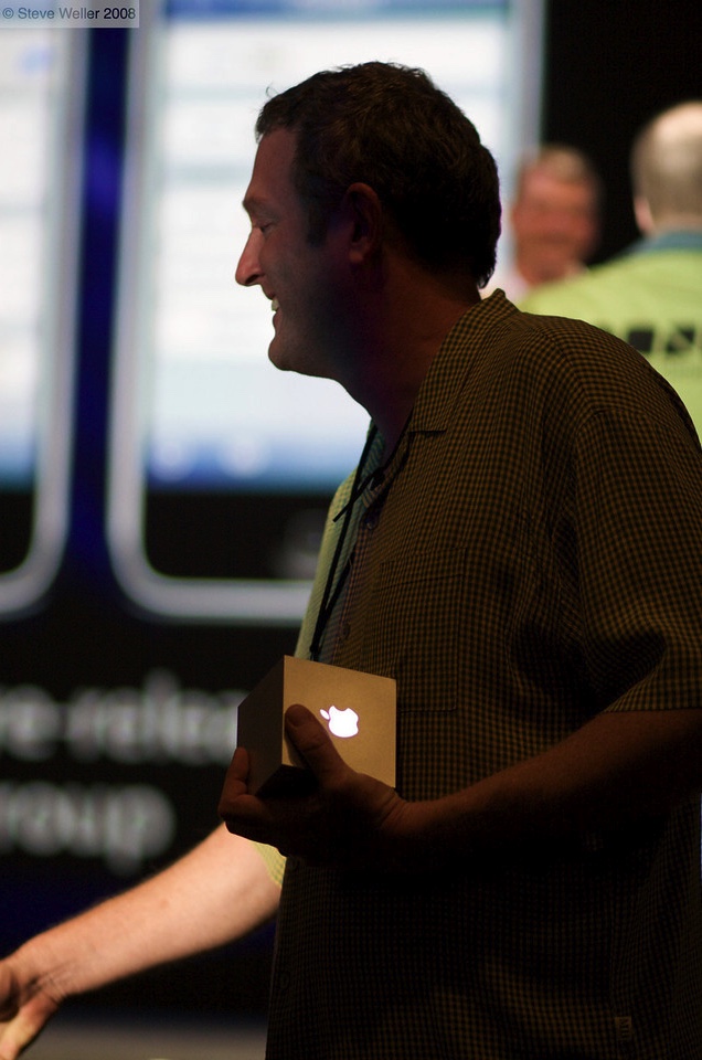
But for me, the app that came in second place was the shining example of what was to come. First, it was a game, and well, that’s worked out pretty well on mobile. But more importantly, it showed how great design and programming could take something from the physical world, make it work seamlessly on a touch screen, and significantly improve the overall experience.
Lucas Newman and Adam Betts created the Lights Off app a few days before C4. Afterwards, Lucas helped get me started with the Jailbreak tools, and at some point he gave me the source code so I could see how it worked. Luckily, I’m good at keeping backups and maintaining software: your iPhone X can still run that same code we all admired 10 years ago!
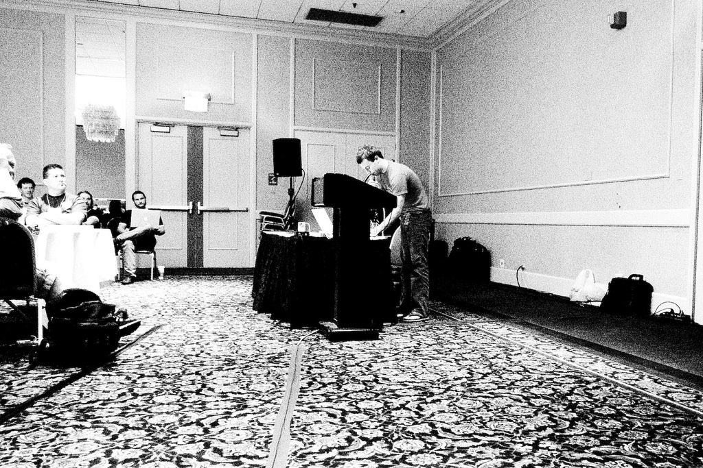
Lucas Newman presenting Lights Off at C4[1]. Photo: John Gruber
If you’re a developer who uses Xcode, get the project that’s available on GitHub. The project’s Jailbreak folder contains everything Lucas sent me. The Xcode project adapts that code so it can be built and run – no changes were made unless necessary. It’s much easier to get running than the original, but please don’t complain about the resolution not being 1-to-1 :-)
In the code you’ll see things like a root view controller that’s also an application delegate: remember that we were all learning how to write apps without any documentation. There’s also a complete lack of properties, storyboards, asset catalogs, and many other things we take for granted in our modern tools.
If you don’t have Xcode, you’re still in luck. Long-time “iPhone enthusiast” Steve Troughton-Smith sells an improved version on the App Store. I still love this game and play it frequently: its induction into iMore’s Hall of Fame is well deserved.
Now I was armed with tools and inspiration. What came next?
The Iconfactory’s First Apps
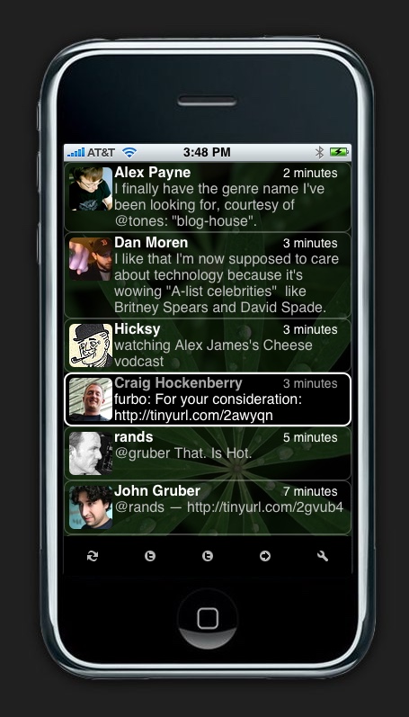
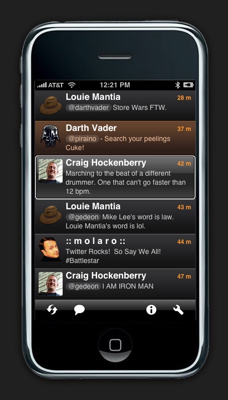
In June 2007, we had just released version 2.1 of our wildly popular Mac app for Twitter. It should have be pretty easy to move some Cocoa code from one platform to another, right?
Not really. But I was learning a lot and having a blast!
The iPhone attracted coders of all kinds, including our own Sean Heber. In 2007, Sean was doing web development and didn’t know anything about Objective-C or programming for the Mac. But that didn’t stop him from poking around in the class-dump headers with the rest of us and writing his first app.
But he took it a step further with a goal to write an app for every day of November 2007 (inspired by his wife doing NaNoWriMo.) He called it iApp-a-Day and it was a hit in the Jailbreak community. The attention eventually landed him a position at Tapulous, alongside the talented folks responsible for the iPhone’s first hit franchise: Tap Tap Revenge.
Over the course of the month, Sean showed that the iPhone could be whatever the developer wanted it to be. Sure, it could play games, but it could also keep track of your budget, play a tune, or help you hang a painting.
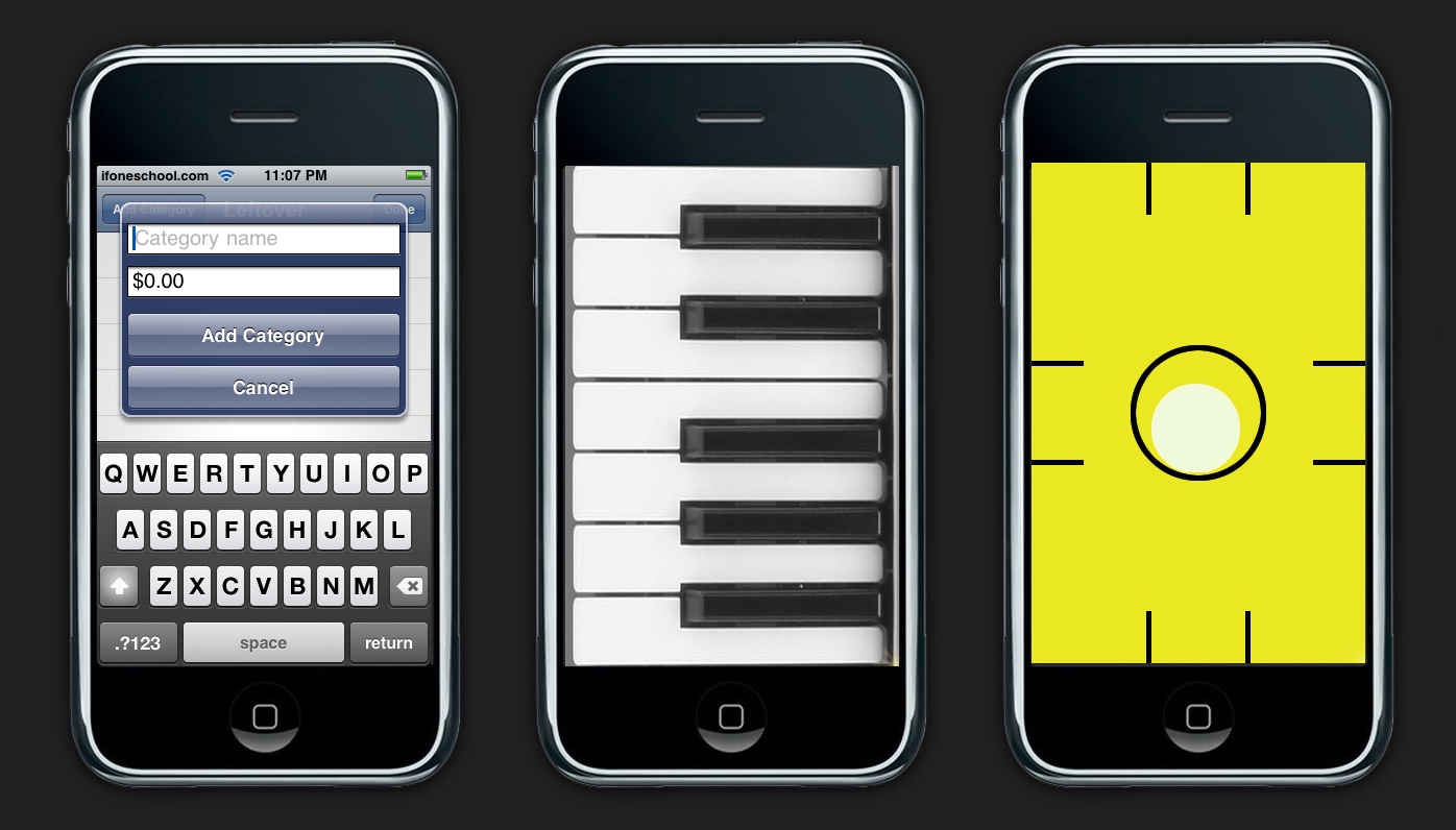
Screenshots from Sean Heber’s iApp-a-Day.
Both Sean and I have archives of the apps we produced during this period. The code is admittedly terrible, but for us it represents something much greater. Reading it brings back fond memories of the halcyon days where we were experimenting with the future.
There were a lot of surprises in that early version of UIKit. It took forever to find the XML parser because it was buried in the OfficeImport framework. And some important stuff was completely missing: there was no way to return a floating point value with Objective-C.
There were also strange engineering decisions. You could put arbitrary HTML into a text view, which worked fine with simple tags like <b>, but crashed with more complex ones. Views also used LKLayer for compositing, which was kinda like the new Core Animation in Mac OS Leopard, but not the same. Tables also introduced a new concept called “cell reuse” which allowed for fast scrolling, but it was complex and unwieldy. And it would have been awesome to have view controllers like the ones just released for AppKit.
But that didn’t stop us from experimenting and learning what we could do. And then something happened: we stopped.
A Real SDK
Apple had worked their butts off to get the iPhone out the door. Those of us who were writing Jailbreak apps saw some warts in that first product, but they didn’t matter at all. Real artists ship. Only fools thought it sucked.
Everyone who’s shipped a product knows that the “Whew, we did it!” is quickly followed by a “What’s next?”
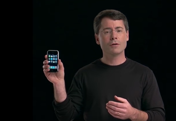
Maybe the answer to that question was influenced by all the Jailbreaking, or maybe the managers in Cupertino knew what they wanted before the launch. Either way, we were all thrilled when an official SDK was announced by Steve Jobs, a mere five months after release of the phone itself.
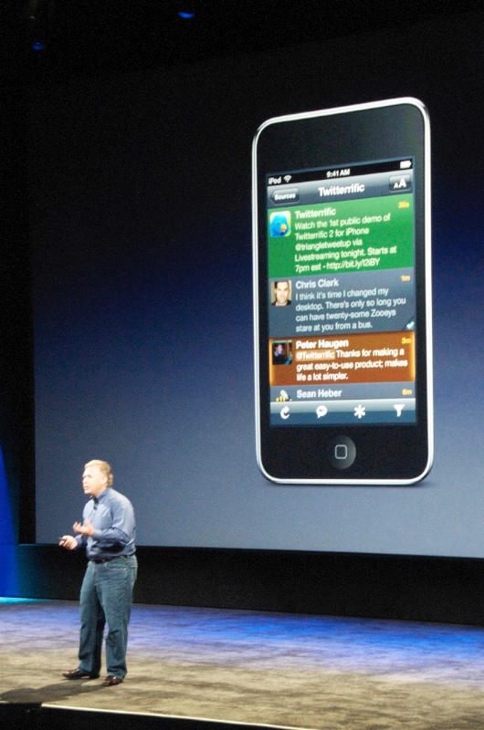
The iPhone SDK was promised for February of 2008, and given the size of the task, no one was disappointed when it slipped by just a few days. The release was accompanied by an event at the Town Hall theater.
Ten years ago today was the first time we learned about the Simulator and other changes in Xcode, new and exciting frameworks like Core Location and OpenGL, and a brand new App Store that would get our products into the hands of customers. Jason Snell transcribed the event for Macworld. There’s also a video.
Our Turn to Be Real Artists
After recovering from all the great news, developers everywhere started thinking about shipping. We didn’t know exactly how long we would have, but we knew we had to hustle.
In the end, we had about four months to get our apps ready. Thanks to what The Iconfactory learned during the Jailbreak era, we had a head start understanding design and development issues. But we still worked our butts off to build the first iPhone’s Twitter app.
Just before the launch of the App Store, Apple added new categories during its annual design awards ceremony. We were thrilled to win an ADA for our work on the iPhone.
How thrilled? The exclamation I used while downloading the new SDK was the same as getting to hold that silver cube.
After that, we were among the first apps to be featured in the App Store and ranked high in the early charts.
We knew we were a part of something big. Just not how big.
The Journey Continues
The Iconfactory’s first mobile app entered a store where there were hundreds of products. There are now over two million.
We now sell mobile apps for consumers and tools for the designers & developers who make them.
We now do design work for mobile apps at companies large, medium, and
small.
We now develop mobile apps for a select group of clients. (Get in touch if you’d like to be one of them.)
A lot can happen in a decade.
But one thing hasn’t changed. Our entire team is still proud to be a part of this vibrant ecosystem and of the contributions we make to it. Here’s to another decade!
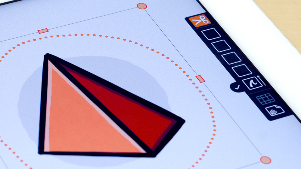
 Curious about how Linea Sketch came to be? Check out Episode 20 of the iPad Pros podcast to hear Ged talk about Linea Sketch’s past, present, and future.


