On macOS, we added support for a reverse proxy. This lets you use WorldWideWeb as a frontend web server for a backend development environment. In simpler terms, this lets you use the auto refresh feature with code written in Ruby, PHP, or whatever framework you’re using.
We’ve used it for development on our own sites, and it’s pretty great to edit some code, hit Save, and have the browser automatically refresh and run that new code.
Every development environment is different, so make sure to check out the Proxy Configuration section of the app’s documentation (click the ? button on the main window). There are a bunch of recommendations and tips that will help you get the most out of this new feature.
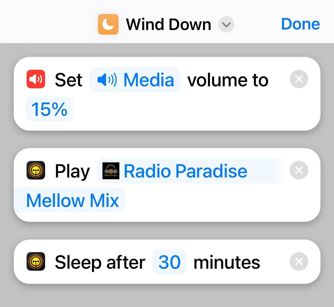
On iOS, we added some Advanced Settings that were previously only available on macOS. This includes the ability to adjust the sound level while in the background (it can now be quiet or turned off completely). No more beeping while showing off your work on the iPad!
To make these changes, look for “WorldWideWeb” in the System Settings app. The app’s documentation explains how these advanced settings can be used (About > Product Manual > About WorldWideWeb).
Get your updates for iOS or macOS today. To learn more about the product, and how auto refresh makes working with the web so much more pleasant, check out the WorldWideWeb website.
October rears its spooky, pumpkin-spiced head once again and with it comes our favorite way to flex our creative muscles – Inktober. The annual event encourages artists, both amateur and professional alike, to pick up a pencil, brush or stylus and channel their creativity each day in the month of October. It’s a great way to express and challenge yourself as we doodle and sketch our way through the official list of prompts.
This will be the fifth year we’ve contributed to the cause by creating a set of handy templates for Linea Sketch that outlines the prompts for each of the 31 days in Inktober. This year’s list of templates is ready for download and broken out by page numbers that contain the prompt for that day’s drawing. The templates are perfect for those who like to have a uniform set of sketches for the entire month or who want to stay tight and focused on their daily creations.
As they are every year, Linea’s Inktober 2023 templates are completely free, easy to set up, and should quickly get you on your artistic way. A few years ago we created a short video tutorial on how to get the templates into Linea Sketch for the iPad that will help guide you through the process this year as well. Be sure to check it out.
Be sure to tag your posts on social media with #LineaSketch – we always share our favorite drawings over on Linea’s Instagram during the month of October so it’s a great way to step into the lime light! Apply new screen protectors and charge those Apple Pencils because October will be here before you know it!
With Interactive Widgets, Wallaroo 1.4 brings a whole new way to customize your home screens on the latest versions of iOS, iPadOS, and macOS! There are also a handful of fixes and improvements that make using and enjoying your favorite wallpapers easier than ever.
Wallpaper Widget
Thanks to the new interactive widget, you’re no longer limited to seeing just one wallpaper at a time. Now you can customize each page of your home screen with even more of your favorite Wallaroo artwork by adding one or more Wallpaper widgets.
Decorate your Home Screen with Wallaroo’s widgets, or quickly change it with the built-in shortcut.
You can set each widget to show random wallpapers from any of Wallaroo’s categories such as Comics, Fantasy, Nature, Sci-Fi, and more. Or you can configure a widget to just cycle between all of your Favorites.
You’re not limited to only seeing the default version for each wallpaper, either – the widget can randomly choose any of the many variants available for each release. And when you’re feeling like changing the mood, tap the interactive refresh button to get a new wallpaper right away.
If you want more control, you can even configure the widget to display one specific wallpaper!
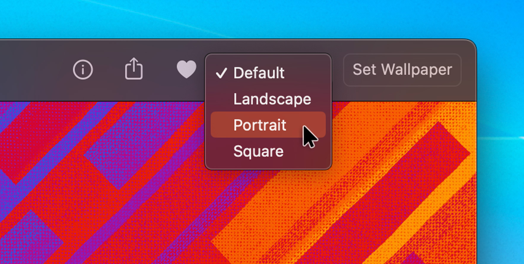
Select-A-Size
Each of Wallaroo’s wallpapers is really a complete set of artwork tailor-made for iPhone, iPad, and Mac. Many releases also include multiple variants to cater to a wide variety of tastes. Every image in a wallpaper pack has portrait, square, and landscape versions which are all carefully designed for each device.
Previously, Wallaroo only used the size appropriate for the device you were using, but starting in version 1.4 you can view them all and pick the one you want with the new size selector. Now you can use the wallpaper orientation that works best for your setup. (It’s especially handy when you have a portrait display connected to your desktop!)
Choose the aspect ratio that works best with Wallaroo’s new Size Selector.
While viewing a wallpaper on iOS or iPadOS, tap the name of the wallpaper in the top toolbar and choose which orientation you want to use. On macOS, the same menu is located in the upper right next to the “Set Wallpaper” button on the toolbar.
Better Shortcut
Wallaroo makes it easy to change your wallpaper by using a custom shortcut. Recent changes in iOS and iPadOS have made the shortcut a bit less reliable than we liked, so we’ve improved it.
The first time you set a wallpaper using Wallaroo 1.4, you’ll be asked to update the shortcut. Follow the prompts and replace your existing shortcut with the new one and you’ll be back in business.
The new shortcut detects situations where the wallpaper cannot be set (such as when a built-in dynamic one like Astronomy is being used). It’s also more reliable when setting the individual Home or Lock screens. And as an added bonus, using the Home Screen option will now set the wallpaper without blurring it.
And More!
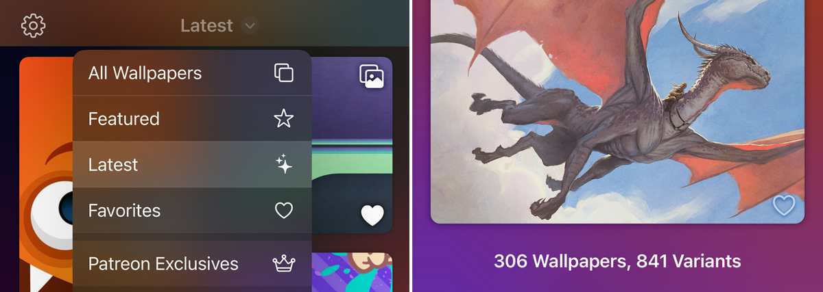
We’ve also added a few quality-of-life improvements including a “Latest” category that makes it easy to see which releases have been recently added or updated, a trackpad gesture for swiping between wallpapers on macOS Sonoma, the ability to save wallpapers at full resolution on macOS, and a total count of wallpapers and variants displayed at the end of each gallery category. And, of course, we fixed some pesky bugs.
Be sure to get the latest version of Wallaroo today for both iOS and macOS. Check out the website to learn more about the product or view the details about what’s changed in the release.
Announcing Triode 2 – a huge update to our popular Internet radio app.
We’ve packed the new version with improvements, including new support for Shortcuts and Widgets, improved Siri and CarPlay support, and a ton of tweaks and refinements across iOS, macOS, tvOS, and CarPlay.
Interactive Widgets
Triode now sports two different types of iOS 17’s new interactive widgets:
A controller widget lets you play and pause stations, view artwork, and see track info. It’s a quick way to answer “what’s that song?” from your Home Screen.
The stations widget shows your favorite stations or recently played items. Start listening to a new station or easily switch between them without ever leaving the Home Screen.
Triode’s new Interactive Widgets let you choose your favorite stations and control playback without ever having to leave the Home Screen.
These new widgets also work great with the new StandBy mode. And combined with Triode’s new Sleep Timer, your iPhone is about to become the best clock radio ever made.
Triode helps make your iPhone a great companion at your bedside or while you work.
The new interactive widgets will also be available on macOS Sonoma when it ships.
Shortcuts
We’re also bringing full support for Shortcuts actions to Triode:
Quickly find and play stations
Start, stop, or mute playback
Get information about what’s now playing
Start an automatic sleep timer
Use these shortcuts as automations to easily integrate Triode with your life. Turn on the lights and start some music on the stereo when you arrive home. Play your favorite station when the Driving focus mode begins. The uses are limited only by your imagination!
CarPlay
Speaking of your car, gear up for some great new additions to CarPlay:
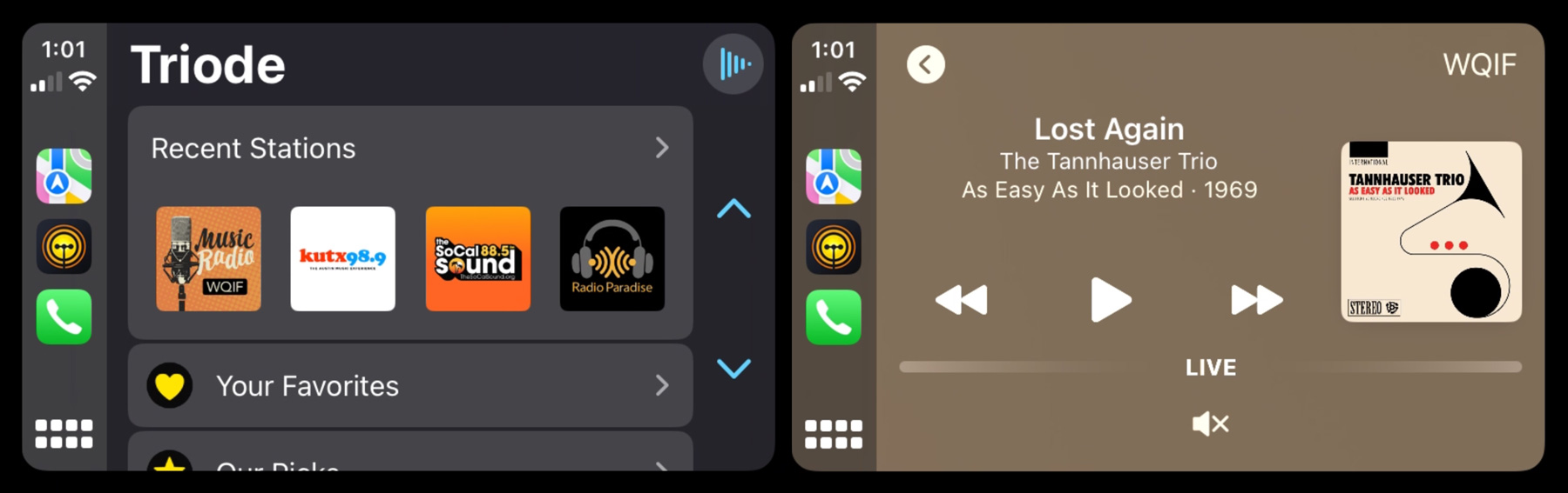
Quickly start a station using the new Recent Stations list
Now Playing screen shows the station name (WQIF) in the Up Next position
Choose another favorite station by tapping Up Next button
A new mute button is included below the playback controls
Visual improvements to Triode when CarPlay is in light mode
Pick a station image and keep your eyes on the road, while the player shows that station at a glance.
If you love CarPlay like we do, your drive just got a whole lot better!
Apple Music
We’ve also integrated Apple Music more deeply into the app. Viewing an entry in Triode’s track history now offers options to open the show or play the track in the Music app. You can also replay the track without leaving Triode: perfect for those cases where you want to hear a great song again!
The sharing options when viewing track details also lets you add the song to a “listen later” app like MusicBox.
Interface Refinements
The cherry on top is the improvement to Triode’s visual appearance. Default station artwork and track info are more vibrant, and new choices for category icons are now available.
We also made improvements to the Dock icon on macOS – enable it by right-clicking on the icon, and Triode’s presentation will match the new visual default first introduced in Big Sur.
For a full list of what’s new, check the Triode version history.
Download Today
Triode is FREE to download and play. In-app purchases enable benefits like favorites and high-quality artwork. To learn more about the app, check out the product website.
You can download the update today for iOS, macOS, or tvOS (search for Triode in the App Store).
We hope you enjoy this new version as much as we do. Rock on!
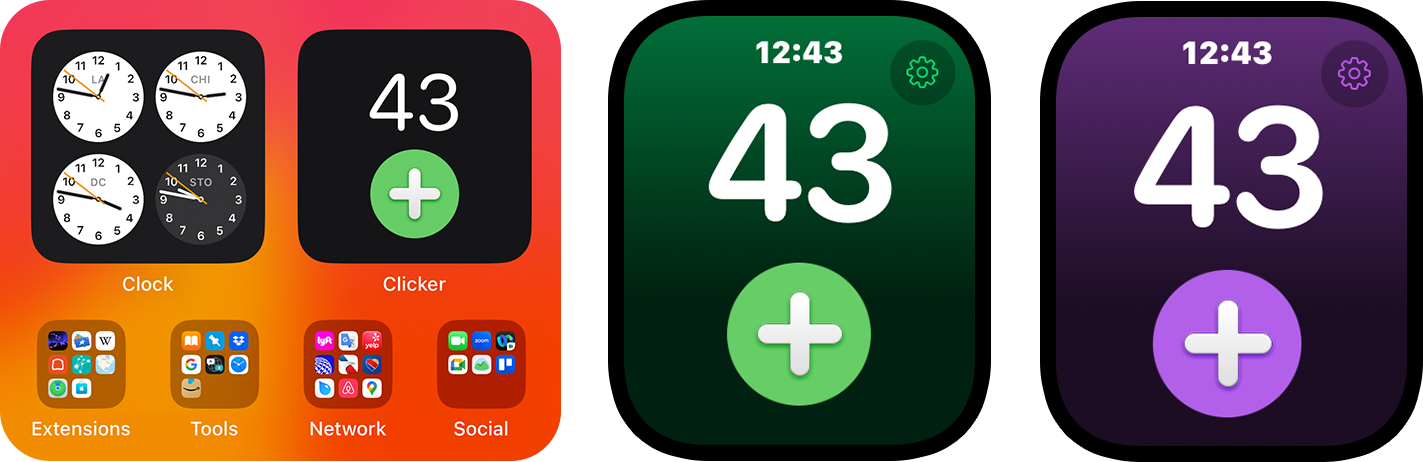
Just a quick post to let you know about updates for our FREE Clicker and Now Playing Plus apps for both iOS 17 and watchOS 10.
Clicker, our little counter with a thousands uses, gets two new features on iOS. The first is an interactive widget that lets you see and increment your count on the Home Screen. The other is support for Shortcuts: which means you can now automate your counting, including running a shortcut using the Action Button on your Apple Watch Ultra.
We’ve also adopted the new look on watchOS 10, so the app looks completely at home on the new OS.
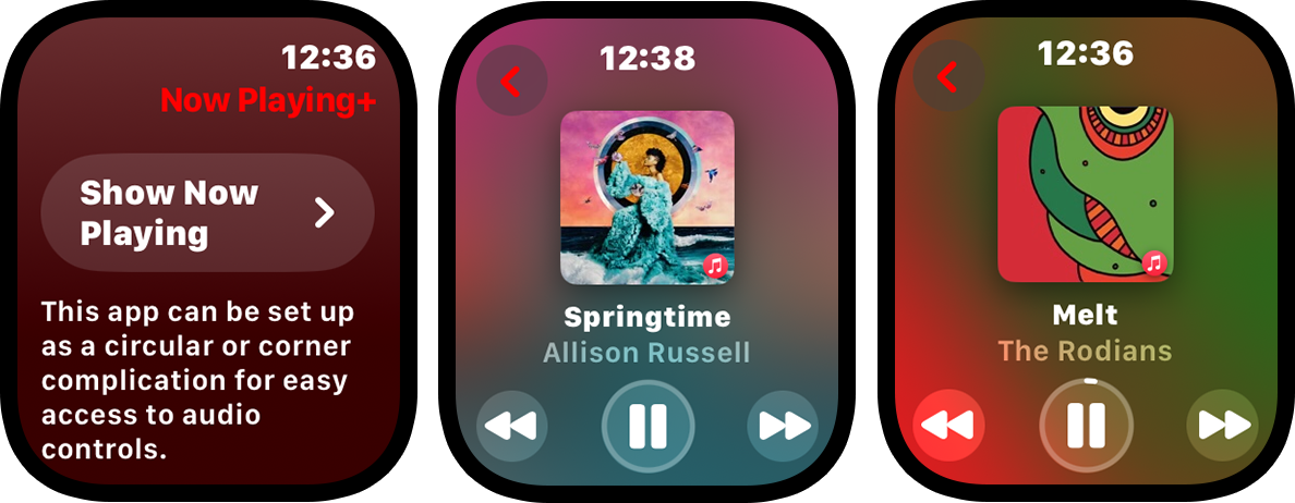
Now Playing Plus, which provides a watch face complication for Now Playing, gets a similar visual treatment and fixes a bug that could prevent the now playing view from appearing correctly.
Get your updates today and you’ll be ready for the new OS versions on Monday. And if you enjoy these little apps, make sure to check out our big ones! 😀
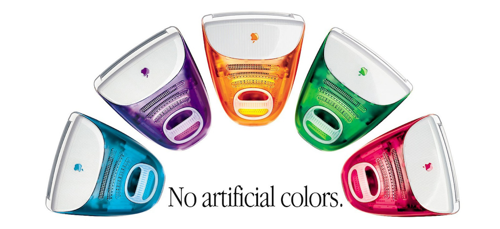
In 1998, the Iconfactory was still a toddler. Our first website launched just two years prior, but by the time the iMac appeared, we were on our third iteration.
And that was enough time to figure out that folks loved customizing their computers. Especially the hard drive icons – over the years we’ve made hundreds of them.
Back in the late 90’s the networks we now take for granted didn’t exist. You may have had a few Macs connected together, but it was often quicker to copy a bunch of media to an external drive and walk it over to whoever needed the files (we called it sneaker net!). And forget about cloud storage – we were using 56 Kbps modems!
This environment made customization popular. The first reason was practical: you knew that the Klingon ship on your desktop was an external drive and so did the person who was offloading the files. But more importantly, that icon allowed you to express a little bit of your personality – that drive icon said “I’m a Star Trek fan”. Maybe you even talked about the latest episode of Deep Space Nine as the files copied over (networks weren’t the only thing slower than what we use today).
Then along came the iMac. A computer that looked like nothing else, and we all loved it. The originality of the design inspired a lot of things, including icons. A machine that looked that cool needed a desktop to match!
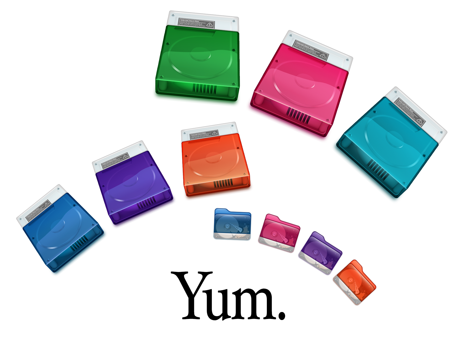
And as we celebrate the iMac’s anniversary, it has inspired us yet again with a fresh take on hard drive and folder icons:
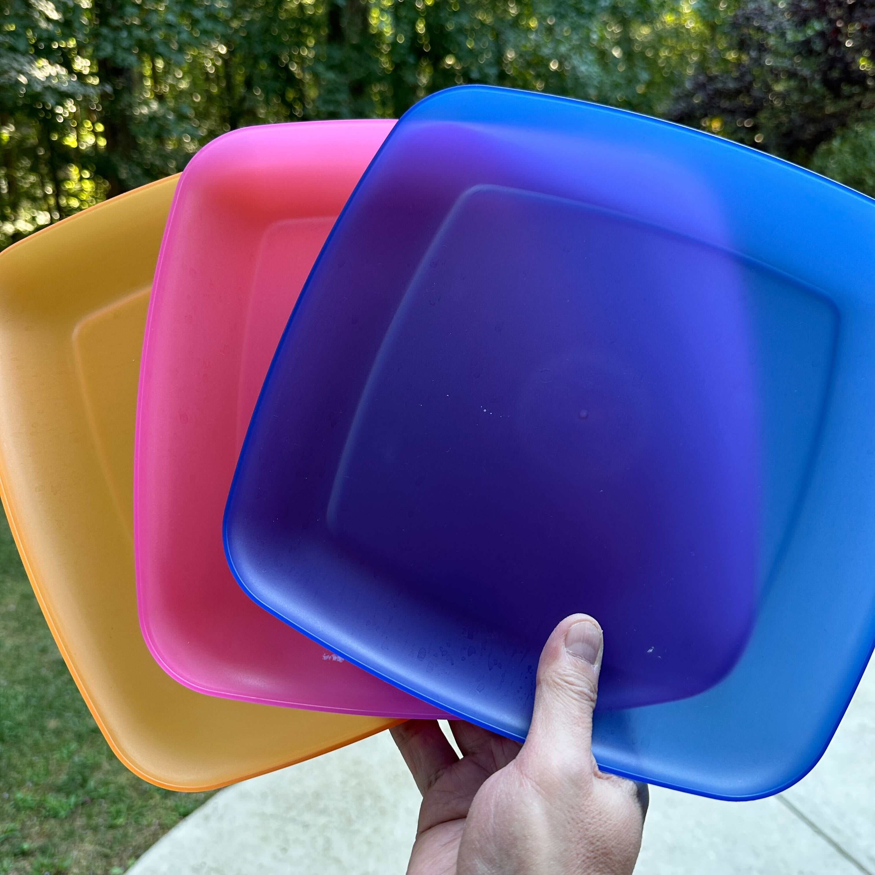
These icons got their start back in July when Talos Tsui bought some plastic plates in translucent colors. While the Bondi Blue colorway was all sold out, the fond memories were still available. After redrawing the original macOS hard drive icon, which wasn’t high enough resolution for today’s needs, Talos wrapped it in the colors of the original iMacs. And when going over-the-top isn’t enough, he decided to make icons that are an exact match of the current macOS folders!
Sadly, these icons also remind us how much more difficult it is to customize today’s computers. System integrity is a good thing, but it also takes the fun out of expressing ourselves with a desktop that looks exactly like we want. We’re doing our best to keep it alive, but there’s only so much we can do.
Thankfully, Mac users have it much better than folks on Windows. While we can still Copy & Paste in the Finder, on Microsoft’s platform it’s a long and arduous process with RegEdit. That also explains why we’re not including .ICO files in the downloads above. If you’re smart enough to dig around in the registry, you’re also smart enough to figure out how to use the included PNG files.
But when it comes to customizing our devices, there is hope! It’s all happening in our pockets and purses.
Apple sells a lot of cases and saw the popularity of this kind of personalization. Software to customize your phone arrived in iOS 14 with Home Screen widgets. Apps that gave your device a unique look were wildly popular.
This move toward customization continued with Lock Screens in iOS 16. We were thrilled with this new feature and quickly developed Wallaroo to fill this niche with a constant stream of great looking wallpaper.
And now with iOS 17, Apple is bringing us Contact Posters and NameDrop – features that let you share your personality with others. “More personal and intuitive” indeed.
But our favorite thing in iOS 17 is Interactive Widgets. We can’t wait to show you how Wallaroo, Triode, and even Clicker have gotten more personal!
So while we’ve lost some customization options, we’ve also gained some new and important ones. And it all began when the iMac broke from the bondage of beige. Happy anniversary!
Relive fond memories of your favorite classic arcade or electronic handheld games with Ollie’s Arcade – a fun collection of retro-styled mini games that are challenging and simple to play.
All of us here at the Iconfactory love the classic video games we played in our youth. Many hours were spent in front of titles like Asteroids, Moon Patrol, and Battlezone, as well as cherished handheld electronic games like Mattel Football, Simon, and Merlin. Ollie’s Arcade recaptures a little bit of this magic and gives players a chance to turn their iPhone or iPad into a retro gaming experience.
Two of the games in Ollie’s Arcade – Ollie Soars and Tranquility Touchdown – were inspired by simple Easter eggs in Twitterrific, our beloved Twitter app. We polished Tranquility Touchdown, completely revamped Ollie Soars, and added an all-new third game – our own take on the classic Snake. All of Ollie’s mini-games are easy to learn and designed to be accessible for everyone. You can even play with your favorite game controller or via wireless keyboard.
The Games
Here are the three retro mini games:
Ollie Soars – The sky’s the limit as you fly around the world with Ollie. Find all the gems you can while soaring past obstacles. Take time to enjoy the scenery but watch where you’re going!
Snake – A hungry snake is its own worst enemy. Gobble up as many apples as possible while you avoid running into your snake’s own twists and turns. Watch out for apple cores!
Tranquility Touchdown – Head for the stars in a game of exploration and skill as you pilot your lander to the surface of six different planets. Keep an eye on your fuel – what goes up, must come down!
Do I need quarters?
No, you won’t need a pocketful of coins to play! And better yet, there are no annoyances while playing: all the mini games are ad-free with no subscriptions.
Ollie’s Arcade is a free download that includes Ollie Soars. The other two mini-games, Snake and Tranquillity Touchdown, are unlocked via a one-time purchase of just $1.99 USD each.
We have lots of ideas for future additions, and your purchase will help us bring them to life. So grab Ollie’s Arcade on the App Store today, press PLAY and have some fun!
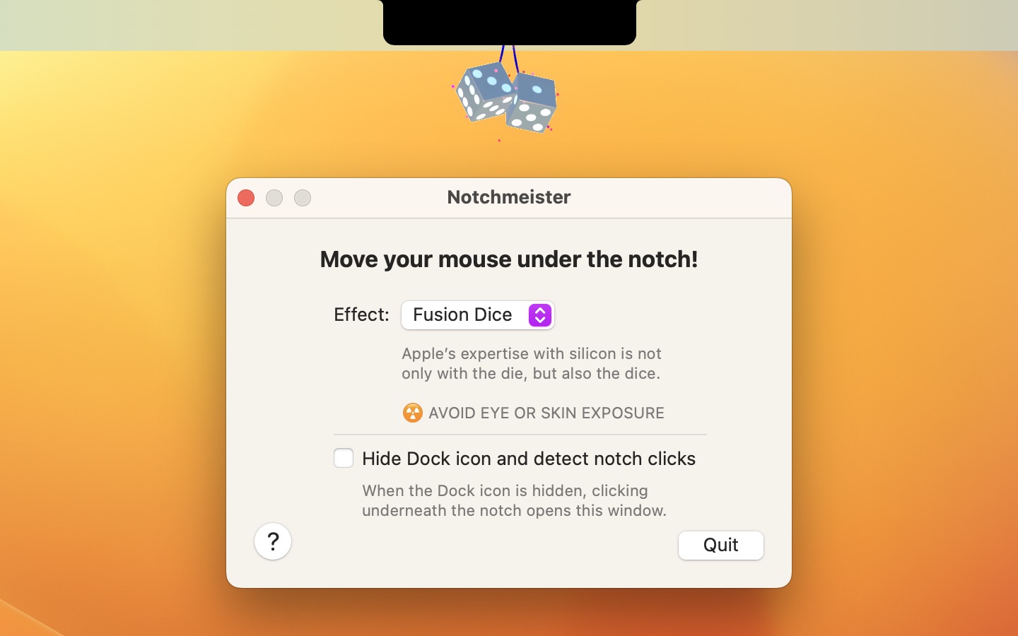
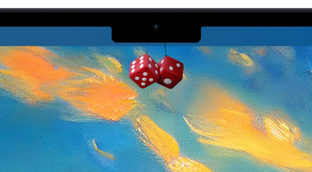
We’re proud to announce that version 1.0.4 of Notchmeister is now available to download. And with it comes a revolutionary new feature called Fusion Dice.
They spin.
You can click on them, too.
Fusion Dice are the perfect accompaniment to a never-ending video conference—you’re looking right into the camera while clicking the time away! And even if you’re lucky enough to not be in one of those meetings, they’re still a great fidget toy.
This all began with a toot from BasicAppleGuy. As soon as I saw this image, I knew it had to happen:
There was a snag: the window where the dice were being displayed blocked interactions. A large area surrounding your menu bar that prevents mouse clicks has just a few usability issues, so I asked people who are smarter than me for help. Luckily Guy English, Steve Troughton-Smith, and Justin Miller came up with some pointers that led me to a solution. It may not look like it, but there are five windows on screen, working in concert, just so you can fiddle around with your notch. As it should be.
Meanwhile, Louie Mantia was off making a font for die-hard fans of typography and Star Wars. And creating the assets needed to play Corellian Spike.
All good collaborations come to an end, even if one of the team members comes up with an idea that makes you think it will never be done.
(Unfortunately, this work has also inspired another request, but please don’t ask us for Truck Nutz. The first problem would be the unpleasant experience of finding a 3D model; the final problem would be App Review.)
This effort has been a labor of love, but if you’d like to show your appreciation, we have plenty of other apps you can buy. You can also be like BasicAppleGuy and become a Patreon supporter. We treat our patrons right, but not always this extensively 😉
The bottom line is that the more you support us, the more we can do the things that bring a little weird joy to your life. Once you’ve done your part, hold down the Option key while clicking on the Help icon, then live long and prosper.
WorldWideWeb, our simple web server for iOS and macOS, has been a hit with developers. It’s another case of us scratching our own itch and finding out there are lots of folks who need to do the same thing!
Of course, people who rely on an app also start asking for features. One feature that has gotten a lot of attention is auto refresh. It’s a huge time saver to edit your HTML, CSS, and JavaScript in your favorite editor, then see all the changes in your browser as soon as you save with ⌘S. It also makes testing in multiple browsers a snap because all of them update simultaneously.
The auto refresh we included in version 1.0 was very basic. We spent quite a bit of time with improvements and making the feature as bullet-proof as possible. The whole user experience is better.
And now our simple little product is a little less simple and needs more customer support. To deal with these new costs, we’re going to be charging for the features that only web professionals will need. The basic features will remain free and the PRO upgrade is a one-time purchase of $10 per-platform. You can also try out PRO with a free trial.
This new revenue source will also help keep the app FREE for the folks who need it the most. It makes us incredibly happy when people use the app to learn how the web works without first jumping over the hurdle of setting up a server with the command line.
We’ve also launched a new website that includes a quick demo of the new features. If you work on the web, you owe it to yourself to check out the new WorldWideWeb!
Our fast-paced puzzler, Frenzic: Overtime, is back with a brand new chapter to test your reaction and flex your gray matter. Enjoy new challenges as you battle your way through 30 exciting levels, complete new mini-goals, and solve unique puzzles that earn Game Center achievements.
Join in the fun to defeat the menacing Overbot once and for all in Frenzic: Overtime‘s third chapter: Unplugged!
Head on over to Apple Arcade to get the latest levels and start playing Frenzic: Overtime today.


